Home
Home

 Artists
 Search
 Recent
 Random
 Posts
Posts
 DMs
DMs
 Tags
Tags
 Random
 Importer
 Import
 FAQ
FAQ
 Account
 Register
 Favorites
 Login
Login

Patreon Art Book vol.3 cover art drafts (Patreon)
Published:
2019-07-01 21:05:29
Imported:
2022-03
Content
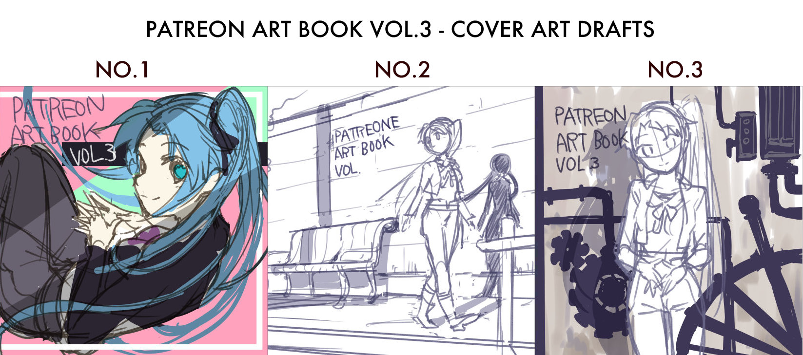
Vilserio!
I’m now working on Patreon Art Book vol.3!
This cover art is Rune theme (Thank you for voting), I’m thinking how I should expression Rune for this art.
I drew three drafts, which one do you like?
I welcome your comments!
Enjoy!
-Hare
====
ビルセリオ!
Patreon Art Book vol.3の表紙イラストをどうしようかな〜と検討中です。
今回は投票の結果ルーンがトップだったので、自分なりにルーンのイメージを形にしてみました。
どれにするかはまだ決めていませんが、どれも好みの感じなのでボツになったラフもどこかでサルベージできたらいいな、と思っています。
皆さんのお好みもよければコメントしてもらえると嬉しいです!
- 小夏はれ

 ↑この絵は奥のベンチにいる子供二人をルドとルーンにしたら面白くなるかなと思ってます。
I think it’s gonna interesting the children on bench in shadow are child Rune and child Rudo.

Files