Home
Home

 Artists
 Search
 Recent
 Random
 Posts
Posts
 DMs
DMs
 Tags
Tags
 Random
 Importer
 Import
 FAQ
FAQ
 Account
 Register
 Favorites
 Login
Login

Patreon Front Page: Constant in All Other Things (Patreon)
Content
Turning some of my energies and efforts back to Constant, I started thinking about the Patreon front page and that rather ugly place-holder art at the top. When I first started the Patreon over a year ago, I didn't have a clue what I was doing. (I still don't really, but I'm trying!) I can't remember where I got that image from - I think it was a website for designing digital book covers from a limited selection of (free) templates.
So, it could probably do with a refresh. People are here for the writing (presumably!) but a better-looking front page can only help, right? And with some of the recent fiddling with Artsmart, I thought I'd see if it could generate anything useful.
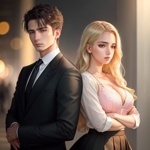
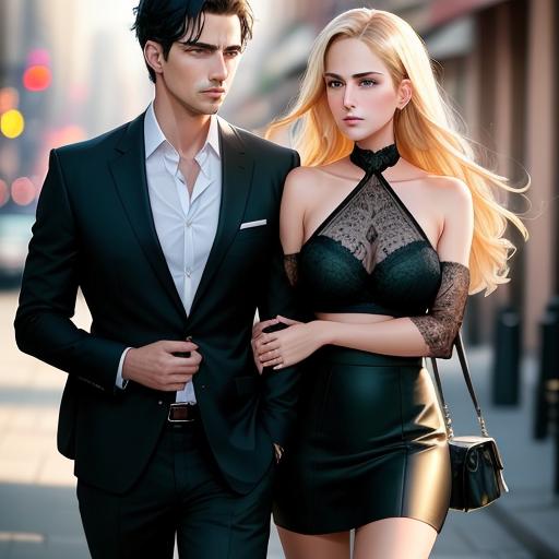
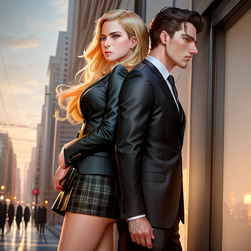
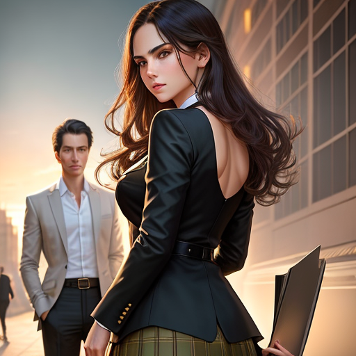
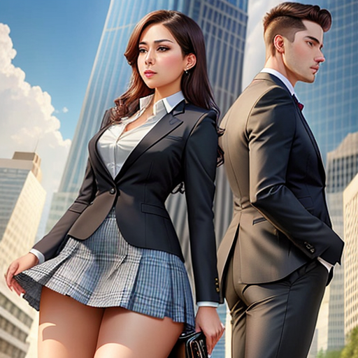
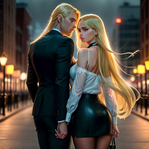
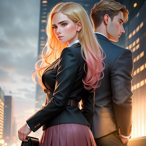
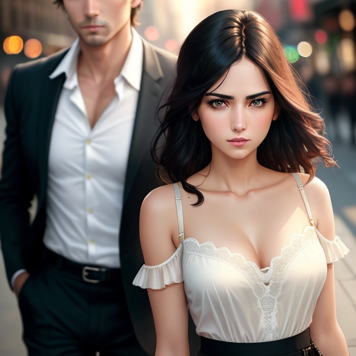
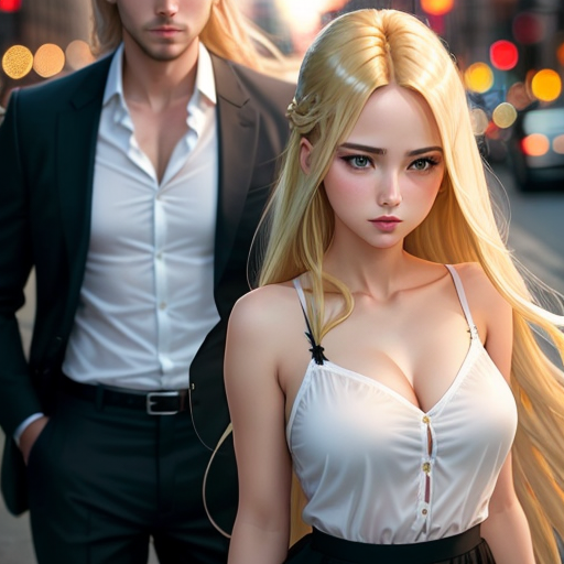
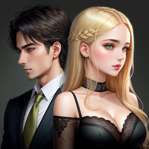
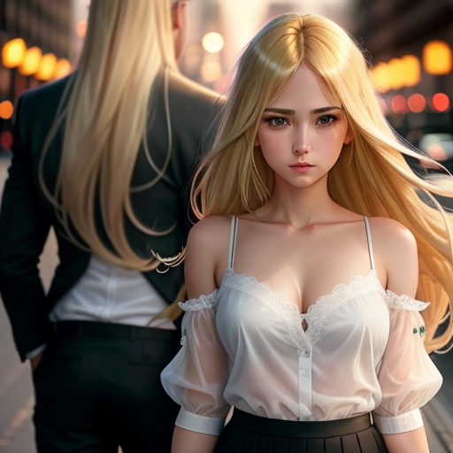
So, I tried getting it to generate an image of two people - a man and a woman - back to back - with some basic descriptions of each - and the instruction that they were male and female versions of the same person, business man and secretary.
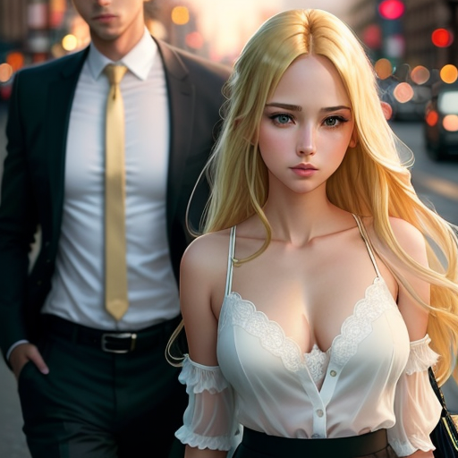
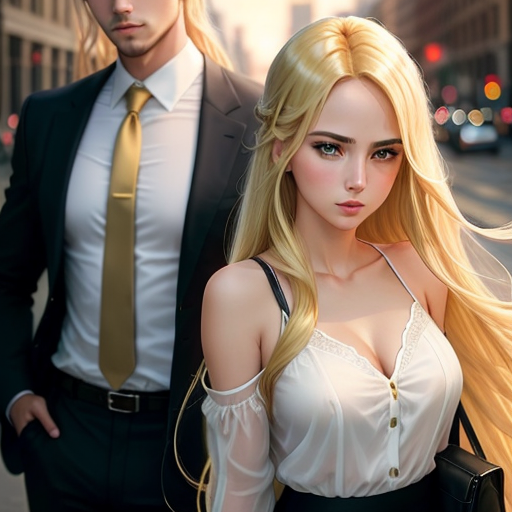
This led to some hiliariously hideous outcomes, such as one where the girl is sitting between the man's legs but their limbs have all sort of fused together. Above, you can see some--I dunno, concept art?--for a front or title page to the Patreon (and possible, Constant's final published book form, someday?)
What do you think? Ignoring the incongruities - wrong hair colour, height, too many fingers, etc - how does the positioning, poses, or dynamic between the two strike you?
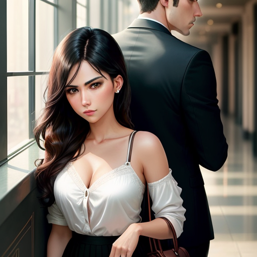
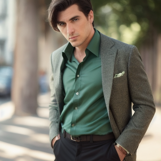
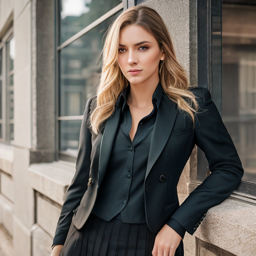
There's also two - uh, real world? realistic? attempts by the AI, two separate images of what I guess could be real-world David or real-world Cindy? Dunno; not really how I imagined them. I do find it fascinating though when the AI tries to create photo-realistic images, like the one I'm using for my profile photo, generated from Thispersondoesnotexist. (Sorry if that's a surprise reveal and disappointment!) The filters are much stronger when creating "realistic" images, I've discovered - it doesn't seem to have a big problem with overtly-comic-style/anime nudity, but avoids the same with its photorealistic representations. Which makes sense, really, as presumably it's using real-people images without their consent and from what I've seen, it's often not hard to draw the real person out from beneath its digital-Frankensteining-patchwork of celebrity photographs inhaled from the wide web.
In any case--any thoughts on the images and composition? Or, alternatively--any suggestions on what might make a good front page / novel cover?
Files