Home
Home

 Artists
 Search
 Recent
 Random
 Posts
Posts
 DMs
DMs
 Tags
Tags
 Random
 Importer
 Import
 FAQ
FAQ
 Account
 Register
 Favorites
 Login
Login

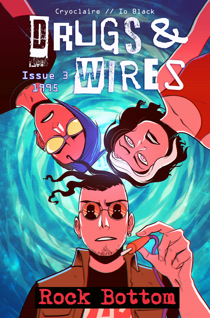
Issue 3 Cover (Patreon)
Published:
2017-03-30 16:44:06
Edited:
2017-08-07 16:04:46
Imported:
2021-10
Content
Some of you might remember that I had two drafts for the cover of chapter 3. Originally we had a bit of a miscommunication with Io and as a result i picked the one none of us actually wanted! So yeah, now that I'm about to release a print version for it, I thought I'd redo it how I wanted to. I decided that the painterly soft look wasn't really my thing either and went with simple bold colours and cellshading. I dunno, i just think it grabs the eye more and works better with my style. In some ways this cover is like a reverse version of issue 2 (with blue on pink) so hopefully they'll look nice together.
Files