Home
Home

 Artists
 Search
 Recent
 Random
 Posts
Posts
 DMs
DMs
 Tags
Tags
 Random
 Importer
 Import
 FAQ
FAQ
 Account
 Register
 Favorites
 Login
Login

Color enhancing + Values (Patreon)
Content
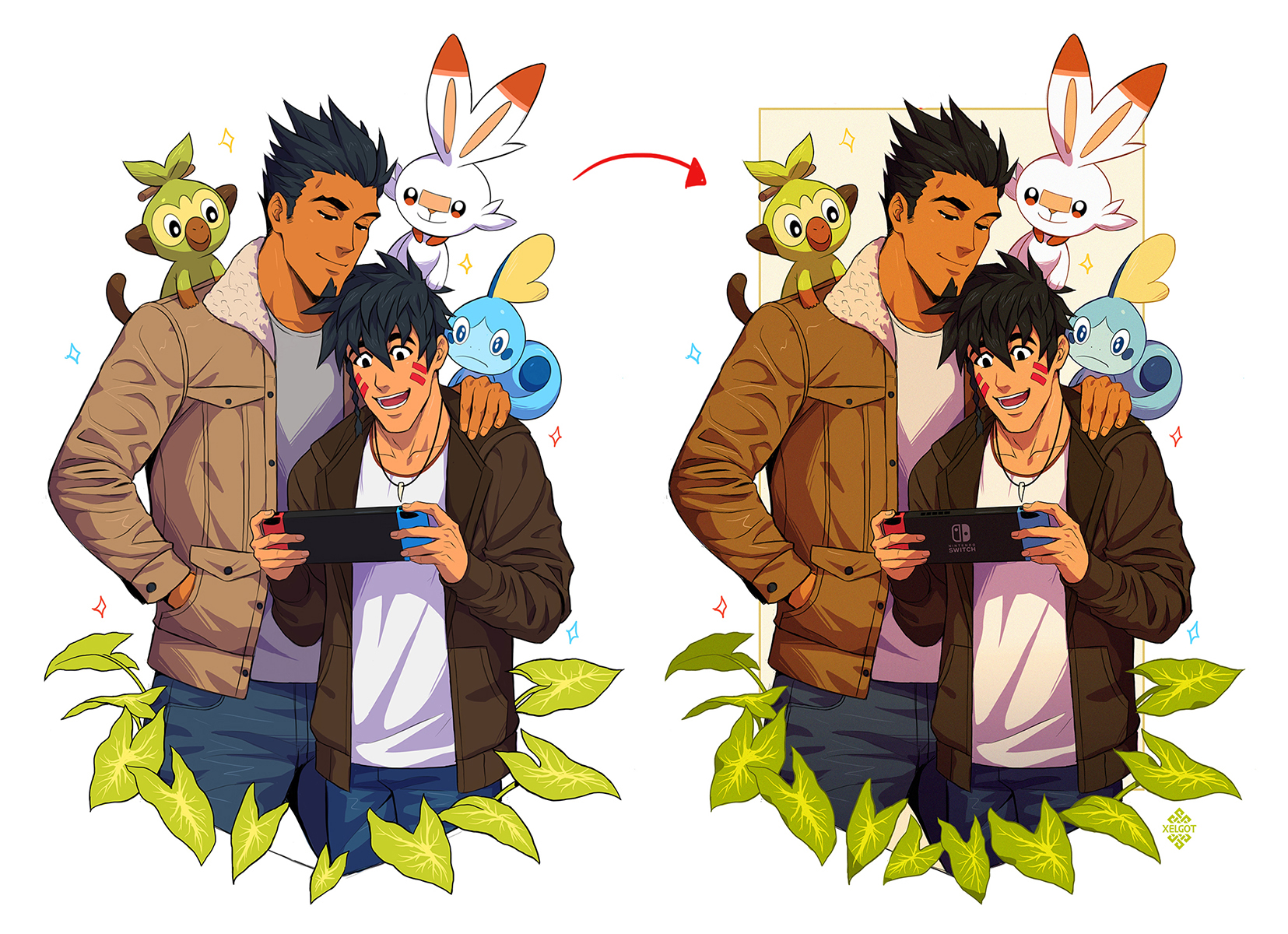
Hi guys! I'm not sure if calling this a tutorial since it's more of a "behind-the-scenes" at how I enhance and finish up my artworks on my PC using Photoshop. In the picture displayed at the top of this post you can see how the colors in the picture in the right stand out more and are more vivid than the one in the left.
The main reason I always finish up the artworks that I do on the iPad on PC is because the colors that are displayed there are not the same and it's also easier for me to check up on color contrast and values using Photoshop.
I must say, whether you work on iPad or desk computer, the way to make your colors and artworks in general to stand out more it's the same. This is what I mean:

If you turn your artwork into a grayscale, you will see the values (how light or dark colors are), which are very important in order to create focal points, separate elements from one another (contrast), creating illusion of depth, etc.
Without the values, all you'll see are colors, and understanding more the values and playing with them can help you enhance your artworks in general.
In my experience, I've found that creating value contrast is a key to make artworks stand out and more interesting. Here's a closer look at what I mean:

As you can see in the picture, the lack of contrast is more evident on Grookey and Aiki's clothes. This lack of value contrast also affects how you see the colors in general: they look more muted/dull. Even if the objective is working with muted colors to communicate certain feelings, it's also very important to check on the values.
Once I detected the areas that lack of contrast, what I did was applying a lighter tone and a more saturated color according to my needs using the color picker:

While playing with light/dark tones and saturation, I always recommend to go back and forth to check on your values. For such purpose, I always use an adjustment layer in Photoshop known as Vibrance on the very top of everything since it instantly turns everything on grayscale:

(If you've pledged to Soldier tier and checked up my PSD files, you might have notice this adjustment layer at the very top of everything)
Here's another good example of enhancing color and contrast by using values:

The pictures in the left are from an early stage of the making, however, I always kept an eye on my values as I was working on it. Values also helped me to "separate" Nightwing's silhouette from the background and make him stand out more.
Here's another example with applied values to enhance my work:

It is important to notice that since my character's skin is dark and therefore it has a dark value, a way to separate him from the background in order to stand out more is by making a background with a lighter value than the main silhouette (the character) OR by using a value darker than the skin, which I did.
I don't consider myself very good at teaching, however I hope this information can be helpful to somebody. If you've read up to this point, thank you! :)
Patreon rewards from this term should be up in the next 2-3 days. I will make a post about it when they've been sent. Thanks for your support! :D
Files