Home
Home

 Artists
 Search
 Recent
 Random
 Posts
Posts
 DMs
DMs
 Tags
Tags
 Random
 Importer
 Import
 FAQ
FAQ
 Account
 Register
 Favorites
 Login
Login

Behind the scenes - Creamy Peaks (Patreon)
Content
This behind the scenes will be very detailed for those who want that, this is an direct insight into how we at Lustgard work and the Q.C. Team who helps me as an artist work.
Enjoy!
---
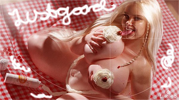
First render.
The light always plays a huge role. And its requires many hours to get right. Sometimes, Light cannot be improved due to limitations in the very software itself.
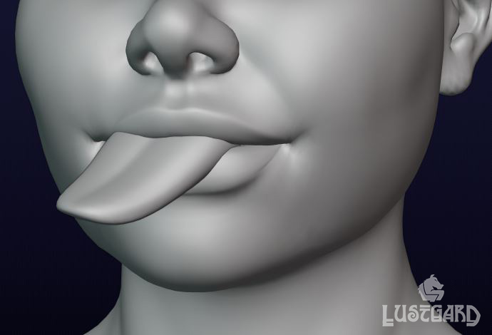
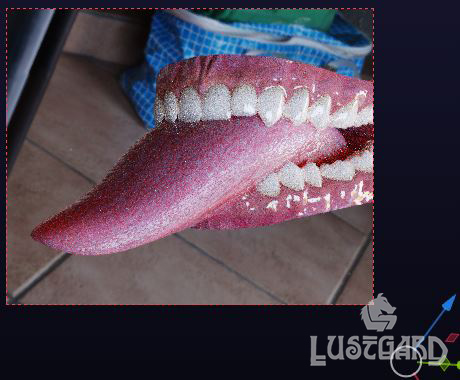
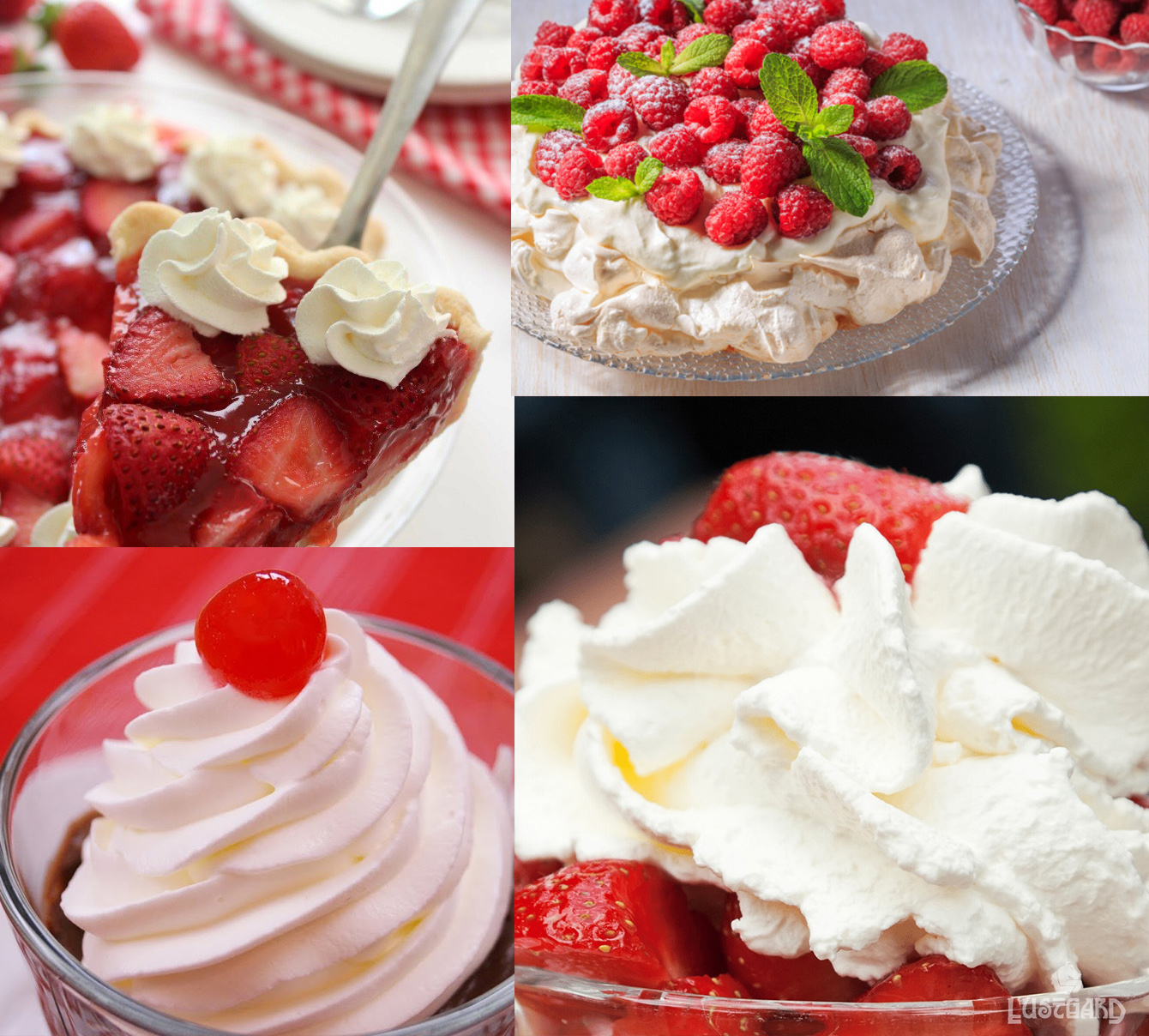
The Cream, as shown in the wip image, has displacement and array working by a curve.
Initially it was no cream on her tongue, but we decided it was for the better to add just a hint :D
More notes from the process of making Creamy peaks:
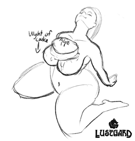
- Carefully tilted head a little forward to bring more lights into her eyes.
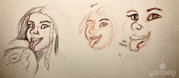
- The teeth was made larger, and longer. Also straightened out the two front teeth. It WAS correctly proportioned after a european female skull. But Something was still off, Since her face is an exaggeration of a typical european female, the teeth had to be too. I believe this caused major problems in the previous renders, like the hettegenser picture.
- Now the teeth seem more in tune with the whole face.
- Due to the deep eye sockets, it tried and tried to get her right eye (left side view) To brighten up more. But it simply would not be done. I have no fix for this in this scene with 3d, so photoshop remains.
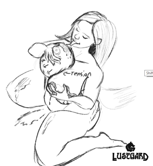
More progress as renders went on, here is a list:
- -head tilted slightly towards bottom left
- -can is now pointed towards her as in suggestion from @Chrys
- -sun light is adjusted slightly to bring forth better light
- - braid is curved better
- -braid did not get its end rendered somehow. error.
- -light in face was adjusted, will adjust back to previous, since face is now alittle too dark
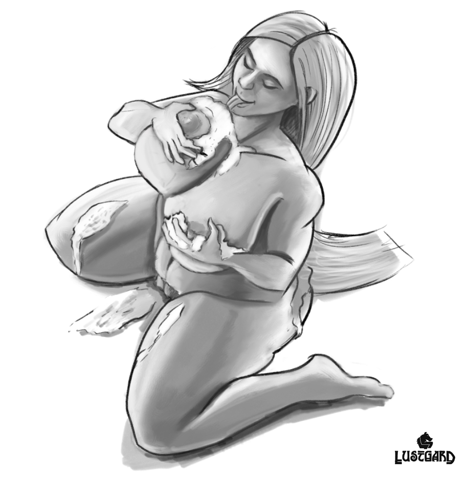
After many more fixes and renders, next checklist:
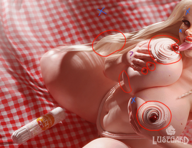
- 1) On the fence about it, please give feedback about the cream bikini.
- 2) the cream on her left boob (bottom most one) Should it be removed? (suggestion by @Lustgard Lumimyrsky )
- 3) the cream itself looks weird, i know Looks like... uhm..? jelly? jellyicecream something strange rubbery.
- 4) the light is not yet perfect. as marked with blue crosses.
- 5) the right boob deformation is not perfect. circled accordinly.
- 6) hair is wrong at right side. its supposed to lie down on arm.
Here are some later stages of the Creamy Peaks image, its a checklist I made for things that did not go right in the other renders, or things simply forgotten at the time.
- -necklace added
- -color adjust
- -ribbon fix
- -ribbon braid distance
- -various ceases
- -noise fix
- -hair fixes
- -teeth fix again
- -tongue wetness adjust
- -grip on hands was also adjusted
- -blanket was made smaller as from suggestion
And many more i forget to mention.
Latest render brought forth a warmer yet more natural look.
We also wanted to have more cream on the scene, but decided against it. As I could take away focus, and serve no purpose.
Creamy Peaks was a piece I was really happy with. It captured a true 50's Pin-Up style as I wanted and became almost like the vision I had for it. It was a incredibly fun picture to make.
Special thanks to: Lumimyrsky, Dark Kuno, Emperor of Titties, Sol, Np3228, Chrys and Lizendy. (Hand drawings was made by Chrys. Thank you for the awesome contribution man!)
Files