Home
Home

 Artists
 Search
 Recent
 Random
 Posts
Posts
 DMs
DMs
 Tags
Tags
 Random
 Importer
 Import
 FAQ
FAQ
 Account
 Register
 Favorites
 Login
Login

COMIC: Space Camp, Page 8 (Patreon)
Content
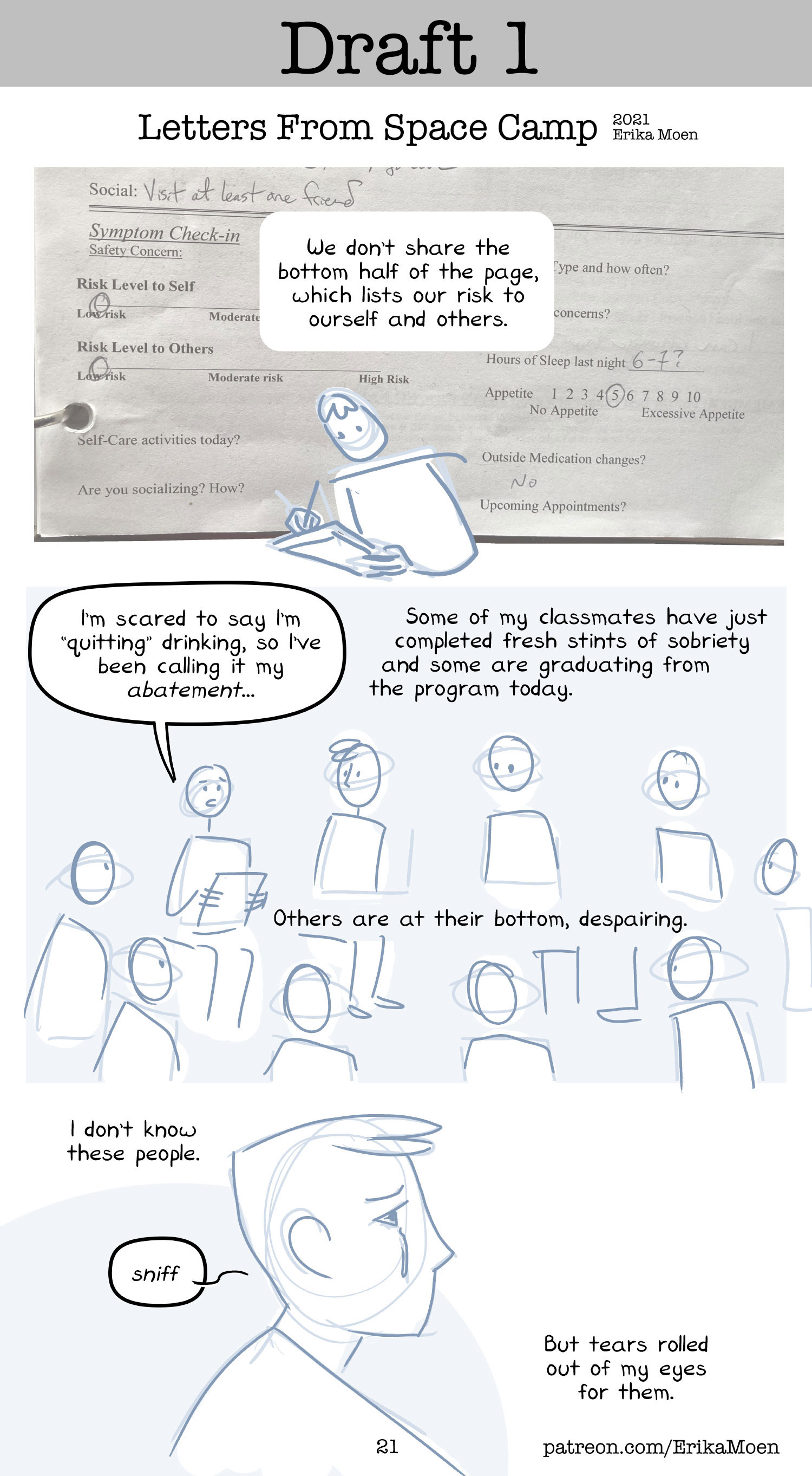
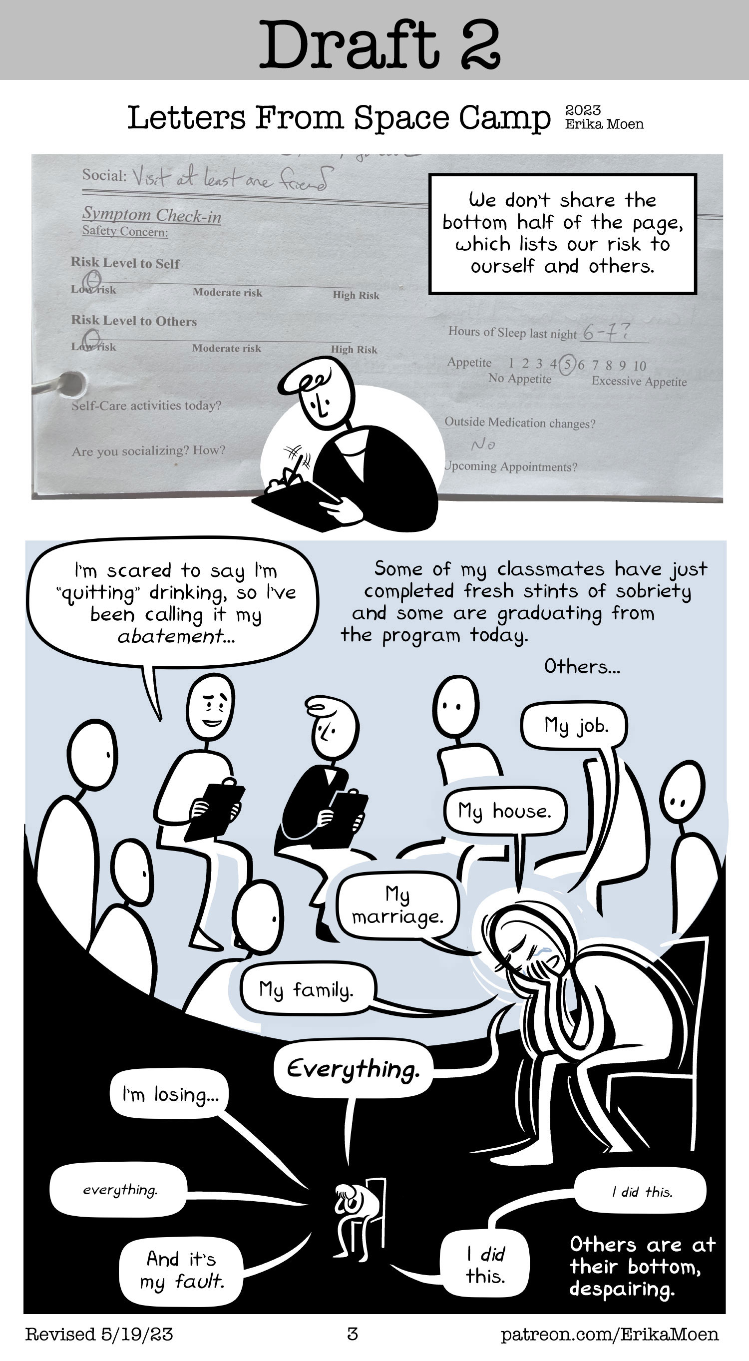
Letters From Space Camp is my memoir about going through a mental hospital program and for my pitch to publishers I am revising the Day Two chapter, which covers my second day in the program. This is my third draft of this chapter, you can read the first draft and second draft to see how it's changed (and it has changed).

The round-bottomed shape of the top panel is meant to remind the reader of a water drop.
There was a lot of crying, so obviously you could say the shape represents our tears, which is a bit on the nose. In my head, we're all held together in this little space that, well, it kinda feels like a drop of water clinging to the underside of a surface right before its weight pulls it into a free fall. Us patients, we're all huddled together, safe in this little environment for the moment before the fall.
The raindrop-shape also pulls the reader down the page, which starts on a more positive note and descends into despair. It's a shape that drags the reader's eyes downward, both across the page physically and through the character's experience emotionally.
I also expanded the black background to fill up the entire page, so show how lost in space and empty some of us were. The blackness is swallowing up the whole page now.
I was heartbroken to cut the "I'm scared to say I'm quitting drinking, so I'm calling it my 'abatement'." and "Some of my classmates have just completed fresh stints of sobriety and some are graduating from the program today." lines, but my agent rightfully pointed out that my sample chapter needs to be very clear that I'm in an Intensive Outpatient Program for mental health, not a rehab clinic for substance use. This chapter will be read out of context by potential publishers, in order to woo them into paying me to make the entire book for them. When (if) I get to make the full book, maybe I'll be able to sneak those lines back in, since people will be ready from the beginning and they won't be confused about where I am.
Check out the image gallery to see each iteration this page went through over the last three years!

Files