Home
Home

 Artists
 Search
 Recent
 Random
 Posts
Posts
 DMs
DMs
 Tags
Tags
 Random
 Importer
 Import
 FAQ
FAQ
 Account
 Register
 Favorites
 Login
Login

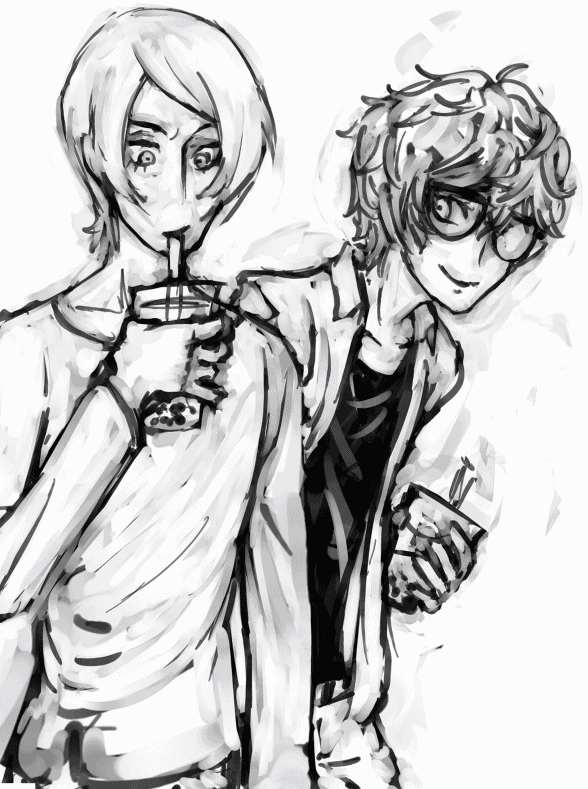
Akira and Yusuke Art Walkthrough (Patreon)
Content
Last year, I switched from a Wacom Intuos to a Huion Kamvas GT-221 pro - a very advanced monitor tablet! It was super crazy and daunting, and this was the first drawing I ever did with my lovely Huion. I went through many ideas for this zine piece and ended up going with bubble tea in the park from P5 - I used a screenshot from the game as a reference.

picture I used as a ref for the background!
Unfortunately, I didn't save a version of the .sai file involving the background. It's lucky that it isn't super detailed and was done pretty fast!
I had my persona 4 artbook out whilst drawing this, for inspiration... I really enjoy the cell-shaded art by Soejima. This is something I highly recommend - if there's a style or aesthetic you're going for, have a bunch of inspirational images or moodboards at the ready for you to look at throughout to keep yourself on track!
Another general point is that it's been almost a year since I drew this, and I can spot a bucketful of mistakes I wish I could fix now. However, it still looks goodish(?) overall!
Everything I mention here is my own opinion on what I draw and all links to my personal process and stuff. If you can't relate, don't think you're doing it wrong! Also I am in no way a professional or anything. This passage might just be something useful to consider.
So first off, I got my initial sketch down. As always, it is very important for me to sketch my thumbnail whilst very zoomed out from the canvas - this forces you to focus less on the little details and instead on the overall composition, something you need to nail before you start zooming in and adding little things.
Unlike most of my other pieces, for this one I didn't make a thumbnail with potential colours and shading - just the sketch. This was a little risky, and I feel like if I were to do it again, I would make a thumbnail; as it would have saved me a lot of time and effort!
The anatomy was a complete fluke here. What I did was send many versions of the sketch to several friends, asking them if anything looked wrong or off. It's important your friends know that you want to hear criticism, as some will just be nice and say it's perfectly fine when there are issues they'd talk about otherwise. My friends told me that there was something off about yusuke's hand in particular, and one artist friend mentioned how his hand would actually be holding the cup at a different angle - after looking in the mirror and fiddling around, I managed to fix the issue! On top of this, I changed his grip to something light and almost classy - something to match his mannerisms and artist persona.

fixed the hand!
Akira is leaning over to check out Yusuke's reaction to something new, kind of like what the player would do in a social link. I don't really think I did this on purpose... it's important to make sure your piece feels right in terms of the characters and what they're doing, but in order to achieve this you don't really have to think about it anyway! Just make sure your art feels natural to you.
It took a long time to neaten out the lineart. When you're doing this, go grab yourself a cup of tea and relax! I'd also highly recommend opening another window and looking at a zoomed out version of your drawing, so you can see how you neatening out and changing the lineart is changing the artwork overall. To do this like how I do in SAI, go view>new, then adjust your two windows accordingly - one zoomed out and one zoomed in!
Then came the colours. I colour dropped from a screenshot of Yusuke's social link where he wears this outfit, then tweaked with overlay layers, fiddled with the hue, saturation, brightness etc until I had the flat colours I thought looked good! I loved the pink sunset look. Cell shading was added as a layer on shade mode, and I fiddled with the opacity until it looked alright. A lot of fiddling and adjusting happens in digital art! Don't be afraid to do things you feel are "cheating", like abusing the undo button, doing things that'd be impossible in traditional art, and filtering. I do all of these things constantly.
Now, you may see on the .sai file I have used these funky layer modes - turn them on and off and you'll see the colours in the drawing change! This is a really easy way to add some extra lighting effects to your piece. Mess around with them!
Filtering involves a lot of fiddling around for me, but here's what I ended up doing to this piece:
- Blurring of the background to give a feeling of focus.
- Very low cellophane, to give the lineart this cool "edge" - cellophane was set higher on blurred or far away areas, to add to the 3D effect.
- I inverted the piece, then used the "bloom" tool, then inverted it back - giving the colours a glow.
- Lots of colour filters took place here - including gradient ones from top to bottom, changes in the contrast, in brightness, and saturation. Don't be afraid to experiment!

The thumbnail next to the final png!
Please feel free to ask questions! If you feel I missed out a description of any important details or aspects to this drawing, let me know.
Files