Home
Home

 Artists
 Search
 Recent
 Random
 Posts
Posts
 DMs
DMs
 Tags
Tags
 Random
 Importer
 Import
 FAQ
FAQ
 Account
 Register
 Favorites
 Login
Login

Bayonetta Zine Piece Art Walkthrough (Patreon)
Content
walkthrough, so let's end May with this!

I work with paint tool sai and filter with photoscape, so the exact same rules won't apply to you if you're using another program. However, I've written this with everyone in mind!
First, I like to make a thumbnail to help give me an overall idea of what to aim for.
Getting the sketch (the first frame) right meant using the app designdoll (which is free if you want to use it!) to make a pose because I'm lazy, but I ended up standing in front of the mirror and making the pose a lot. I ended up altering ans stretching the image I got from designdoll quite a bit! The app is amazing and so useful; however you simply can't replace real life references.

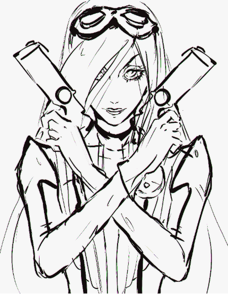
the picture from designdoll as it appeared as a layer in sai
I used the official reference art and screencaps from the game itself to get aspects of her outfit right, and get an idea for how the materials of her clothes even worked (to be honest I still don't know for sure)!

Official art of Jeanne I used as a reference, and took some colours from
I slapped on those colours below the lineart to help give me an idea on how it would look overall - I took the colours straight from the official reference, just like how I did with the komaeda zine piece. After taking the .png out of sai and fiddling around with filters, I had a thumbnail (the second frame). It's also worth noting that for the thumbnail and sketching period, I always zoom pretty far out of my canvas; as what's important at this stage is the idea and composition, not the little details that require you to zoom in. Zooming far in this early can cause mismatching anatomy, details and proportions.
Overall, my process for this piece was very similar to the Komaeda zine - except with a lot more emphasis on the lineart and solid black shading. You will often hear artists telling you, "don't shade with black!!" This is very true, but it means this: when blending and shading, simply making the colour you're using closer to black or blending black into your colours will most likely look very dull. In the comic-booky cell-shady art I have up here, I'm using solid black, which I haven't mixed in with my colours (which is actually a really dark purple if you colour drop it!) to make the colours pop.
As you can see in the gif above, there's a pretty big leap in the drawing's progress. This often happens when I get really into the zone, and work away at the lineart for a long time without realising how much I've done. I know you all do this too sometimes! As I worked on the one solid black lineart/shading layer, I gradually fixed up the colours alongside it to check everything would look alright.
I actually had a normal cell-shading layer which I deleted, as I thought the drawing looked better with the black shading alone.
The entire time I was working on the lineart, I was turning the colours and shading off layers and on again, checking how the piece looked with them on, using them to help me spot mistakes. It's also important to flip your canvas (but not too often, otherwise you'll get too used to it both ways round!) in order to spot and correct mistakes!
I'm terrible at drawing streamlined, square objects - let alone objects like those interacting with a person's hands! It took me a long time to draw those guns. I couldn't read the gold writing on the side of them in my references, so I quickly wrote "arigatou" in hiragana and slapped it on, ahaha!
I used line tools to help make the guns looks as streamlined as possible - and because I'm lazy sometimes; I copied one gun, flipped it, then used that as my lineart for the other one.
Something very important which I often fail to see artists perform is that eyeballs are round. Often, you see an eyeball look like it's simply painted onto their face - you always must remember that your eye is a round ball inside your skull, and what you're seeing is part of a sphere! Remembering this whilst drawing is an instant way to improve how your eyes look, in my opinion. As you can see in the thumbnail (which is in the last picture), I had forgotten to keep this in mind initially.
After finishing the illustration in terms of lines and base colours, I then went on to filter it.

the piece before filtering & overlays
As you can see, the colours are pretty different! Even though Jeanne's outfit is very red, I preferred the piece after its purple overlay - where it looked pretty darn pink. With your paint program, try sloshing around some colours and then fiddle with the layer modes! It might add some dramatic coloring to your drawing. Mostly, I use overlay layers.
Filtering involves a lot of fiddling around for me, but here's what I ended up doing to this piece:
- Blurring of far away/moving areas such as the hair, far back of head and bottom of illustration
- Very low cellophane, to give the lineart this cool "edge" - cellophane was set higher on blurred or far away areas, to add to the 3D effect.
- I inverted the piece, then used the "bloom" tool, then inverted it back - giving the black lineart a dark glow.
- Lots of colour filters took place here - including gradient ones from top to bottom, changes in the contrast, in brightness, and saturation. Don't be afraid to experiment!

The thumbnail next to the final png!
The final piece is clearly an improvement - however a lot of aspects from the thumbnail have been lost! Do you see how her suit seems to have a much more leathery feel in the first one?? It's a huge shame I didn't manage to carry it to the final version... but you must remember that you will almost always prefer your sketch/draft in one aspect or another. That's normal and perfectly ok!
One day, I'll hopefully be able to perfect everything as much as I want, but I doubt it! Are is a medium where if you're any good, you will you continually grow and change.
Please feel free to ask questions! If you feel I missed out a description of any important details or aspects to this drawing, let me know.
Files