Home
Home

 Artists
 Search
 Recent
 Random
 Posts
Posts
 DMs
DMs
 Tags
Tags
 Random
 Importer
 Import
 FAQ
FAQ
 Account
 Register
 Favorites
 Login
Login

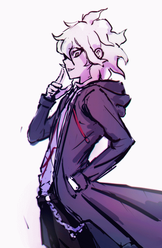
Komaeda Zine Piece Art Walkthrough (Patreon)
Content
I made this piece so fast in comparison to my other art, that the process gif has a lot less frames :( But! Being faster means I'm improving!
So the first frame of the gif above is the thumbnail I set up to give myself an idea of what the final piece would look like. I had made a pose in a very useful app called DesignDoll, then pasted a picture of it into Paint Tool Sai to draw my sketch of Komaeda over.

The pose made in DesignDoll as it appeared in Paint Tool Sai
I dropped the colours straight from the official reference art of Komaeda and quickly added them in, all on one layer; then added a new layer where I splodged down a ton of dark purples and blues and pinks, changed the layer mode to overlay, fiddled with the opacity until it was something I liked... and if you have the .sai/.psd open, you'll see that I actually did this a few times! I tried to make the parts of him that were furthest away from "the camera" more blue and pale (as if they were fading into the white background), whilst also throwing in some random variation.

Official art of Komaeda I used as a reference, and took the colours from
I also added a layer that faded to black towards the bottom in "clipping group" mode, to really solidify the light source and give those colours a nice gradient too.
I scribbled down some cell shading (using the DesignDoll image to help me remember where the light is coming from!) to further help me visualise the final piece.
It was also an option to for me to fiddle with the contrast of the original colour layer (to change all the original colours in respect to each other in order to create that dynamic colouring I love!) but didn't in the end!
So then, I had my thumbnail. I find it very useful to create a little thumbnail, as it really helps me visualise the final piece in my head, and it also lets me know that my idea won't look bad (because the thumbnail looks okay)!! It's also worth noting that I always make my thumbnail with the canvas very zoomed out, as this will show me how the composition looks - I will be worrying about the little details later.
From there, I neatened up the sketch layer. Yeah, I never started a new lineart layer the entire time! I know right?! That's so weird, I'm not sure how it happened either. The entire time I was working on the lineart, I was turning the colours and shading off layers and on again, checking how the piece looked with them on, using them to help me spot mistakes. It's also important to flip your canvas (but not too often, otherwise you'll get too used to it both ways round!) in order to spot and correct mistakes! On top of all this, I was also checking out my thumbnail every so often to make sure I wasn't straying too far from it and warping how my piece looked. That tends to happen when you stare at something for so long, so having a thumbnail you drew very fast can be a life saver, since you knew it looked very good at the time you first saw it.
I shaded using the same cell-shading layer and neatening it out, but also using the lineart itself (which you can see on his hand, the underside of the jacket and a few other places). It's a tricky combination to pull off, and I'm not sure I did it very well to be honest ^^"
I fixed up my colour and shade layers when my lineart was close to being finished. Sometimes it can be tedious cleaning things up, so my lazy ass has developed an art style that lets me be lazy! Scratchy lines are absolutely everywhere, but using cell-shading really lets me use that rough yet smooth look (heavily inspired by Persona series artist Shigenori Soejima) to death. I like leaving the instinctual lines in.
I didn't want the background for a zine piece to be plain white, so I started fiddling around with what I could do. I browsed twitter for inspiration, and eventually settled on a scope target, but then also decided to add some splooshes and jagged lines. It was all pretty instinctual!
After all that, I had to filter the piece using photoscape. I added a very small cellophane effect - giving my lineart a cool subtle futuristic glow. I also inverted the colours, carefully applied a "bloom" effect, then inverted it back, to make the image have a dark glow. I was viewing the same image on two monitors - which really helps when it comes to filtering digital art, as the same colours will appear different on different screens. Try saving it and opening it on your phone to check out how different it looks! I noticed that it looked incredibly blue on one of my screens, so I added a bit of warmth and tried to make the parts closer to the "camera" have a more pink/red glow, adding more diversity to the colour scheme.
Finally, I blurred the background a little, to make it look like the viewer or "camera" was focussing on the character in the foreground, and making the image look more 3D. I also slightly blurred the parts of Komaeda that might not be as in-focus (such as the arm that's far away from the camera).

The thumbnail next to the final piece
Phew! That might seem like a lot of information to take in, but with time and practise, it all starts coming naturally (trust me)!! All this funky layer stuff, how to change up your colours, how to spot what's wrong - it'll all get easier and easier with more and more experience. So never give up on art, because if you want to get better, you will!
Please feel free to ask questions!
Files