Home
Home

 Artists
 Search
 Recent
 Random
 Posts
Posts
 DMs
DMs
 Tags
Tags
 Random
 Importer
 Import
 FAQ
FAQ
 Account
 Register
 Favorites
 Login
Login

UI design sketches (Patreon)
Published:
2023-04-29 14:39:49
Imported:
2024-06
Content
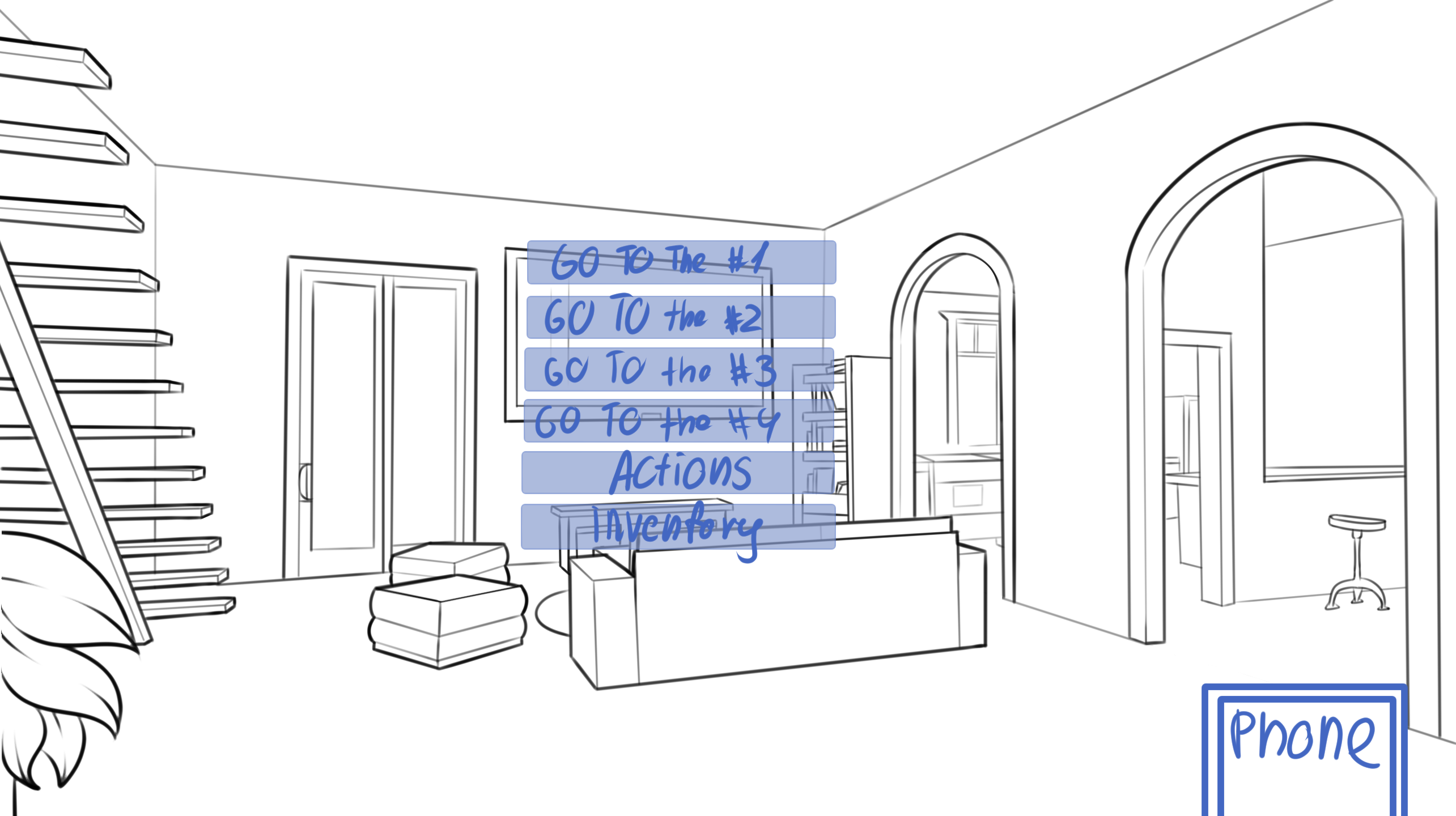
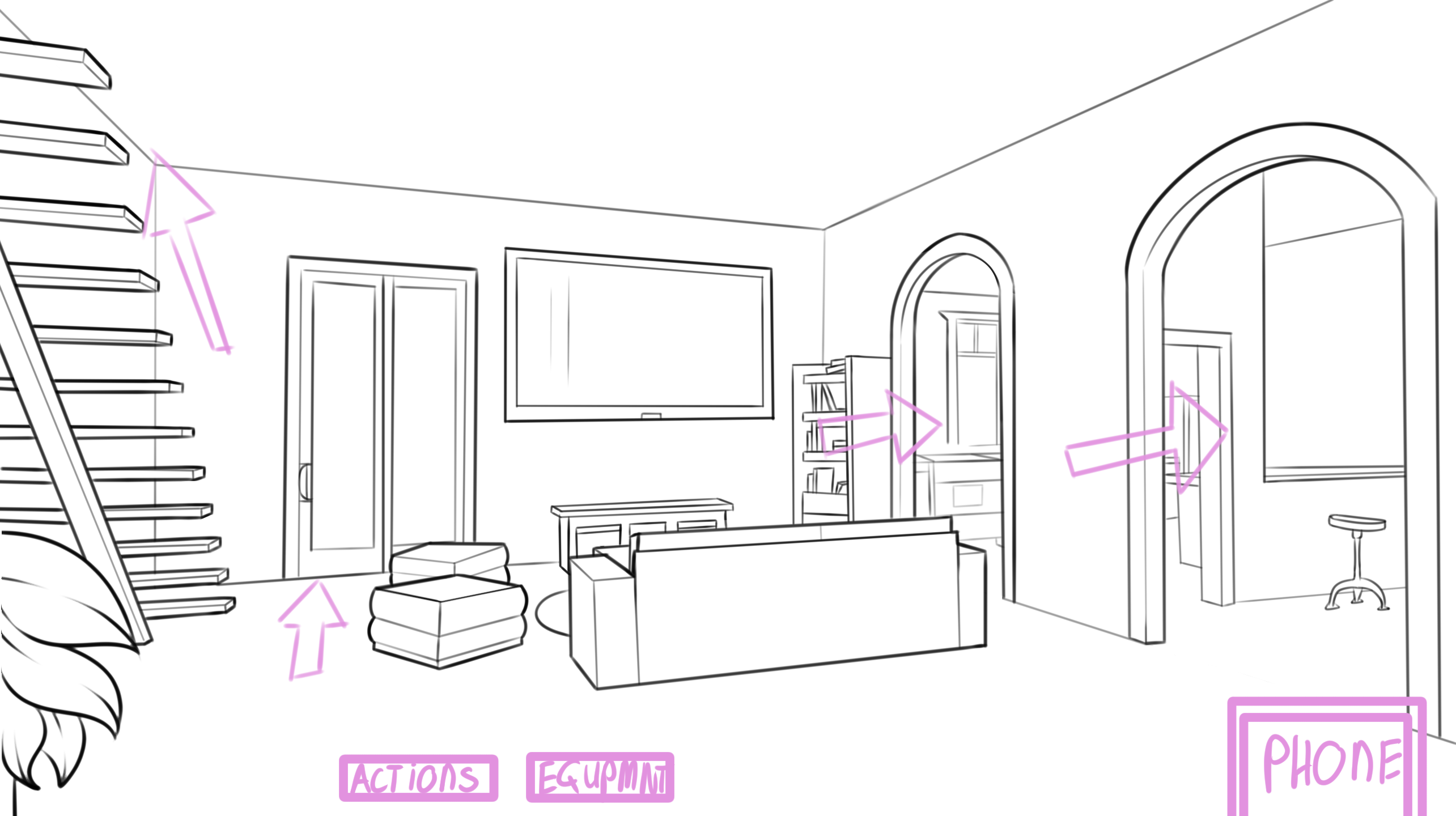
Thinking about the user experience menu in the game. I'm leaning towards the pink version because it's a good balance between immersion and clarity.
Phone icon is there because I'm planning to implement in game random events, connected to the storyline. At least that's the idea lol
Files