Home
Home

 Artists
 Search
 Recent
 Random
 Posts
Posts
 DMs
DMs
 Tags
Tags
 Random
 Importer
 Import
 FAQ
FAQ
 Account
 Register
 Favorites
 Login
Login

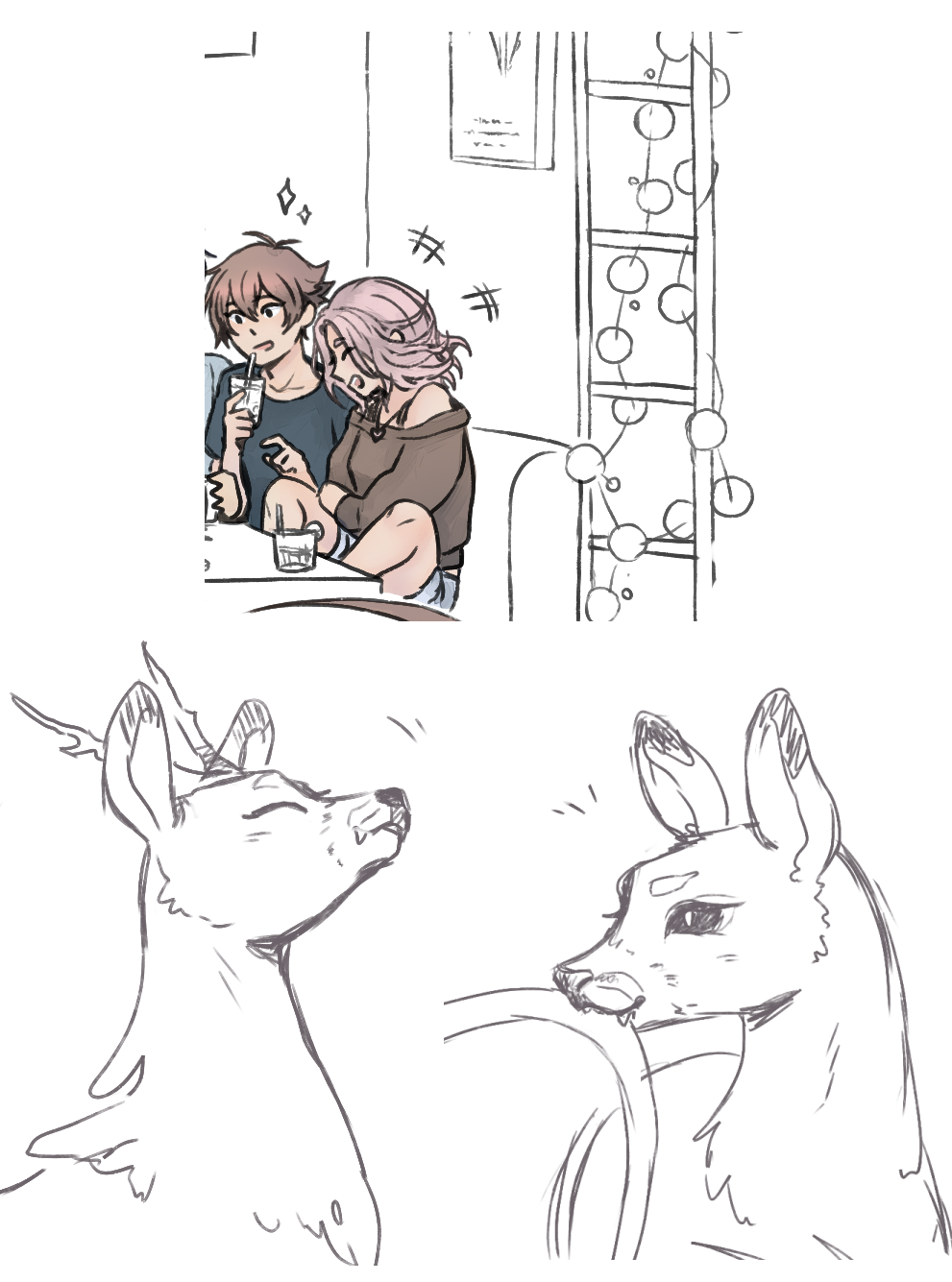
scene 39 wip + spirit warm-up sketches (Patreon)
Content
hey 🌻 as always i don't want to spoil you too much, so this will be the last wip i show you from the comic scene! i plan to update scene 39 on Thursday!!
public update (scene 38) will be either posted on that day, too, or a bit later! i'm not sure yet, i want to try something when posting the update for public, so i have to prepare the files a bit differently than usual.
Ghost Lights is meant to be read horizontal, but most popular platforms are set for vertical reading. which is actually not much of an issue, i think the comic pages can still be read easily - but i notice how the small screens of phones and the way we scroll through pages just invites readers to speed through the pages like it's nothing. most of my updates have around 10 pages with many panels, but it rarely even feels that way 😭 i don't blame my readers here at all, it's just kind of set up like that and i'm not surprised by it one bit. but then the scenes feel shorter than they actually are which is a little sad i think. if i stretched the panels out with a lot of empty spacing between each panel the scenes would be very very long and the reader could spend more time with the update. this is a nice trick and is pretty nice for mobile reading, but even though i know this i won't do it ;; simply because it would take me very long, and also i just love horizontal panels and the things you can do with them 💙 this is just personal preference, that's why i want to keep it like that
but also, i really want the reading experience to be as nice as possible for everyone, so i want to find some sort of middle ground solution for this!
i already tested something in the extra i posted some weeks ago. i call those extra pages "fake verticals" and i think it worked well! but when there are pages with dialogue i need to be careful to not destroy the pacing and instead place the little buffers exactly where they need to be (like, when there's a little timeskip or change of scenery or something). i have to test around a bit with the length and the placement, let's see how it goes..!
anyway!! for patreon and public: i will update very soon 💜
Files