Home
Home

 Artists
 Search
 Recent
 Random
 Posts
Posts
 DMs
DMs
 Tags
Tags
 Random
 Importer
 Import
 FAQ
FAQ
 Account
 Register
 Favorites
 Login
Login

DEV WORK AND STUFF | Gorgon Gryphon (Patreon)
Content


Sorry this is the boring prerequisite part of doing commissions. It's important that myself, as well as anyone who reads this understands the direction that I am planning to go in and how I approach eat piece of art.

Thank you Greg for leading us in.
COMMISSION DETAILS
This is one of my favourite types of commissions, character and creature design. The commission wants to have a hybrid creation of a Greek, snake haired Gorgon and a standard half eagle half lion, Gryphon.
The character must be imposing and aggressive.
NOTES FROM COMMISSIONER
'Needs to resemble the flag's colours, needs to resemble a gorgon, needs to be a girl? Yeah I was about to say something in the scary/aggressive area.'
ART DETAILS
- Character design
- Character reference sheet (3/4 headshot (gryph + snakes), full body profile (with and without snakes), wing view (top + bottom), eye detail, colour pallet (include paw pads)
- Flat colours (No shading on references)
- Coloured line art
- Composition/formatting

MAKING A MOOD BOARD
A moodboard is a compilation of inspirational elements; including images, colour swatches, textures and any other details to help flesh out ideas at the beginning of any design project. This is extremely useful for establishing and grounding details for the final design.
Examples:

Source: Art Direction http://donhogan.com/art-direction/
Extra information about mood boards that may be of use.
Source: Planning For Success – 5 Reasons Why You Should Create A Mood Board https://belmarketingdesignstudio.com/planning-for-success-5-reasons-why-you-should-create-a-mood-board/
MY MOOD BOARD
Though other mood boards can be pretty detailed, I don't think mine had to be. I feel pretty confident in myself and having the bare minimum of what I visually need for this specific piece is fine.


Source: MEDUSA - The Prequel https://youtu.be/P6z3KaHZh2o
SKETCHES
The commissioner is pretty open to what I suggest. I drew this quick squiggle to get a feeling if I am heading in the right direction with the design. They liked it.

A rough sketch aint it? Sketches don't ever have to be super clean and neat while you are just starting. Having something down on the canvas does so much more for you than mulling over a blank canvas trying to draw 'perfection' straight away. Digital art is so wonderfully malleable that you can turn any shitty scribble into something.
I blocked out a side view of a generic gryphon, giving me a base to pull gorgon details on.

Originally I drew the snakes super thin and noodley but it looked like angry dreadlocks rather than a lion mane made of snakes. One of the description I was given by the commissioner was to make her aggressive. Making the snakes thicker and beefer looking felt like a more fitting approach thematically.

As a design the re-draw ability of this character matters as well. Making the snakes thicker means that they cover more of the neck/mane area with less snakes to draw, keeping down the complexity. Trying to make a composition with 12 snakes versus 7-9 snakes.

This design is a good start but very much needs refining. Ears and how many snakes?

At this point I started to speak with the commissioner. I wanted to confirm details before I moved on. So seven heads for the snakes and no ears.
MORE CLEAN UP SKETCHES
I was disliking the way the body was proportioned for the lion end, so I referenced the butt.

This girl is more of a predator then cute so it is important to keep her lean and more animal like rather then my cuter gryphon variants.
Her face still looks derpy.

Body is sketched out, so now to add the snakes. Thick snakey bois. Make them chonky.

Now for the wings. I'm pretty confident with quick basic wings but I wanted to up my wing game.
I grabbed some references and blocked out my wing. I didn't need to draw much more than that because I am already going to simplifying it, just with more 'correct' areas.

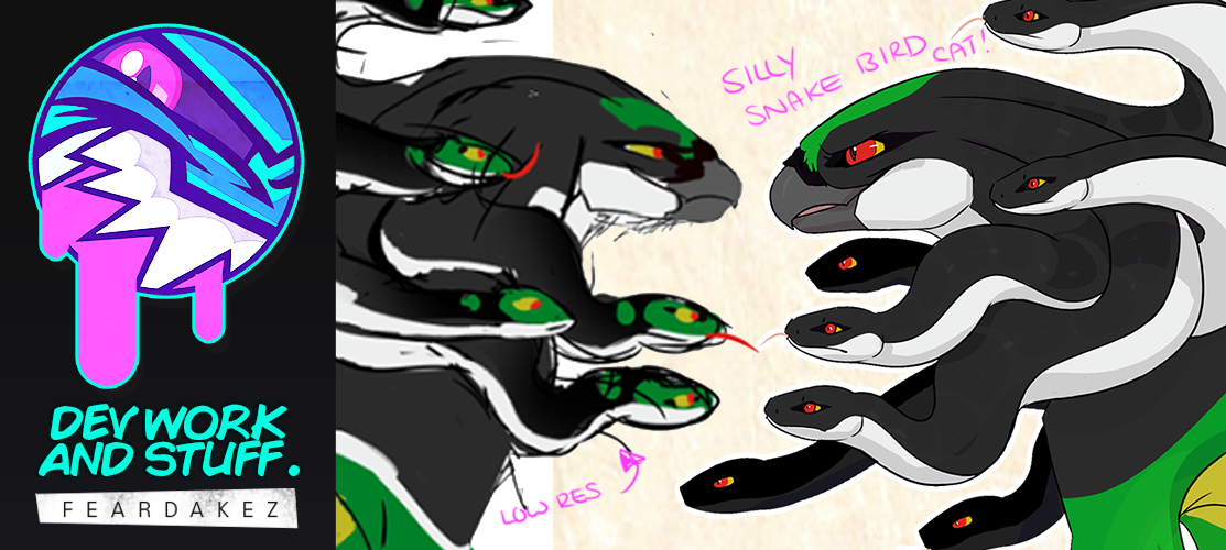
HEADSHOTS
Time for the close ups of the Gryphon and a snake head. As the snakes are all identical I only need to show one off.

The Gryphon head looked off model and I really wanted to show that 'mean' element that the commissioner was looking for. The snake just needed some clean up work before I start to line art.
The Gryphon looks so much better now.

I am comfortable with the body proportions and details, time to line!

Busting out my 5pxl brush.
BODY PROFILE - NO SNAKES

BODY PROFILE - SNAKES

GRYPHON AND SNAKE PEEPERS

3/4 HEAD VIEWS

I am loving the line art.

This is how I start every single line art piece. Check out the process here in this simple tutorial! CLICK THIS LINK

COLOURS
When it came to colouring I saw some areas that I felt could be a little more. I felt like I took too many of the elements from the flag reference too literally, including colour picking directly from the flag.

The original colours look muddy and over all the use of white was making this creature too busy. The white stripe, as an animal marking didn't make sense along the body. I kept the white for 'underside' area like the necks, hind paws and back feet floof and tail. Smacking that white stripe up the body not only look like a car decal it just look clustered.
I removed the green from the snake heads, keeping them visually different from the main head. I liked that even as snakes they are still her mane.

I softened the wing colours too, it was too much green and I liked the darker silhouette this would provide rather than a colourful parrot. The green also just an awkward accent colour, so I splashed some yellow on them secondary and primary coverts (I'm not smart - I Googled it).

The snake details were missing some patterns. Something subtle.
I added large rectangular shapes and lowered the layer opacity to 20%.

CHANGES
Now these are not uncommon with any commission. The commissioner liked the shape of an older version of the tail, which from memory was just kinda happened.

So I had to go back and make some edits - I think it was a good change.

3/4 view is all coloured and looking nice. I splashed some colour in the square - I am still not 100% sold with the colours. I may change these when I lay them out on the reference guide.


I like to make a image by putting detached elements together, like the wings. This works more for winged characters as I like to show the characters without their wings attached in the first place.

After finalising all the elements, I exported them as individual .pngs.

I mocked up a rough sketch to show the layout and composition of everything. Plan everything, thumbnails are your friend.

I imported all the assets onto a smaller document. I added a Greek meander or meandros, the square, repeating pattern which is commonly used in Greek iconography.
The reason I am going with a Greek motif is because of the character's origins. The Gryphon is based off Medusa the Greek Gorgon famously known for having snakes as hair.

Photoshop is not very user friendly when it comes to graphic design elements, so I use guides a lot. I moved elements around and added text blocks to fill in space.


I think I lost my train of thought towards the end of this post.
This was a big one. Staying on theme with my current posts, is that this took me far too long to finish. I am really happy with the execution, the line art is really nice and I like the detail of the cat body and wings.
Files