Home
Home

 Artists
 Search
 Recent
 Random
 Posts
Posts
 DMs
DMs
 Tags
Tags
 Random
 Importer
 Import
 FAQ
FAQ
 Account
 Register
 Favorites
 Login
Login

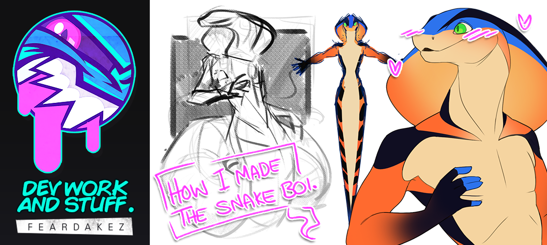
DEV WORK AND STUFF | Naga OC Design (Patreon)
Content


COMMISSION DETAILS
Oh boy this is a big one. Finalising a male Naga design with a final glory image (Like a beauty picture to show him off).

NOTES FROM COMMISSIONER
'Five digits on hand. he body section when "standing" is going to be about 6 foot 4 inches and tail length of 45 feet giving him a total length of 51 feet, 4 inches. His tail will have a bit of squish to it.'
ART DETAILS
- Single Character
- Flat Colour
- Simple BG (1-2 Tones)
- Character Design (Includes sketches)
REFERENCES


Before I can start the final art piece I need to have a solid finalise character design.
Using the real life snake as colour and pattern reference, I made a simple orthographic view to get some direction with the client.
WHAT IS AN ORTHOGRAPHIC VIEW?
The definition of an orthographic projection is a two-dimensional drawing of a three-dimensional object, using two or more additional drawings to show additional views of the object.
Source: https://www.yourdictionary.com/orthographic-projection
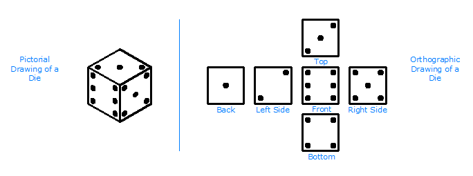
Image Source: https://sites.google.com/site/multiviewdrawings/home

There was quite a lot of back and forth with the client and admittedly there was some awkward miscommunication.
I believe that we are under a much better understanding and this is the cleaner version of the Naga base.

Coloured version.

This is the version that I sent to the commissioner. The feedback I received was a only a few small changes;
'That’s pretty great! My only requests are to remove the blue “glow” from the top of his head and butt, and to complete the orange you did on the back of the hood. Mmm, make his tail more solid blue and I believe we’re good!'
This is the final version.

This boi be designed! This ortho is not in proportion, the snake boi be having a long tail butt.

Time to block out the beauty pose for this guy. I haven't really drawn too many snake / people creature thingys so I will very much have to study up and REFERENCE.
COLLECTING MORE REFERENCES
From what I have gathered from the commissioner's request, there are elements in the below images that would help guide me to what they are looking for in the final art piece.

I like the posing of the first 2 characters and the head shapes of the second 2 characters.
TIME TO ACTUALLY ART!

First version of the sketch. It

Having something to work with is so much more easier for you as an artist than staring at a blank canvas. Even though the sketch above will be changed a whole bunch by the time I get to the line art stage I have something to pull apart and build back up.

Definitely more personality in this version. Like a 'HARK! who goes there?' pose.

I sent a preview looking for feedback and confirmation. The commissioner was overall happy with the direction but requested one thing...

...MAKE THE TAIL BIGGER.
The commissioner was happy and now it's time to clean this rough snek boi up. The head needs some fixing up.

Referenced a cute snek girl to help me shape the Naga a little better.


This snek boi is coming along. I tend to sketch in different colours to help break up what is new versus what I wanted to fix.

Let's line this boi.

I started lining. One huge change from my original way I drew my line art is the line weight. My line work was once much thicker.

The liner line feels more mature, well for me personally.

HANDS
Oh my, those arms and hands. The original arms are far too muscley and derpy looking.

I am always looking for areas that could be improved in the image, even if it means that I need to redraw elements or even redraw the entire picture. This is not most efficient way to do your art but for me I want to make each art it's absolute best (within reason as well) as I can and LEARN as much as I can.

And doneth!


Starting of my flat colours the using way. CHECK OUT HERE!

Added some more details in the line art.

Almost complete.

I have kept the colours on their separate layers. Though I have had approval from the commissioner I would like to keep them apart just incase I need to make any last minute edits.
I SENT A COPY FOR APPROVAL
I am so glad that did because there are changes.

It wasn't much of a change but it does not hurt to be prepared.


I did touch up the line art a little with some colour but I kept it super subtle.


Now that this boi is all done, it is done to the final presentation for the commissioner.

They were already given an image of their character with no background. However I don't like to leave it there.
"Though this boy looks fine, this picture is lacking presentation due to all this space."

I added a simple grey square to balance out the composition and fill the empty space around the character, nice and easy and I think it works well.

An extra image I put together was adding colour swatches in a hexagonal pattern, almost scale like. This image was also meant to double as a simple reference sheet so adding the colours will help any future artist while colour picking.


Oh boy this was a big one. I feel like I let myself down a little. I was avoiding this commission and it hurt me as an artist. This commission took too long and progressively stressed me more and more. I need to be more professional.
Files