Home
Home

 Artists
 Search
 Recent
 Random
 Posts
Posts
 DMs
DMs
 Tags
Tags
 Random
 Importer
 Import
 FAQ
FAQ
 Account
 Register
 Favorites
 Login
Login

Designing the Limerence Covers (Guest Post and .gif by Matt!) (Patreon)
Published:
2016-08-03 22:52:04
Imported:
2023-04
Content
Hi everybody!
I was told my last 'design a cover' animated gif wasn't long enough for some of you so today I wanted to show off a longer albeit a bit smaller version that showcases the other two covers. [EDIT 8/4/16: If the animated .gif isn't playing in this post, just click here to see it on its own!]
At the same time I thought some of you might enjoy a write up of how these three Oh Joy Sex Toy covers that Limerence will be distributing to book stores came about and some of the thinking that went into it all.
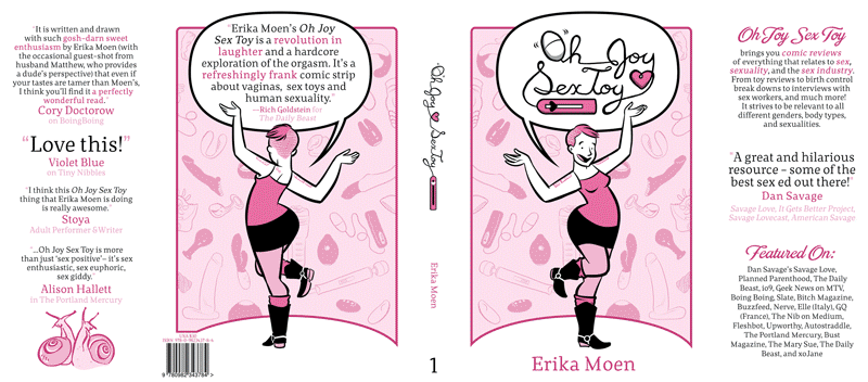
Before I jump into it, here are the final covers (before I sent them to Limerence) for you to check out:

http://www.internationalhobo.com/forPatreon/Design/001.png
And a handy Twitter image of the Diamond codes you can give to your local book store in case you want to see them appear in your neighborhood shop:

http://www.internationalhobo.com/forPatreon/Design/002.png
-----
Due to a lengthy contract negotiation, we only had a month of time to get these covers made for Limerence. After a short marketing meeting we walked away with a few key pieces of feedback from which to build:
- The book store covers must be different to the Kickstarter covers
- But have the same OJST branding and style
- No sex or sex toys or nudity to show up
- Each book cover (remember we're making three here!) should be different but similar
- Put a pull quote on the front
- Erika and Matt shouldn't be the focus, diversity should be.
In addition to those notes, we had to start with Volume Three's cover since its deadline was much earlier than the others. So this would be the core design I would grow the other two from, it would be the starting point.
To talk about the design process I've got to talk a bit about the behind-the-action background stuff. My emphasis as a designer on these covers was purely centered around time and project management, I wanted to create as little work for Erika as possible. You see, our website takes up our WHOLE week. Erika works morning to evening nonstop to produce 4-5 pages each week. It’s crazy but that's how we pay the bills, so it’s got to be done. Guest comics aren't much of a reprieve from the work either, though it helps give Erika a week to relax or catch up. The workload moves onto my plate, each guest comic is on average 45 emails of back and forth feedback. Our guest comics aren't free, they cost us money and time, and they are painstakingly forged.
So the plan was to build a cover that wouldn't involve Erika as much as possible. I wanted to give her the least amount of additional work. Not to say that I was successful in this at all (the eventual designs involved ALOT of Erika work), but it was our starting approach.
With all that in mind we cracked to work, blindly trying out ideas.
At first we really wanted to do a simple 'in the bed with Erika and Matt' but it was veto'ed by Limerence. We quickly landed on 'floating jumping fun people' all excited and the sort that are represented in Oh Joy. It was the opposite of 'less work for Erika' but we couldn't think up anything better that would be appealing and work for all the feedback we had to incorporate.
Using this as a leaping off point I had Erika create a pile of rough art assets. I knew I wanted jumping people, and a couple of Erika and Matts. These where to be super simple sketches, things I could fuck around with and break. Erika wouldn't have to produce finished art assets till we were sure which ones we needed, and I would be able to re-use the rough art assets for each cover.
Volume 3 started off with a green background, the same green from the Volume 3 Kickstarter cover and our website. Simply because we were a bit tired of the pink and the complimentary contrast was pleasing to look at, and it would have a fleeting resemblance to the Kickstater cover.
With something like 20 little rough characters and a rough colour pallet, I cracked on. I spent A LOT of time just pixel-pushing: Moving things around, breaking things, changing their shapes, rotations and sizes, adding this and that, removing this and that. I wanted to get a feel for all the floating figures. Should they touch? Should they have space around them? How big should Matt and Erika be? Are they distracting? Can you notice the quote? What if I mute them, what if I add a gradient?
I really love the phrase “pixel-pushing”, because it so accurately describes the way I design. “Move this guy a bit to the left... oh, it probably looked better back where it was. Let’s zoom out... Let’s move it up by a hair.”
It’s easy to fall down a rabbit hole when you work like this, but if you don't linger and stay active on the document, while also being un-precious, you can quickly build something that feels good to your eyes. Taking lots of screen caps as you go helps too. You can take a break and revisit your screenshots and see quickly what looked good.
'What looks good' is very contextual on the designer. I think for me I like things that are soft on the eyes, have good visual flow and interesting points, so that's where my designs went.
The first week of building this cover felt like a constantly failing game. You’re never doing anything 'right', but through trial and error you’re finding what DOES look and feels better, and you’re slowly teaching yourself what your brain wants the cover to look like.
You might notice that half way through the gif I give up on the front and start laying out the back. Anything to keep myself building, even when the design got the most frustrating!
While this is all happening my InDesign document looks like an explosion, the margins are just filled with random art assets.
By the time we got to around here:

http://www.internationalhobo.com/forPatreon/Design/003.png
I felt like I had landed on something that looked 'good'. I liked how Erika and Matt leaped off the book. I liked that at a glance the Dan Savage quote was where your eye went, but it didn't distract. But the design still felt muddy, messy and noisy. So I cracked on with the back pages and just pixel pushed as I went. I was happy enough with it to get Erika to start cleaning up assets. I gave her a real rough screen capture of the page and had her draw on top of it the final high DPI assets (print resolution final line art) that I could then go in, colour, and put into the InDesign document in place of their rough counterparts.
Working with me at this point probably sucked, as she would get all sorts of comments and feedback like 'this guy needs to open his eyes' or 'make Erika’s leg look natural'

http://www.internationalhobo.com/forPatreon/Design/004.png

http://www.internationalhobo.com/forPatreon/Design/005.png

http://www.internationalhobo.com/forPatreon/Design/006.png

http://www.internationalhobo.com/forPatreon/Design/007.png
Brutal.
But eventually it went from ‘eh’ to looking good:

http://www.internationalhobo.com/forPatreon/Design/008.png
A few of the finishing changes, like the orange notes and speech bubbles for the quotes, came later as I worked on V2 and V1. I try not to revisit old work, but in this case the book design and style got better with each cover, it was frustrating to have a V3 that looked worst than the V2! So Limerence made some concessions and let me do a few final changes after the V3 deadline passed.
Moving onto the other two books, I quickly roughed out the covers, using some of my old V3 layouts I had screencaptured but not utilized. Lining them up I then started to tweak with colours.

http://www.internationalhobo.com/forPatreon/Design/009.png
I wanted the covers to be really strikingly different from each other, but also not. I also secretly loved the idea that a full collection of Oh Joys could look like a rainbow.
With some recommendations from Allyson Haller I settled on pink, orange, and green. Chances are the 4th book will be blue!
Then it was just a matter of moving characters around, having Erika do final art assets, and tweaking them all bit by bit.
Again, Erika would regularly get tedious feedback like:

http://www.internationalhobo.com/forPatreon/Design/010.png
Eventually the designs, through the pixel pushing iterative process, got themselves essentially done.
The last of the design was a painful post-designing tedium. I work on two screens, and the colours side by side were very different form each other, I just didn't know HOW they would print, I still DON'T:

http://www.internationalhobo.com/forPatreon/Design/011.pngI spent SO much time tweaking values by the smallest amounts before caving and just sending Limerence the final files. Their book guy would apparently go over and make a few changes if he saw fit, and I would get a chance in the future to look at the proofs.----------All right, guys, that's how we made these covers! It was a brutal month, but I think these look really good. We hope you like them too!
I was told my last 'design a cover' animated gif wasn't long enough for some of you so today I wanted to show off a longer albeit a bit smaller version that showcases the other two covers. [EDIT 8/4/16: If the animated .gif isn't playing in this post, just click here to see it on its own!]
At the same time I thought some of you might enjoy a write up of how these three Oh Joy Sex Toy covers that Limerence will be distributing to book stores came about and some of the thinking that went into it all.
Before I jump into it, here are the final covers (before I sent them to Limerence) for you to check out:
http://www.internationalhobo.com/forPatreon/Design/001.png
And a handy Twitter image of the Diamond codes you can give to your local book store in case you want to see them appear in your neighborhood shop:
http://www.internationalhobo.com/forPatreon/Design/002.png
-----
Due to a lengthy contract negotiation, we only had a month of time to get these covers made for Limerence. After a short marketing meeting we walked away with a few key pieces of feedback from which to build:
- The book store covers must be different to the Kickstarter covers
- But have the same OJST branding and style
- No sex or sex toys or nudity to show up
- Each book cover (remember we're making three here!) should be different but similar
- Put a pull quote on the front
- Erika and Matt shouldn't be the focus, diversity should be.
In addition to those notes, we had to start with Volume Three's cover since its deadline was much earlier than the others. So this would be the core design I would grow the other two from, it would be the starting point.
To talk about the design process I've got to talk a bit about the behind-the-action background stuff. My emphasis as a designer on these covers was purely centered around time and project management, I wanted to create as little work for Erika as possible. You see, our website takes up our WHOLE week. Erika works morning to evening nonstop to produce 4-5 pages each week. It’s crazy but that's how we pay the bills, so it’s got to be done. Guest comics aren't much of a reprieve from the work either, though it helps give Erika a week to relax or catch up. The workload moves onto my plate, each guest comic is on average 45 emails of back and forth feedback. Our guest comics aren't free, they cost us money and time, and they are painstakingly forged.
So the plan was to build a cover that wouldn't involve Erika as much as possible. I wanted to give her the least amount of additional work. Not to say that I was successful in this at all (the eventual designs involved ALOT of Erika work), but it was our starting approach.
With all that in mind we cracked to work, blindly trying out ideas.
At first we really wanted to do a simple 'in the bed with Erika and Matt' but it was veto'ed by Limerence. We quickly landed on 'floating jumping fun people' all excited and the sort that are represented in Oh Joy. It was the opposite of 'less work for Erika' but we couldn't think up anything better that would be appealing and work for all the feedback we had to incorporate.
Using this as a leaping off point I had Erika create a pile of rough art assets. I knew I wanted jumping people, and a couple of Erika and Matts. These where to be super simple sketches, things I could fuck around with and break. Erika wouldn't have to produce finished art assets till we were sure which ones we needed, and I would be able to re-use the rough art assets for each cover.
Volume 3 started off with a green background, the same green from the Volume 3 Kickstarter cover and our website. Simply because we were a bit tired of the pink and the complimentary contrast was pleasing to look at, and it would have a fleeting resemblance to the Kickstater cover.
With something like 20 little rough characters and a rough colour pallet, I cracked on. I spent A LOT of time just pixel-pushing: Moving things around, breaking things, changing their shapes, rotations and sizes, adding this and that, removing this and that. I wanted to get a feel for all the floating figures. Should they touch? Should they have space around them? How big should Matt and Erika be? Are they distracting? Can you notice the quote? What if I mute them, what if I add a gradient?
I really love the phrase “pixel-pushing”, because it so accurately describes the way I design. “Move this guy a bit to the left... oh, it probably looked better back where it was. Let’s zoom out... Let’s move it up by a hair.”
It’s easy to fall down a rabbit hole when you work like this, but if you don't linger and stay active on the document, while also being un-precious, you can quickly build something that feels good to your eyes. Taking lots of screen caps as you go helps too. You can take a break and revisit your screenshots and see quickly what looked good.
'What looks good' is very contextual on the designer. I think for me I like things that are soft on the eyes, have good visual flow and interesting points, so that's where my designs went.
The first week of building this cover felt like a constantly failing game. You’re never doing anything 'right', but through trial and error you’re finding what DOES look and feels better, and you’re slowly teaching yourself what your brain wants the cover to look like.
You might notice that half way through the gif I give up on the front and start laying out the back. Anything to keep myself building, even when the design got the most frustrating!
While this is all happening my InDesign document looks like an explosion, the margins are just filled with random art assets.
By the time we got to around here:
http://www.internationalhobo.com/forPatreon/Design/003.png
I felt like I had landed on something that looked 'good'. I liked how Erika and Matt leaped off the book. I liked that at a glance the Dan Savage quote was where your eye went, but it didn't distract. But the design still felt muddy, messy and noisy. So I cracked on with the back pages and just pixel pushed as I went. I was happy enough with it to get Erika to start cleaning up assets. I gave her a real rough screen capture of the page and had her draw on top of it the final high DPI assets (print resolution final line art) that I could then go in, colour, and put into the InDesign document in place of their rough counterparts.
Working with me at this point probably sucked, as she would get all sorts of comments and feedback like 'this guy needs to open his eyes' or 'make Erika’s leg look natural'
http://www.internationalhobo.com/forPatreon/Design/004.png
http://www.internationalhobo.com/forPatreon/Design/005.png
http://www.internationalhobo.com/forPatreon/Design/006.png
http://www.internationalhobo.com/forPatreon/Design/007.png
Brutal.
But eventually it went from ‘eh’ to looking good:
http://www.internationalhobo.com/forPatreon/Design/008.png
A few of the finishing changes, like the orange notes and speech bubbles for the quotes, came later as I worked on V2 and V1. I try not to revisit old work, but in this case the book design and style got better with each cover, it was frustrating to have a V3 that looked worst than the V2! So Limerence made some concessions and let me do a few final changes after the V3 deadline passed.
Moving onto the other two books, I quickly roughed out the covers, using some of my old V3 layouts I had screencaptured but not utilized. Lining them up I then started to tweak with colours.
http://www.internationalhobo.com/forPatreon/Design/009.png
I wanted the covers to be really strikingly different from each other, but also not. I also secretly loved the idea that a full collection of Oh Joys could look like a rainbow.
With some recommendations from Allyson Haller I settled on pink, orange, and green. Chances are the 4th book will be blue!
Then it was just a matter of moving characters around, having Erika do final art assets, and tweaking them all bit by bit.
Again, Erika would regularly get tedious feedback like:
http://www.internationalhobo.com/forPatreon/Design/010.png
Eventually the designs, through the pixel pushing iterative process, got themselves essentially done.
The last of the design was a painful post-designing tedium. I work on two screens, and the colours side by side were very different form each other, I just didn't know HOW they would print, I still DON'T:
http://www.internationalhobo.com/forPatreon/Design/011.pngI spent SO much time tweaking values by the smallest amounts before caving and just sending Limerence the final files. Their book guy would apparently go over and make a few changes if he saw fit, and I would get a chance in the future to look at the proofs.----------All right, guys, that's how we made these covers! It was a brutal month, but I think these look really good. We hope you like them too!
Files