Home Artists Posts Import Register

Content

Hey everyone. So I'm working on the Minish Cap episode at the moment. And I decided to give the graphs a bit of a polish.
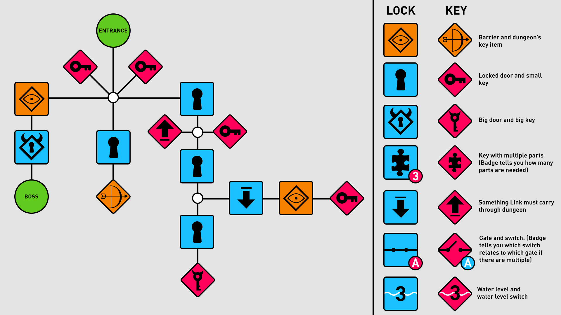
Update - I just read Daniel's comment, and that's given me a lot to think about. I think he's right, and I can clean up the diagram and make it easier to read. I'm going to give that some thought. Leave your own comments in that thread if you have them. For now...

If anyone has trouble reading them, it's (hopefully) simple: you're trying to get from the entrance to the boss. Trace your finger along the lines until you hit a block - in this case, it's an orange barrier.

So you need the key item. Which is behind a door. So you need a key. So you get one of those. Now you can use the item to open the barrier and now you need the big key. Which is... well, you get the idea.

I want to give a shout out to Patron Julian who wrote a big thing about how he would do graphs. That was very interesting. He's coming at it from a different direction from me but one thing I totally stole was using a generic icon for the key item and the barrier it opens.

Thanks dude! I'll give you a shoutout in the episode.

I also realised that most of the other puzzles in Zelda can be categorised into a few different types. You've got multi-part keys, puzzles where you transport something through the dungeon, switches, and water level puzzles.

The other important thing was adding nodes (the white dots). I'm coming to realise that the number of different paths you can take at any point is really important, and this clearly shows that. You can see that at the start of this dungeon you have five different routes you can take.

As I'll explain in the video, this isn't necessarily about giving the player a choice over the sequence of events. You can have a branching dungeon where only one path is actually viable at a time... More on that in the video.

Anyway, hope that's interesting. Other things:

  • I'm coming up on 1000 Patrons which is BONKERS. If you have any requests for what I can do to celebrate lemme know. Streaming type stuff isn't possible yet due to internet / intense anxiety.
  • I really want to make the most of having 1000 people who are interested in game design in the same place. I totally failed to do the "book club" idea from earlier in the year but 2017 yo. It's happening.
  • You can look forward to a podcast with me, and an episode of Did You Know Gaming's "Region Locked" series with me sometime soon. I've been busy!
  • Uh. What's up with you?


Files

Comments

Anonymous

Just want to say, keep up the fantastic work. As a dev myself I'm amazed at the level of insight and thoughtfulness you bring to the table. Let it never be said that video game development at large doesn't benefit from the passion and dedication of people like you, who feed back into the same loop that keeps me getting out of bed every day. Thank you!

Anonymous

I just want to thank you for your work, Mark. I started following you months ago but i became patron just two days ago. All your videos inspire me to keep thinking on my own projects and to be a better designer, even when i'm just starting the gamedev thing on my offwork time :/

Daniel Haas

I think you should clean up the iconography such that symbols match, makes for easier reading-at-a-glance. That is - a square represents an impediment, a diamond represents something which removes an impediment. I should be able to easily and quickly match squares to diamonds by the shape within it - the Bow diamond is needed to remove the Bow squares. TLDR - change "eyeball" to "bow" symbol and "keyhole" to "key" symbols. That way, your reader doesn't need to know Zelda terminology to read it, and your legend can be simpler (just explain Square and Diamond and the rest is clear). If you do this, I recommend using colors to indicate "type" based on your and being consistent - eg "needs main item", "needs key", "needs other puzzle elemenet". I should be able to at-a-glance know that "I can't get past reds without reds". The less you need to explain about a data visualization to prime the reader, the better the visualization is

OSW Review

Thanks for posting Mark! Proud to be one of your almost 1,000 Patrons! Lovely new graphics. I looked it without the legend first and the only thing that confused me was the 'carry through dungeon' icon. Is the "blue" icon where you pick it up and "red" where you put it down? My only other note is that red naturally denotes "impediment" and light blue would suggest "progress"/answer. (so I'd switch the red/blue colour scheme personally). Gold for the big item/door is perfect. I love how the boss key/boss door looks. Excellent work. I wanna shoutout your graphics for the water level in Ocarina of Time, they were so cool to see! All the best, Jay

Anonymous

Maybe now is the moment to create a community place for create topics and discuss with you and the others Patreon supporters. Like a forum, for example.

Anonymous

I really like where this is going. The graph system is very thought-provoking for me as a designer as a kind of UML for dungeons. (DML? Yes please.) In terms of readability, I do like the keyhole-key arrangement because it makes sense, but I do agree with Daniel about the square-diamond thing being easier to associate at a quick glance. The most opaque things for me are some of the other bits like the gates, the key item switches, and the carried items. For the carried items, you could just add a plain box or something at the end of the arrow to indicate you should pick up a thing at one point and put it down at another. Having just arrows there could signify transitions via stairs or ladders or elevators. Honestly, the "find thing and take to place" kind of barrier that the carried object represents could just as easily be noted with the puzzle piece. The gate symbols made sense after I looked at them for a moment, but I don't think the electrical switch is very clear. Something like a closed portcullis and a control lever may have clearer symbolism for a gate and switch, but I can understand how using one specific symbol to mean "a switch that must be flipped" makes it hard to include pressure plates, wall switches, or something like finding the right terminal to unlock a door in one of Fallout's vaults. And the bow and eyeball... well. I think regardless of what you use to represent the item and the lock, it would be much easier to read if the item were on both rather than a bow in one and an eyeball in the other. I've started working on a series based around general dungeon design (because Boss Keys is rad af and I love dungeons) and I'll almost certainly be using something like your diagram system at some point for examples.

GameMakersToolkit

I'd definitely like to do this. Start some topics for new games, general topics, and this gaming book club. I dunno if Patreon is the place to do it, though? I don't want to bombard people with emails if they're not interested in this sort of stuff

Anonymous

It's the other way around. Red is an item you pick up or something that you need to do. The blue icons are where you use the item.

Anonymous

The nodes are a great idea IMO, they help visually structure the black lines and give a sense of architecture. As for making it more clear, I think this is legible enough. If I were gonna do the design, I would definitely take Ian's idea with the axes, graphs are all about axes. Instead of using orange for the dungeon item, I think you could just use blue and red for all locks or keys. If you want to stress the importance of collecting the dungeon item, you could make the shape of that step a circle so it resembles the entrance and exit. I'm a little torn on whether or not to consolidate the icons, but for me personally it's definitely more clear to see what's what when all the icons are unique. Consider keeping the bow and eye switch icons, but drawing the icons in the same color, but keeping the background colors red and blue. It's difficult to say really. Really I think it's not worth stressing about at all. The way your graphs work is very easy to understand and I don't think the structure relies on immediate recognition. You don't need to worry about the tiny little design details for the icons. Definitely use less saturated colors though, even if I do really like the way this looks like a safety diagram.

Anonymous

I'm thinking you did this because the other ones didn't accomodate the many kinds of puzzles of the dungeon. That being said, I think this is a farly more complicated graphic than the others. Idk, the other one was a little more beautiful for me... I know I haven't made a point as good as the other commenters, but it's very summed of what I feel

Anonymous

On a side note: at the time I'm writing this, you're one patreon away from 1k supporters. How do you feel about that? :)