Home
Home

 Artists
 Search
 Recent
 Random
 Posts
Posts
 DMs
DMs
 Tags
Tags
 Random
 Importer
 Import
 FAQ
FAQ
 Account
 Register
 Favorites
 Login
Login

Behind the scenes - The Power of Video Game HUDs (Patreon)
Content
Hello everyone!
I had a wonderful response to the animation and visual style of my most recent video - on user interfaces and HUDs. So I thought I'd talk about how this episode was made and give you some tips on making similar stuff in your own project!
The idea

So, I've been working on a small game prototype in Unity - a platformer where you have a magnet that can draw you towards objects and whatnot. And I was struggling with a problem: how can I effectively explain to the player when and where the magnet can be used? That's when I realised: I need to learn about UI.
Now this is really exciting! Simply because, historically, GMTK videos have arisen from me playing games and then coming up with a video topic (how do they make these Hitman levels? Why does Crash 4 let you pick if you want lives or not? Why does Celeste feel so damn good?). But now I'm starting to make games, I'm asking different questions - leading to video topics that I might not have explored if I wasn't trying my hand at game dev.
Anyway. I started with the very broad topic of "UI", and researched everything I could about the subject. I learned about gestalt theory and visual hierarchy and the Destiny cursor and translation challenges. Hey! Pop quiz! Why do UI designers hate the word WWWWWWWWWWWWWWW? Answer at the end.
Eventually I needed to focus the video down a bit and decided to exclusively look at how the HUD can change the game. The way it feels (cognitive load), the way it looks (diegetic), the way it makes players behave, and the way it changes how games are designed (Into the Breach). Bing bang bosh, write the script.
The visual style
So, as you should know by now, I often like to create a visual style for each video - and it should reflect the content of that video. So radars and green computer screens for stealth games, paper cutouts and jazzy music for prototyping and riffing on ideas, etc.
For this video, the visual style is based around the line, "I want to explore the intersection of UI and game design".
That's something I do a lot on my channel: GMTK is typically about game design, but I can look at other aspects of development - like sound design, music, animation, UI, writing, AI, getting a job in the industry, etc - by looking at where that topic intersects with game design. So that might be adaptive soundtracks, how a story is impacted by interactivity, or the way UI changes how you play.

To show this visually, I made a Venn diagram. Game design is expressed through a messy splash of paint, to symbolise the scrappy, iterative process of game design. And UI is expressed through a Photoshop selection tool - referencing a tool people may use for creating UI, and the more rigid and specific process of making neat interface elements.
From there, I could use Photoshop-inspired visuals for most of the on-screen info, and splotchy paint effects for the transitions, to keep up that theme throughout the video.
Making the selections
Okay, so this was a tricky thing to get right. I wanted to mimic the selection tool in Photoshop, and use this as a way to highlight things in a video clip.
Typically, I make motion graphics by creating static visuals in Photoshop, and then animating them in Premiere. But there are certain things that are beyond this and require After Effects. This was one of those cases. Here's how I did it.

Step 1 was to make a rectangle which expands from one corner. You can set an objects "Anchor Point" to decide where it scales (or rotates) from. I export this for later.

Step 2 was to add the "marching ants" dotted line. To do this, I hid the shape's "fill" and gave the shape a black stroke. Then I gave it a white stroke on top of that, but this one is dashed and I animate the offset of those dashes. This creates the necessary animation.
However - there's a problem! When the rectangle is at full size, the marching ants stroke is at the correct width - let's say 1 pixel. But that number is relative to the size of the rectangle, so when I shrink the rectangle and scale it back up, the line starts off extremely thin and then gets thicker and thicker. That's not what it looks like in Photoshop!
Luckily, After Effects is really powerful. There are things called "Expressions", which are basically bits of programming code that you can write to override how an effect works. So in this case, I write some code that says the stroke width should be 100 divided by the rectangle's scale. In practice, this inversely scales the stroke width with the rectangle, making it "thick" when the rectangle is small and "thin" when it's big. In practice, that means the stroke is always the same width, no matter how big the rectangle is.

Step 3 is to make the cursor. I took a screenshot of it and then recreated it in Photoshop. You can do a thing in After Effects called a "pick whip" where one object exactly follows another (and other powerful things), and so the cursor perfectly follows the corner of the expanding rectangle.

Step 4 was to import the two videos - a blank rectangle and a selection border with a cursor - into Premiere. I could then lay them on top of the game footage. Now I use a "Track Matte Key", which lets you use a video track in your timeline as a mask - and so if I choose the track with the rectangle on it, this cuts a hole in the video, showing whatever's down below.

And so Step 5 is to duplicate the video footage and put it underneath. And to make it a bit bigger. Then make the top video footage darker. This means that when the rectangle expands it cuts a hole in the dark top footage, to reveal bright, enlarged footage below - highlighting the exact thing I want to show you.
So it looks like this in Premiere.

Step 6 was to add a sound effect. I'm normally quite bad at this - simply because it's so hard to find effects that fit abstract motion graphics. But I found a nice "tick up" effect that, with a bit of tweaking to its EQ, gave the impression of selecting an object.
The other effects

For text, I use the same marching ants stroke, and also some little transform handles (just white squares with a tiny black border). I then make the text come in one character at a time, using After Effect's typewriter effect.
To change UX Design to Cognitive Load, I made a version of the text where it's white and highlighted in black. Then, by cropping the image and moving the crop every few frames, I'm able to recreate the effect of highlighting text in Photoshop. I also threw in a cursor, and gave it a bit of overshoot to mimic a real person using the tool.
The caret (the vertical line that shows you where you can type) is just a 1 pixel-wide rectangle that changes between 100% and 0% opacity every few frames.

For the GMTK logo, I took a video of me resizing the logo in Photoshop. Unfortunately, Photoshop is very chuggy and so the logo would hitch and stumble as it resized. In the end, I remade it in After Effects.
The little width and height window uses an After Effects technique called a "slider", which is just an invisible number that you can change over time. If I then link that to a text box, I can make a number count up over time - from 0 pixels to 380 pixels.
In retrospect this was way overkill and I should have just used the video of the real deal, lol.

For the Slay the Spire and Specter Knight case studies, I did some quick video manipulation to show you what the games would look like without their HUDs.
There are some other effects in here - I used a visualiser to show off the Hitman 3 sound effect, I did some clever editing on the SpellTower footage to hide UI until I was ready to show it, etc. But those are the main ones.
Last minute changes
Initially, the video had a section where I talked about how UI can be used as a teaching tool. I talked about how the UI gets more complex in games like Mini Metro and Animal Crossing, to ease players in.
Ultimately, I decided that this could be a whole video and so cut this section out for later use. It actually helped with the pace, too - the cognitive load section was too long, and so this cut made that section closer to the other parts of the video.
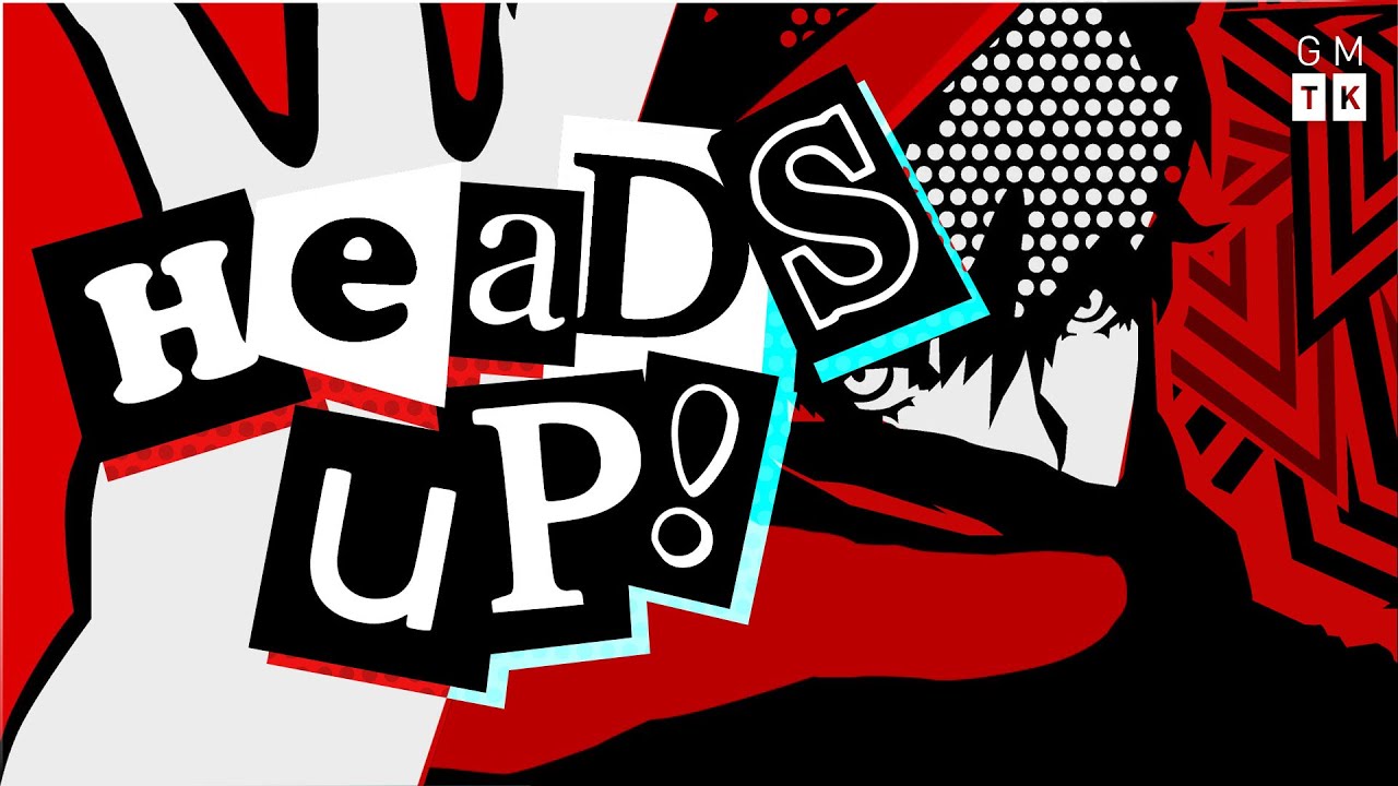
The thumbnail

I knew early on that I wanted to put Persona 5 on the thumbnail. It went through a few iterations (first attempt, above) but it was mostly easy to make.
I found a high res version of the pause screen, and someone had made a custom font that resembles the game's UI. It just took a lot of time to get the right positions, colours, and composition. I wanted it to be red, black, and white, but adding the blue (which also shows up in Persona 5's UI) was essential for making the text stand out.
And there we have it! I'm really pleased with this one - it feels like a classic GMTK video (exploring a broad topic through the lens of lots of different games) and I like the visual style. I may end up re-using it for future UI-based videos. Who knows, we'll see.
Thanks for reading!
Mark
Quiz answer: Xbox gamer tags used to be 15 characters max (it's now 12), and as W is the widest character, WWWWWWWWWWWWWWW is the longest possible gamer tag. Every UI design on Xbox must be made with this specific string in mind.