Home
Home

 Artists
 Search
 Recent
 Random
 Posts
Posts
 DMs
DMs
 Tags
Tags
 Random
 Importer
 Import
 FAQ
FAQ
 Account
 Register
 Favorites
 Login
Login

How I made the Super Mario Maker 2 thumbnail (Patreon)
Content
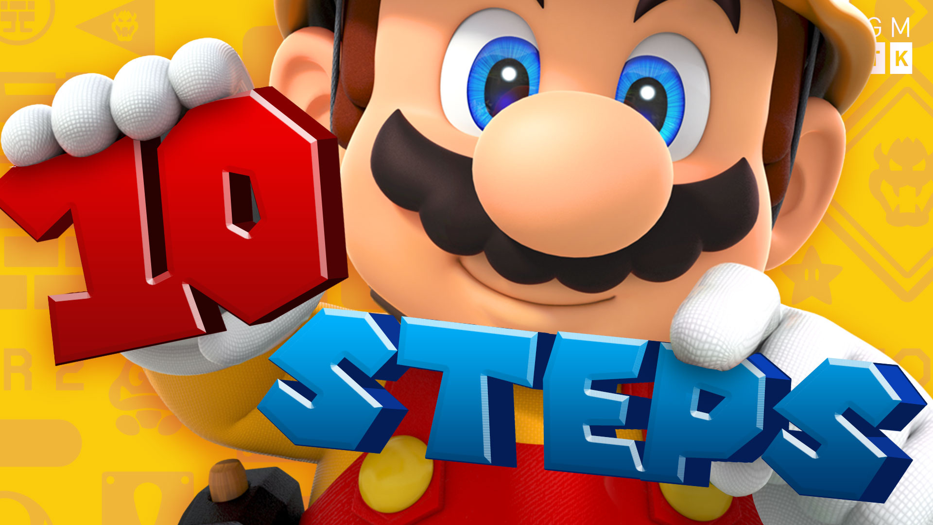
I’m very pleased with the thumbnail for my Super Mario Maker 2 episode. It’s big, bold, inviting, fits the game, and combines official art with custom text in a cool way. So here’s how I made it.

So I started by finding the original artwork. I liked the picture on the game’s box and had this idea to have Mario holding up some text instead of level parts.
Luckily, I’ve got access to a few asset libraries, from my days as a games journalist, where I can get official artwork in super high resolution, and often with transparent backgrounds. So I grabbed this off Nintendo’s asset library and imported it into Photoshop.

I made the image super big (thumbnails are so small on YouTube that you really want to zoom in on the important details), and removed the pipe simply by drawing around it with the lasso tool and hitting delete. The fact that some red pixels remained on Mario’s glove (due to the volumetric lighting), meant it was easiest to make the replacement text red!

Mario’s other hand didn’t work for me: it’s too low down, and so I can’t get Mario’s eyes and both hands on screen at once. And also, Cat Luigi’s head obscures some of the fingers and so I’d have to remake them from scratch. Luckily, the official art also has Luigi, who is holding up a brick. So I pinched his hand and placed it over Mario.
I also mirrored Mario’s dungarees strap and button, to make up the stuff behind Cat Luigi.

I then made the text. The font is an unofficial (I think) Super Mario font. I put on a gentle gradient and a little bevel / emboss to make it more 3D. Then I made a copy of it, offset it, made it dark, and put it behind the text to create the 3D depth. And finally, I added highlights and dark areas to the 3D depth to create a more convincing 3D effect.

I then put it in the image. I put Mario’s fingers on a separate layer, above the text. And also added a bit of shadow from Mario’s fingers so it really looks like he’s holding the number.

I did the same for the word Steps, and added in Mario’s (well, Luigi’s…) thumb to make it look like Mario is pinching the word.

Finally, I added a nice warm glow around Mario, and put on a Super Mario Maker 2 backdrop. Oh, and don't forget the all-important GMTK logo!

This wasn’t the first version, mind you. It was originally “10 Tips”, but ultimately I realised that the vidoe was more of a step-by-step tutorial than a list of tips. So I had to replace the word.

I also tried different fonts. This just didn’t look as good, and also I had to fill the giant space in the O with the inside of Mario’s glove and it just looked odd.
I obviously put a lot of work into these thumbnails, but they're so important! So, hopefully, it all pays off.
Thanks for reading
Mark
Files