Home
Home

 Artists
 Search
 Recent
 Random
 Posts
Posts
 DMs
DMs
 Tags
Tags
 Random
 Importer
 Import
 FAQ
FAQ
 Account
 Register
 Favorites
 Login
Login

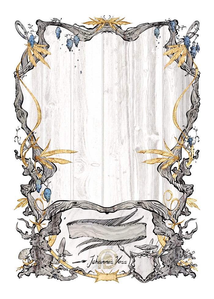
New Token frame! (Patreon)
Content
- art readability
- bigger art area
- clearer token name
- color identification
At the same time I wanted to keep the overall look, and I wanted a bit more detail as well as the chance to give the art more detail. I really enjoy the inked style as a counterbalance to the fully painted commercial work I do and want to explore where it takes me (no worries though, there'll be painted sparkly ones!) so I wanted the new frame to stay compatible.
Either way here's a picture of it! This one is for a blue creature - I want to make the color clear, but not too obnoxious. All five colors have different designs too and are combinable for multicolored creatures.
I know the changes might seem subtle but flipping back and forth you see it's actually a pretty big difference!
So you'll start seeing these in Wave 21 and 22! Hope you like them.
All the best, and more updates (good ones!) the next few days!
Hannes
Files