Home
Home

 Artists
 Search
 Recent
 Random
 Posts
Posts
 DMs
DMs
 Tags
Tags
 Random
 Importer
 Import
 FAQ
FAQ
 Account
 Register
 Favorites
 Login
Login

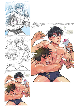
Summer Process Picture (Patreon)
Content
I tend to colour everything onto one same layer to speed up my process and dwell less on making separate layers for everything. It is much more spontaneous this way!
I will still break it down into text here.
1. Start with a loose sketch and render lightly to get your ideas down. Ink pools, light shading. I sketch without lifting my pen much, resulting in a lot of lines. But from then on, not only is it more dynamic but you get to choose from the many lines you make. Just happy mistakes! There are eraser marks here to clear up and polish the sketch a little. But stay loose. (soft pen brush w/ opacity in FireAlpaca)
2. With the same brush I ink everything. Again, I ink really quick and loosely because I don't want to be stuck in one part. I focus on making dynamic lines more than drawing clean lines. Just so when I got more than 80% of the lines done, I can start cleaning, erasing, re-lining darker etc. Stop here and have a drink!! As you can tell, even a lot of my inking stays loose and sketchy because I love and prefer retaining the feel of the initial scrawl.
3. I'm sorry about here! Not much steps detailing here but in nutshell: I select the white space around the characters and intervert it, fill a basic colour in (peachy browns) and make a sweet gradient with lighter colours over where light would hit. Around the face, shoulder-pecs, thighs. Gradient tool of dull rose-pink over heated-hot areas, middle of the chest, cheeks and nose. I love inputting my colour bases with the gradient tool. Effective and smooth, gets you there in speed. No worries if it's off though!! HAVE ANOTHER DRINK! Use your soft brush and play with the opacity, blend the matte areas you want smooth and make sharper shadows where light hits. Your image can't just be 100% smooth it WILL look like a spray paint with no definition. Keep in mind the textures you want to convey. Sun-kissed skins, wet areas, rougher skin vs smooth lips/nose. The sharper lighting on Miyata's hair make it look shinier vs Ippo's rougher dull but spikier hair. The harder brush on Miya's facial sweat drops give it more of a water feel too. What a good time to refill on your beverage.Use reference! I know a lot of muscle definition/light+shading by memory but only because I look up photos... Here I google "summer boys", "wet boys", "wet muscles", "beach guys" amongst others AHAHAHAH! This part gives muscles much more dimension WOW I love that part!
4. Do that thing I always do for every picture: mask your line layer and recolour over certain parts! It warms the picture so much more than just letting it stay black. Think of the facial features, a lot of the muscle definition. I recolour it in mix of warm purples, dark reds, and browns. What a difference!
Use your art knowledge but make it adapt to what you're going for! I love going for the obviously anime look, feel, and expressions. Exaggerate certain features, add move lines to everything, and sweat drops (haha!)But I like it when it's coupled with grounded anatomy without it being TOO realistic. Don't want it to be too jarring... Just... I dunno, I like my characters to be hefty and feel weighty ;)
ANYWAYS I hope this was an interesting and helpful read to you, if not entertaining! Happy drawing, and stay hydrated!!
*Drawn in FireAlpaca, 9x12in 200dpi, default soft brush, lots of IPPO love, and lots of iced tea*
Files