Home
Home

 Artists
 Search
 Recent
 Random
 Posts
Posts
 DMs
DMs
 Tags
Tags
 Random
 Importer
 Import
 FAQ
FAQ
 Account
 Register
 Favorites
 Login
Login

Mermay 🧜♀️ - Waterfall 🌊🌺 - Thoughts and Process (Patreon)
Content
Hello Patrons 💕
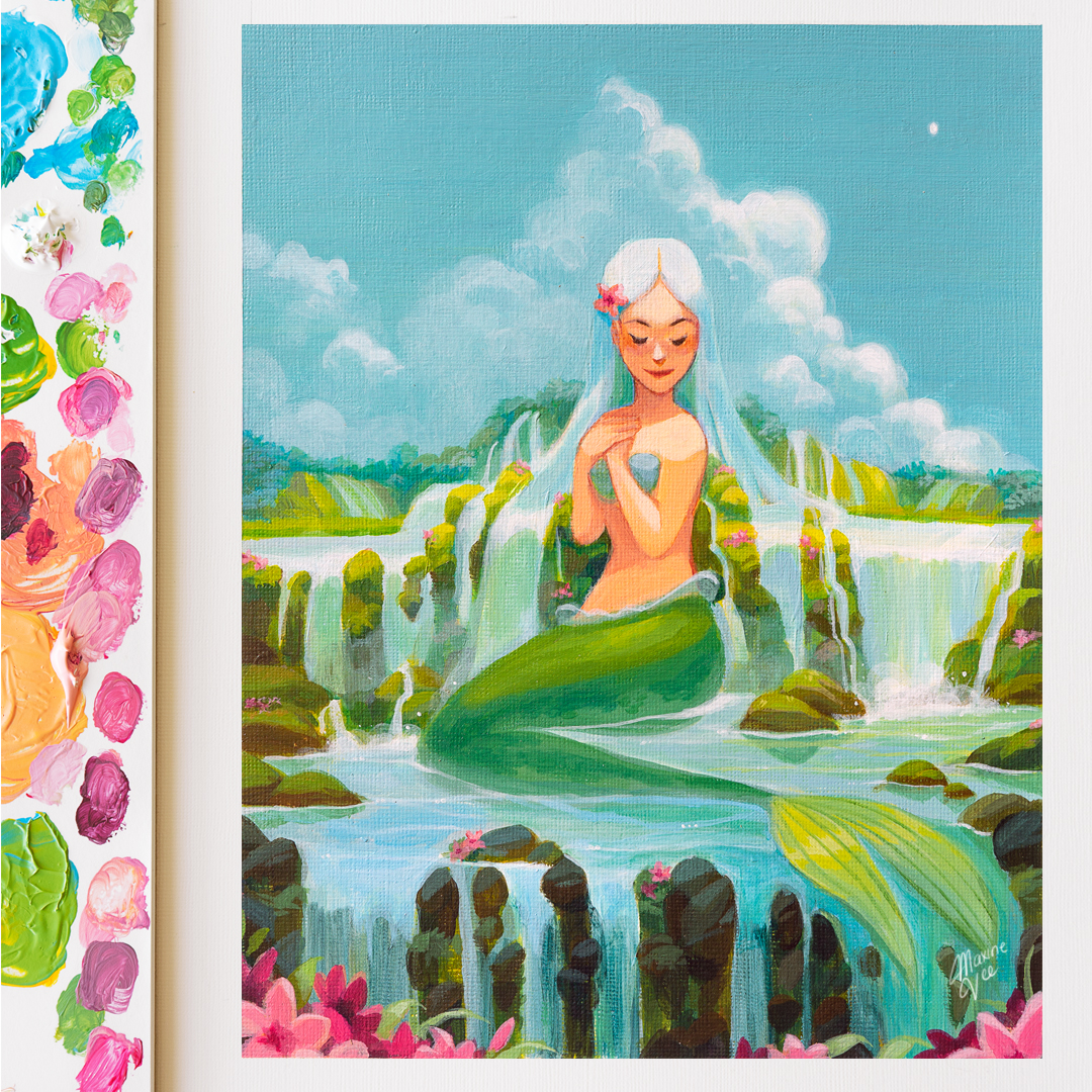
I am very excited to show my latest painting because I’ve challenged myself to paint traditionally! 🎨 I kept telling myself that I’ll eventually try it out, but I always delayed it this time, I told myself, no more excuses! 😂
I’m sorry I didn’t take as many pictures as I’d liked or videos since this painting went through some changes and quite took a while to finish since I was trying to get used to the medium. I’d like to talk about my process, though and let you know how I was able to get through the painting! 😊
To ease myself back into the medium, I decided to choose an idea that I’d feel comfortable painting which is a waterfall mermaid! I’ve painted a waterfall mermaid back in 2020 so I wanted to try doing something similar. I sketched the painting on Procreate and made sure I had the foundation down (the character’s anatomy/pose and composition.)

Then I did a light sketch on my canvas paper and decided to do a quick wash of the colours. I decided to choose a limited palette for now so it’s not too overwhelming.

When I use acrylics, I build up the layers by slowly adding more paint each time. I do this with her hair since her hair transforms to water I want to make sure I can easily blend it later. ✨

Midway through the painting, I decided to change the pink clouds and stick to a blue sky. I want to focus on painting the clouds here. It took a lot of trial and error to get to where it was so I had to look at a lot of cloud references so I can get the shadows right.
I even had to quickly do a paint-over on Procreate to see how it would look like on canvas.

I am pretty happy with how it turned out! It’s a little more subtle than what I had digitally, but I think the calmness of the sky will be balanced out with the waterfall.

With acrylics, I find it a lot easier to mix your colours beforehand. I also used a spray bottle to spray the palette occasionally to keep it from drying out.
From here, I decided to paint the bottom of the painting darker so it would create a contrast against the middle lighter areas.
I used a slate-bluish gray to add highlights to the darker rocks. I always try to introduce some blues to the shadows just so it’s cohesive with the rest of the palette.

For the last touches, I decided to add pink flowers around the painting so that it could have some variation against the cool hues.
I’m really happy with how it turned out! I really enjoyed the process as well! I want to paint more traditional paintings in the future and record more videos of them when I have the proper setup! 💕
Thanks so much for your support! 🫶🥹🫶🥹
Love always,
Maxine
Files