Home Artists Posts Import Register

Content

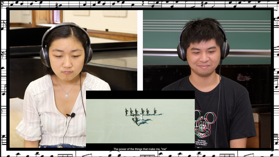
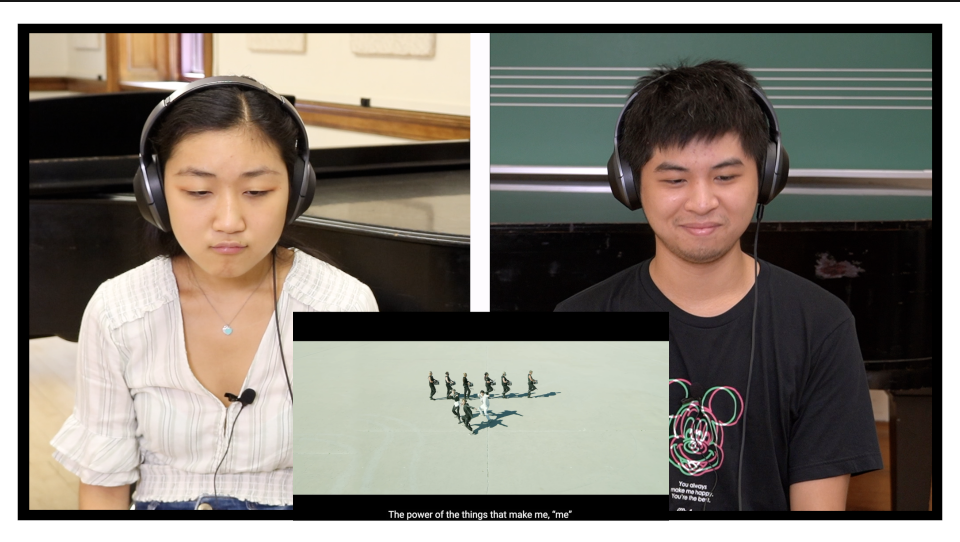
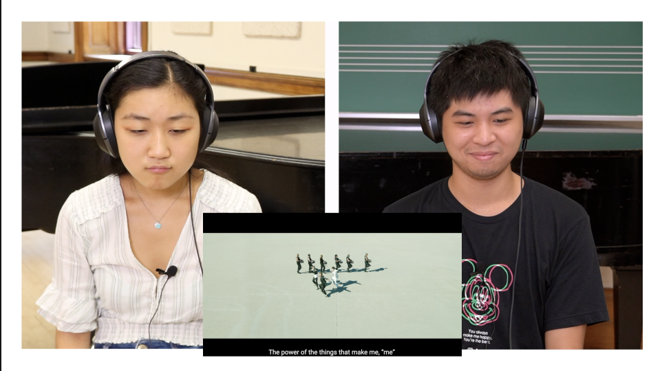
We're now shooting in separate rooms/ at the opposite ends of a large room/windows open, and therefore I'm brainstorming a new layout for the reaction footage! Wanted to run my ideas by you guys so far to see what you think/which one you like best/if you hate all of them lol :D

Files

Comments

Anonymous

3rd one looks good

Anonymous

2/3 are best!! Not too keen on the first one xx

rockthekazb0t

I like the idea of the first one, but it's kinda busy. I would go for #2 or #3

CluStar75

I do think the second one works the best. Nice work and I do like the aesthetic of it.

Rin

I like the 2nd one - from a design perspective the 1st is too busy, and the 3rd feels floaty with all the extra negative space. The black border on the 2nd is a good visual anchor

Anonymous

#2 is more visually pleasing, in my opinion

Jack F

#2 for me. 1 is a bit too much, like the thought though and 3 feels too empty.

Falco

I feel like #2 is the most elegant option, but I think #1 is really cute!

Anonymous

#2 but only if you align the bottom of the video with the bottom of the stroke 😉 #3 is also absolutely fine!

Anonymous

I’ll put in for #2.

Anonymous

I prefer #2

Anonymous

#2 for me as well

equilikua

#3 for me : )

Ginj13

#2

PositiveThinking

I like #1, but might get too much after awhile. #2 strangely reminds me of funeral announcments in my country, so I prefer #3 - clean and simple.

reacttothek

Would #2 be less funeral-y if the border was changed to a different color? 🤣

Anonymous

I think #1 is cute, but it's a bit busy so I would say #2 is the better option

Alice Owi

#2 is because my all photos also put borders like tat 😁😁😄😄

Talise Snyder

I like 3 because its least distracting from the video of the reactors

Anonymous

#3 looks good - it's the cleanest one and thus makes it easier to focus on the reaction :) Also, #2 could work better if the middle vertical bar were black (or if each reactor had a black square all around rather than just three sides).

Anonymous

#2 definitely

Kelly

I would say #2. As a personal preference, I would like it if the stroke were a biiit thinner, but other than that it seems the best out of the 3. #1 would be fun and quirky, but does appear to be a bit busy. Perhaps you could try "shadowing" it in a sense. Try adding a layer with 50% opacity or something of the sort to dim the image, so it doesn't clash as much with the reaction?

jimmirakeul

i would pick #1 cuz it's cute only if you could try layering it a bit or add more opacity. otherwise, #2

Anonymous

I would pick #3 it looks smoother to me, but for practical purposes #1 seems better for editing purposes (so you can keep the black outline as a guide to where the bottom of video can be)