Home
Home

 Artists
 Search
 Recent
 Random
 Posts
Posts
 DMs
DMs
 Tags
Tags
 Random
 Importer
 Import
 FAQ
FAQ
 Account
 Register
 Favorites
 Login
Login

The Shrinking Husband -- Format Change (Update #7) (Patreon)
Content
So here's the deal.
I've spent the last few hours or so redoing the format for the entire comic. I'm starting to find it difficult to work with placing the text directly on the frame. I really enjoy the look, but it takes a little too much time per frame to actually accomplish.
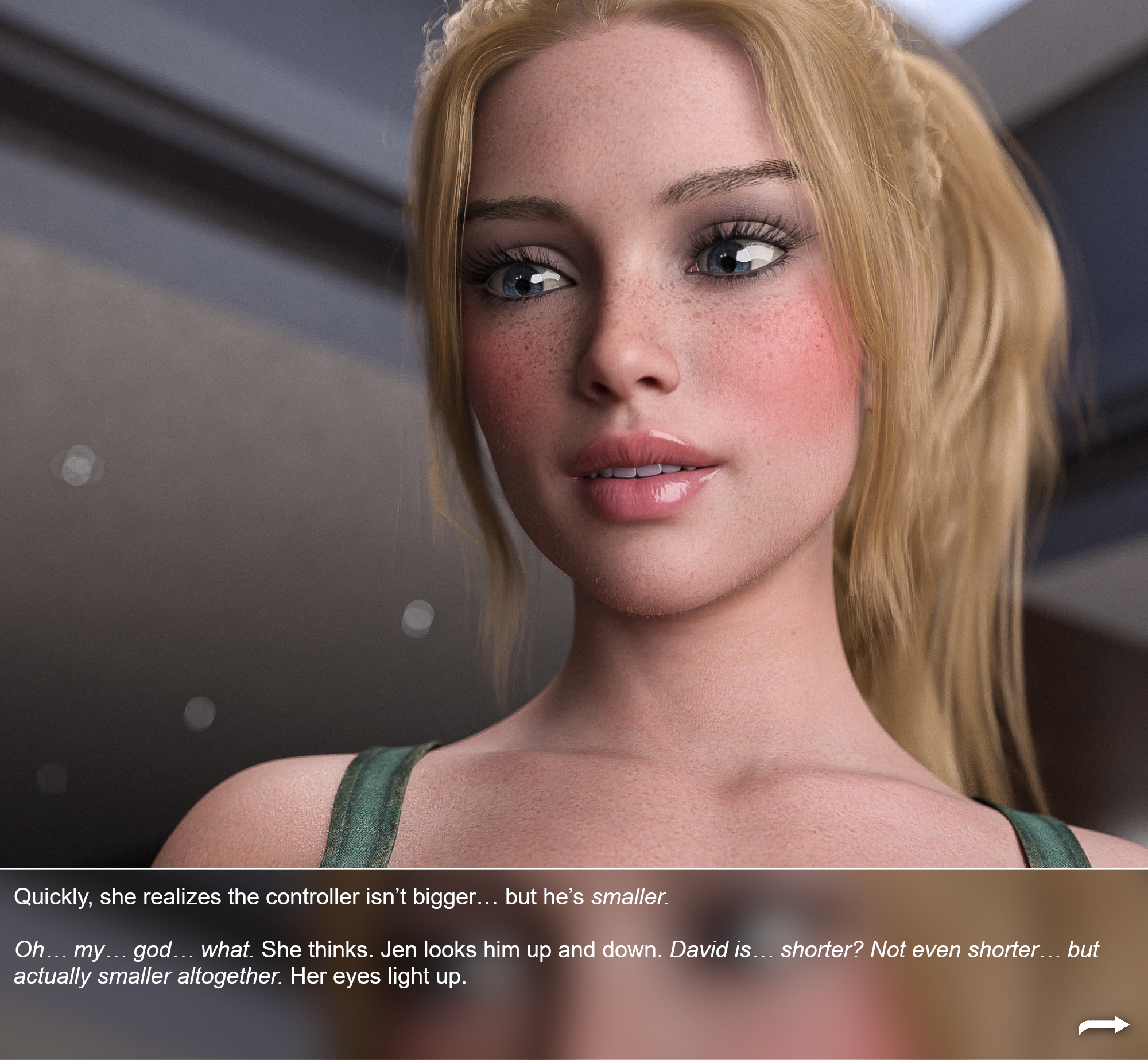
Swipe to the end and you'll see it's now more of a square. The text is once again separated from the image, but still has an interesting background from the current page. I also changed the three dots to an arrow for this one.
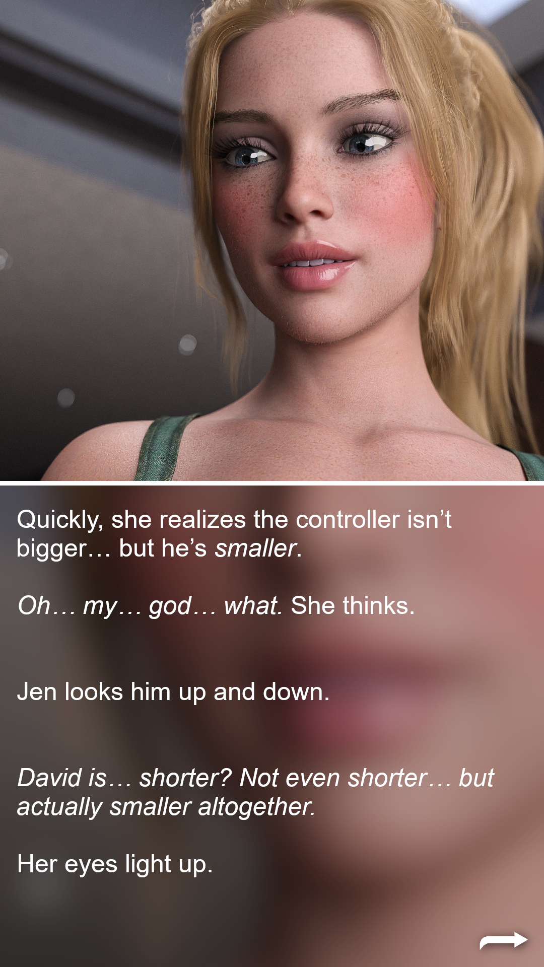
Lastly I'm going to offer a vertical version in the "complete" variant of the comic when it releases. The preview is the last image above. I'm hoping that will provide a nice alternate viewing format for people on phones.
We'll see in the next comic if I return to the old format, but this one is for experimenting!
Also, enjoy some of the new images that I haven't gotten to caption yet ;)
Files