Home
Home

 Artists
 Search
 Recent
 Random
 Posts
Posts
 DMs
DMs
 Tags
Tags
 Random
 Importer
 Import
 FAQ
FAQ
 Account
 Register
 Favorites
 Login
Login

WIP logo 2 (Patreon)
Published:
2017-10-22 13:48:12
Edited:
2017-10-22 13:49:18
Imported:
2021-02
Content
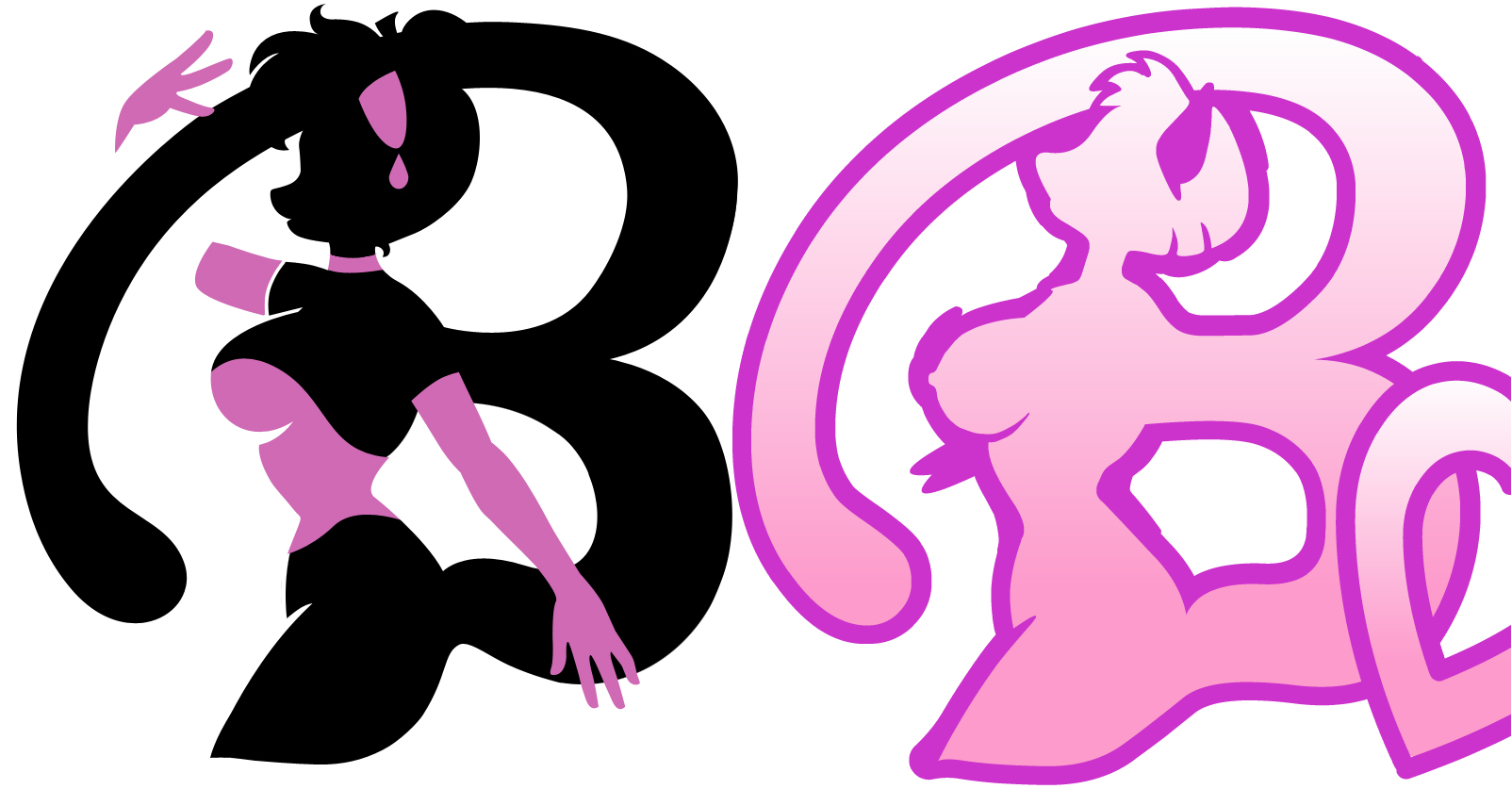
I'm still working! Ok, there are the differences between the first and second silhouette and first letter B. Now the letter B is the same, I thought it was more elegant the original B that remind a long tail.What do you think? Don't look at the black, it is a temporary color ( even I like the black silhouette, it is a classic from the Victorian era), and there is no "stroke" effect yet . V.
Files