Home
Home

 Artists
 Search
 Recent
 Random
 Posts
Posts
 DMs
DMs
 Tags
Tags
 Random
 Importer
 Import
 FAQ
FAQ
 Account
 Register
 Favorites
 Login
Login

Spider-Man Animals Assemble Cover Process! (Patreon)
Downloads
Content
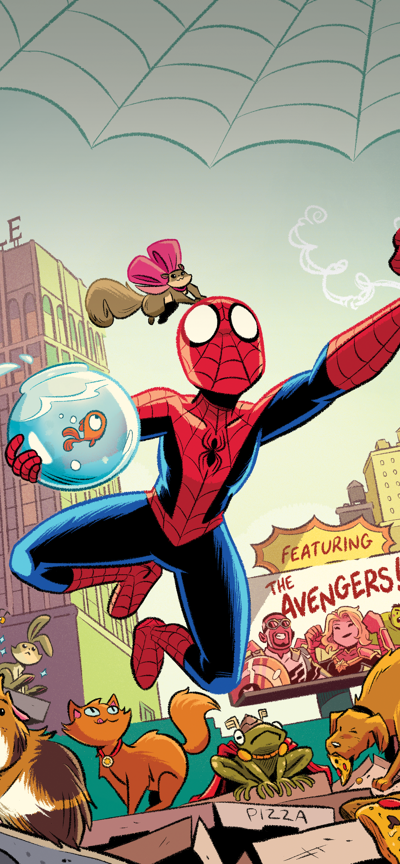
I recently finished up the cover for my 2nd Spider-Man book and it made me realize I never shared the process of creating the first cover with y'all!
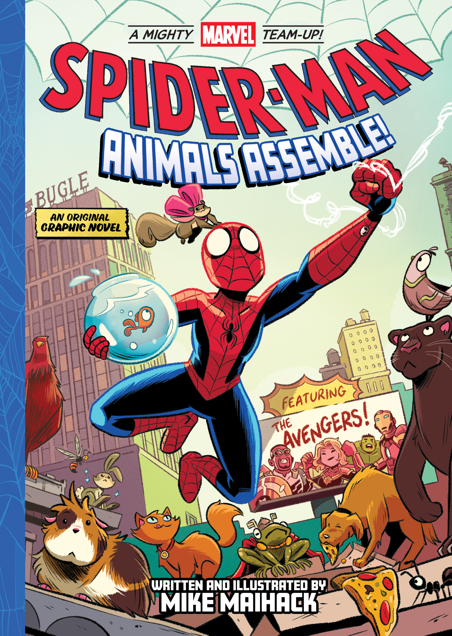
For those unawares, I've been working on three Spider-Man books for young readers (although truthfully I think old readers will enjoy them too). The first book, ANIMALS ASSEMBLE, will be out on June 13th. Please preorder it if you can! (Also FYI: the B&N version will have an exclusive pull-out poster)
And with that out of the way, strap in! We're going to dive into a pretty massive process post and *ahem* cover a lot of stuff I often get asked about.
__
DIGITAL BRUSH
First up, over and over I get asked about which brush I use for all my digital work. Ever since around the beginning of 2020, I've been almost exclusively using the default textured pen in Clip Studio Paint (the program I use for almost all of my art these days). If you have CSP, you have this brush! Here's where to find it, along with my current settings:

I love this brush, not just because of its fuzzy texture, but also the varied line weight I can easily get out of it. And just in case you don't have it (or simply don't feel like messing with the settings) I included mine in this post. Download it below.
__
CONCEPTS
Okay, onto the cover. It's always nice to give your publisher--in this case Abrams Books--some options and these are the sketchy concepts are I let them choose from.
There was a lot of information Abrams wanted to have on the cover. Spidey obviously, some of the pets, a few Avengers, a "featuring" tag, a "Marvel Team-up" heading, the title and the subtitle (Animals Assemble--although at this stage we were still calling the book Pets Assemble), and even something I completely forgot about (more on that later).

The title logo was given to us by Marvel and, at the time, was what we thought we were going to use--or at least some variation of it. I like to include it in my concepts because it's helpful to know how much space I'll need to leave at the top as well as any curves that might aid in the composition.
Anyhoo, I was 90% confident that we were going to go with this concept of Spidey hanging upside down above the pets:

My remaining 10% of confidence thought we might go with him sitting in the middle of them instead:

I recall scribbling this third concept super quick just to give the publisher one more option--although I thought there was no way we'd use this one:

So yeah. Guess which one they picked. Haha.
__
PUBLISHER'S PICK
They had some great suggestions on that third concept though! The art director pieced together some of the elements from each cover to create this sort of composite image. This way the pets (and pizza boxes) stayed pretty prominent. We also exchanged Avengers Tower for the Daily Bugle building and swapped the Bugle billboard for a "Featuring the Avengers" billboard. He even included the part I completely forgot about. My name! Which I guess is sorta important.

Hooray! All the pieces are now in place. I can finally start drawing this thing.
__
PENCILS
I started out by taking the composite cover my art director gave me...

...and tightening it up. Which honestly wasn't much. Mostly moving and adding in some more pets as well as fleshing out which Avengers to use.

__
INKS
Once I'm satisfied with my "pencils" I start "inking" over them. Really you could just call the previous stage "sketching" and this current stage simply "drawing" because that's pretty much what it is. I used to have an in-between stage but I've been skipping it these days. I'm not sure if this is because of increased boldness on my part or simply a lack of time. Likely a bit of both.

I then quickly drop out that penciled layer, and HAZZAH! Drawn cover:

__
LAYERS
Covers can be a little more tricky because you never know if parts of it are going to need to be moved around (or deleted altogether). I thought I'd try to share how I drew the various parts of this cover on separate layers.

As you can see, I'm kind meticulous about labeling my layers. I can work a lot more efficiently when I immediately know what to navigate to. And really, it takes minimal effort to type something in there. I don't normally have this many layers though. In this case I just thought I'd be saving Future Me some headache if I had to change/move anything. In the end I don't think I did but I still think this is a good practice to keep.
__
COLOR
Nothing much to note here that I haven't gone over in previous process posts. I'm just...well, coloring. I don't even really flat the entire illustration at once these days; jumping right into lighting and shading. My main concern here was just making sure Spidey really stood out over everything else. The yellow to blue sky really helps with that against his bright red costume.

Finally it's simply touching things up, coloring some lines, adding a few more highlights, brightening the sky, maybe a bit of texture, la la la...

There! [Almost] finished cover.
__
SIGHT LINES
This seems like a good place to talk about sight lines. Those little hidden (and often intuitive) things artists do to lead a reader's eyes where they want them to look. There's a lot going on in this cover so there's quite a bit of sight lines in this case. Below I've starred the most important focus points.

Spidey is obviously number one. He's the star of the book! So almost everything has to be directed at him. That's why a lot the animals are looking at him (so that we look at him) or their general shape is drawn in that direction. Everything kinda frames that central image. Spidey on the other hand should be looking directly at the reader. Locking eyes on someone is a good way to get somebody's attention after all.
After that, the other two directions you want is toward the title of the book and toward the pages. While there are always exceptions, you almost never want to lead a reader's eye toward the spine of the book. Everything on the cover should be telling the reader to open it up. That's why Spidey is swinging from left to right.
If all of that is working out, you should get a nice, clean compositional spiral focusing, again, on the most important viewpoints of the cover.

Cool. It works!
__
TITLES
All right, now that it's all drawn and colored, this book needs a title. We thought it'd be fun if I drew over a couple options based on our initial title treatment. We thought my fuzzy linework would compliment the artwork nicely.

So which one did we go with? *drumrolllllll*
__
FINAL
Neither! My art director went with the good ol' curved and classic title style. I didn't even have to draw over it. Which I couldn't be happier with. It looks great!

I actually just got a couple of comps of the book over the weekend. The bounded product looks amazing. Spectacular, even. Here are some photos.

Hard to see here, but all the characters and pets on there have a nice spot gloss finish. It's really sharp.
And there we have it! That's how a Spidey cover is made (at least by me). And heck. While I was at it, I thought I'd make another new phone wallpaper for you as well. Both iPhone and Galaxy sizes and can be downloaded below.

Thanks for reading, my friends! Make sure to click play on the main header image for a very quick time-lapse of everything I just went through. And I hope you all have an amazing weekend. :)
Files