Home
Home

 Artists
 Search
 Recent
 Random
 Posts
Posts
 DMs
DMs
 Tags
Tags
 Random
 Importer
 Import
 FAQ
FAQ
 Account
 Register
 Favorites
 Login
Login

Disintegrity 108-109 remade + 100 hd (Patreon)
Content
First off, 100 HD. Apparently it was only one month since this was remadeOld & new : https://drive.google.com/drive/folders/1rqvbs0AhHkXSvBJQgKu35UspVeCur6CM?usp=sharing
Just new : https://drive.google.com/drive/folders/1axdXteUc7pbZZD6PljuDC7JINqTEkRoV?usp=sharing
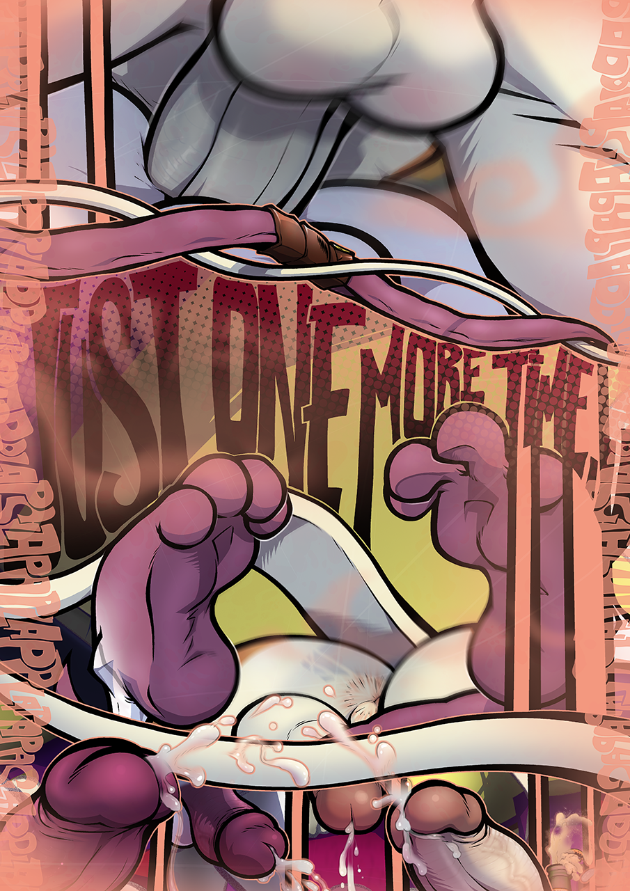
As for the new pages, well, it's like the opposite of the usual. There used to be lots to see, now it's all zoomed in on page 108 ! Which I'm sure some will find to be a downgrade, that's how I usually consider it as well but those were pages simply meant to show that Zee and Larsen fornicoom for a while. They didn't need to be explicit. Which is why they aren't anymore.
108 is one of those where I'm pretty sure I was inspired by how other comics i had see did it : to show a fucking timelapse, just show different poses in a single page with hazy paneling ! There's nothing wrong with that, it works but eh, didn't feel like retrying that concept. There's been enough of that in the comic til now, Larsen and Zee engaging in varied positions will have to wait for some new material instead of being thrown in a single page.
109 was just kinda lame. It just looks dumb to me; There's barely anything to see, Larsen's position looks stiff and probably not something that'd make him scream, he's crying for some fucking reason, the "just one more time" text looks like ass, the bad kind of ass, the kind that's barely readable and I clearly didn't put much effort in back then. The background looked okay tho, for what it was.
So I just went for some simpler imagery. A silhouette of Zee and Larsen with some more plaps in the background and I'd say it looks cool enough. Nice rain transition. The point is for it to take space and waste the reader's time. No, really, it's there to make the comic slower, which in extenso makes the pacing feel slower.
I added some "dialog" down there just for the sake of re-introducing the characters a little less cold than it used to be, especially since we don't really see their expression on the page anymore, it compensates.
Well, that's that ! There's now less than 10 pages to remake I believe.
Files