Home
Home

 Artists
 Search
 Recent
 Random
 Posts
Posts
 DMs
DMs
 Tags
Tags
 Random
 Importer
 Import
 FAQ
FAQ
 Account
 Register
 Favorites
 Login
Login

Disintegrity 17 + 124 remaster remake (Patreon)
Content
Well, just got these two pages. Maybe I'll have another one tomorrow. But that'll be then, so let's detail the changes in those two first :
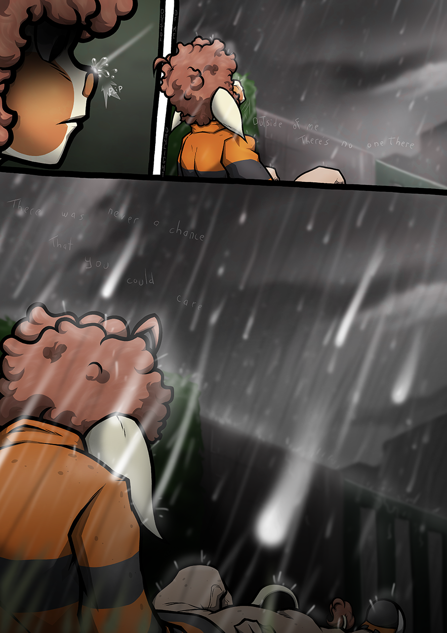
17: Obviously it's not a very interesting pages to talk about since there's simply not much on it but there are a few things still worth mentionning. The first panel display pretty well the change in the way i draw profile views for furry characters. I feel like a small muzzle looks cuter than... whatever I was doing back then.
There's also that pure black bloc of blackness hiding Zee's eyes. It was for dramatic purposes but it just looks weird the way I did it. The softer black gradient is less aggressive.
Otherwise I added another black gradiant at the bottom of the page to make the transition with p.18 a bit less harsh. It's like a feade to black, except it doesn't fully fade to black, so it's not a fade to black, it's a fade to bleh. Also you can look at Zee's hair on that last panel on the old page and see how weird the linework is. It's goes from SUPER THICK to tiny to SUPER THICK again. Terrifyingly awful.
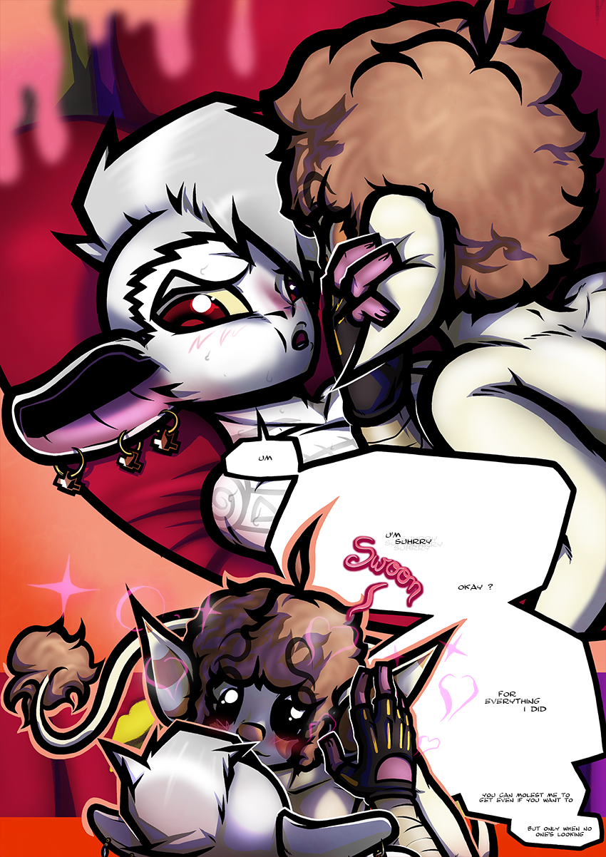
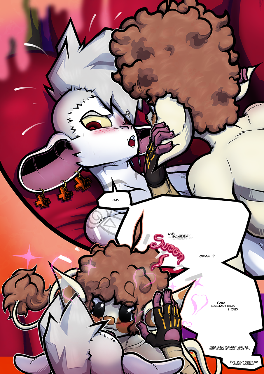
124 : There's even less to say ! I really liked Zee's face on the last panel, with his big eyes wide open but it was a bit weird that on the previous panels his eyes weren't opened at all (yet they were on the last panel of p.123). So now they're also open on the first panel. That's about it. The rest is just "it's better cos I draw better and that's it"
Anyway, maybe I'll actually draw the next YAGM tomorrow and not Disintegrity, I'm not sure. I'll see. Or the poll winning picture. I dunnow...
Files