Home
Home

 Artists
 Search
 Recent
 Random
 Posts
Posts
 DMs
DMs
 Tags
Tags
 Random
 Importer
 Import
 FAQ
FAQ
 Account
 Register
 Favorites
 Login
Login

Disintegrity 34 and 122 remake ! (Patreon)
Content
Lesgo through the changes, some of these are actually pretty substantial this time :
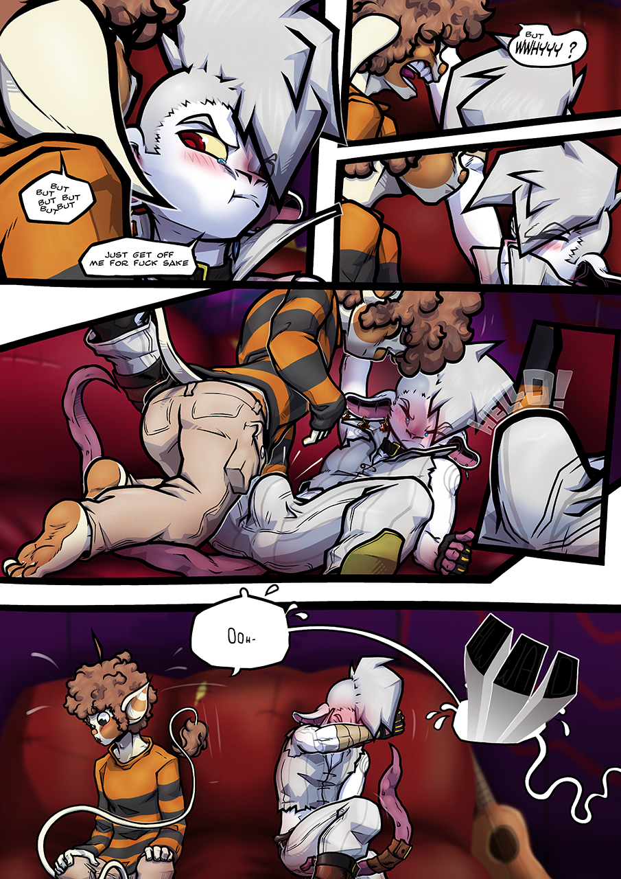
The old 34 isn't a page I ever liked for a few reasons so I'm glad to have fixed some of that. It starts slow with that first panel that's not anywhere near good but not too horrendous either, altho Larsen's head was angled in a weird way and the top of his eyebrow was super thick for some reason... The size of my linework was really inconsistent from line to line, it's nasty.Beside fixing all that, I also changed his expression from 'a bit annoyed' to 'uncomfortable'.
Panel 2-3 have nothing special in their upgrade.
Panel 4 tho was one of the thing that made me dislike the original page. The point of it was to show that Larsen had a boner through his pants but it doesn't really come through . I don't think it's much better in new panel 4 but if you know where to look, there's no confusion to be had, which is why there's a new zoom panel ! It mimics the act of realizing what the fuck is going on ! It's not a cop out to explain a still confusing shot ! It's better than an arrow that points to nothing all that noticeable anyway...
Beside that, I pulled back the camera to show the scene better cos... Zooms are boring. I said it before but I like drawing full bodies now moreso than I did back then. So when I can, I do, this was one where I could, that zoom didn't necessitate that whole portion of the page.
Last change is the removal of the 'it was awkward for everyone'. I remember that I re-drew this once before cos I wasn't happy of how i drew these words back then, but now I remove it altogether... kinda feels like I wasted my time for nothing in retrospect... I removed it because it just ruins the mood. It's there like a fat obnoxious explanation of what the mood is but it doesn't help enhance it in any way, it defuses it. Really, the most awkward thing in there was Larsen's right arm, what the hell is that thing ?

As for 122, there's not much to be said. THe old 122 wasn't too bad at all, just suffering from typical issues. The linework is too thick, it makes adding details too hard, coupled with the fact that Zee's irises were completely black, it was harder to parse his eyes from his hair than necessary. Speaking of, hair were not fluffy enough. His skull is also too round.
So yeah, typical flaws with typical fixes. Which is to say, redoing it all.
In related news, I'll probably start posting these pages publicly soon. I don't think there's a point to keeping it patreon exclusive til it's entirely completed and then posting it slowly everywhere else because I've seen pages I posted solely here (temporarily) being leaked on other website before I could post them myself. I don't really mind that, the leak in itself isn't bothering me but I wouldn't want some other website having the entire comic posted meanwhile only two pages are available on my galleries, it'd be rather insulting to my audience if they're better served my comics by someone else.
So yeah.
Files