Home
Home

 Artists
 Search
 Recent
 Random
 Posts
Posts
 DMs
DMs
 Tags
Tags
 Random
 Importer
 Import
 FAQ
FAQ
 Account
 Register
 Favorites
 Login
Login

Disintegrity 23 remade ! (Patreon)
Content
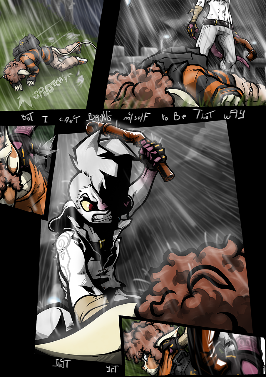
Technically, there's not too much changed in this page beside that it's almost entirely redrawn (except the background on the first three panels, the more you know), but obviously that makes it look quite a bit different still.
The big change is just the way the panels are laid out. It felt like the orignal page's layout was just a bit too clean, too normal given the context. Now it's gained in drama. To that end I also drew Larsen's face to be more visible. It seems more fitting than the dehumanizing shadows of yore.
Also yes I said yore.
Anyway, that about covers it. I guess I can link to the music the backgrounds words are lifted from :
https://www.youtube.com/watch?v=q1XHc9Itqno
I'm not too sure I still think it suits the scene all that well but the words still fit at least.
Files