Home
Home

 Artists
 Search
 Recent
 Random
 Posts
Posts
 DMs
DMs
 Tags
Tags
 Random
 Importer
 Import
 FAQ
FAQ
 Account
 Register
 Favorites
 Login
Login

Logo Part 2! (Patreon)
Published:
2017-12-30 20:06:27
Imported:
2020-10
Content
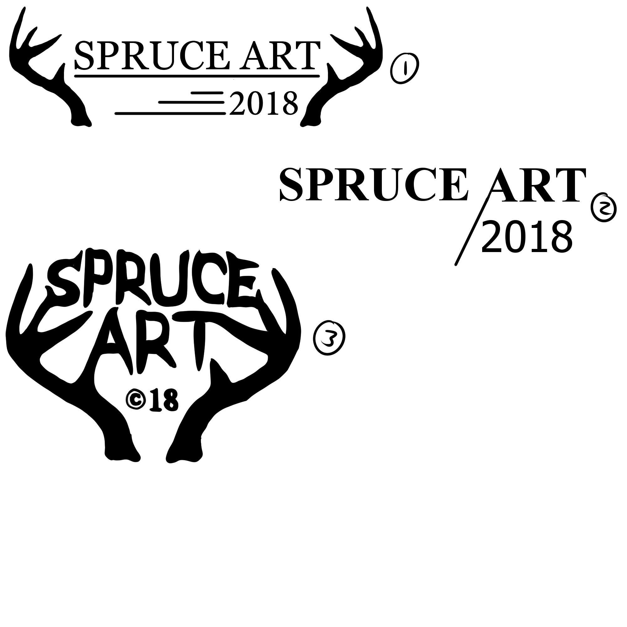
Another set of logos. Very similar to the past ones that seemed popular. A little more refined. Added the year. Added a new design too! :D
What do you guys think?
What do you guys think?
Files