Home
Home

 Artists
 Search
 Recent
 Random
 Posts
Posts
 DMs
DMs
 Tags
Tags
 Random
 Importer
 Import
 FAQ
FAQ
 Account
 Register
 Favorites
 Login
Login

Mango Manga Practice #1 (Patreon)
Content
Joshua is making a music for Hank anim atm. So I practicing some inking and screen toning on the upcoming Mango comic/manga style while waiting.
As I plan earlier on what to achive in 2024 here. One decission I made is; Mango the Dragon Comics will be in black and white, traditional manga/comic style.
I love the idea of stripping our ego in works bit by bit. I've been doing comics in color for decade. As well as the current Hank animation is also animating in a full fledge, Disney style that smooth like baby butt. It's time to tone it down and cut out the part where it does not needed and focus on what's the most important; The Story Telling.
That's why I decided to not coloring the comic (and maybe in the future animation as well!) But it's been forever since I drawn everything in pure black and white line (not counting the skethes I've been doing in later years).
I need some practice a bit!
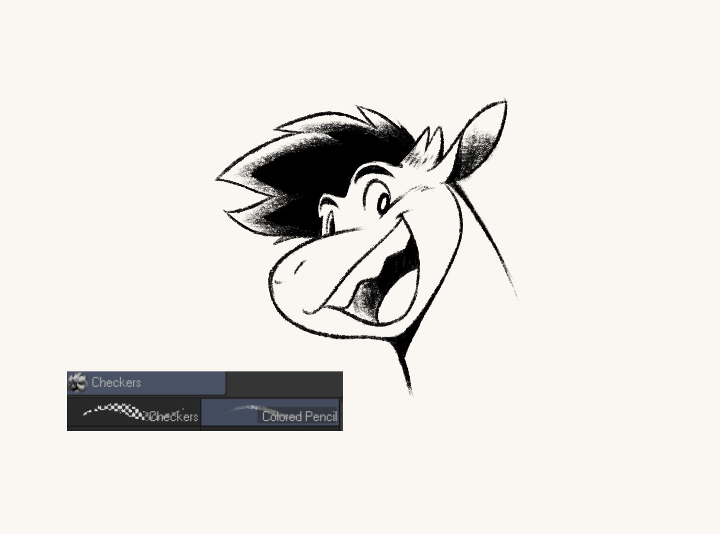
Amateur time! I love discovering thing before actually studying it. So I just use my instinct for this first attemp. See those wings and unneccessary dark screentone on the tanktop wrinkles? Those need to be fixed!
At first I was trying to find the right brush. I love the texture of pencil and I can cheat a lot with that when doing the drawing.
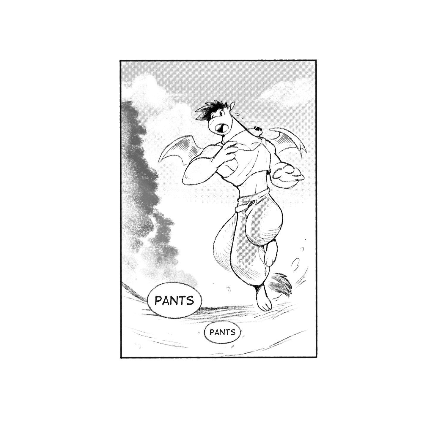
Sadly It looks not that good in this fake comic panel I made just to see the result. What we see above is the result of me trying to apply coloring technique into the inking style of comic/manga.
There's no contrast of monochromic in the characters drawaing, everything is airbrushing like the pants that, in the color version is orange but it should be darker gradient instead. The sky and trees are pure airbrush that doesnt goes well with inking line on character. The details on the ground is just lazy.
Knowing this the amateur time is over. It's time to use a professional manga panel for practicing reference!
Of all the comic/manga I read until now, 2 artist came into mind when it comes to who I wanted to learn their style/story telling;
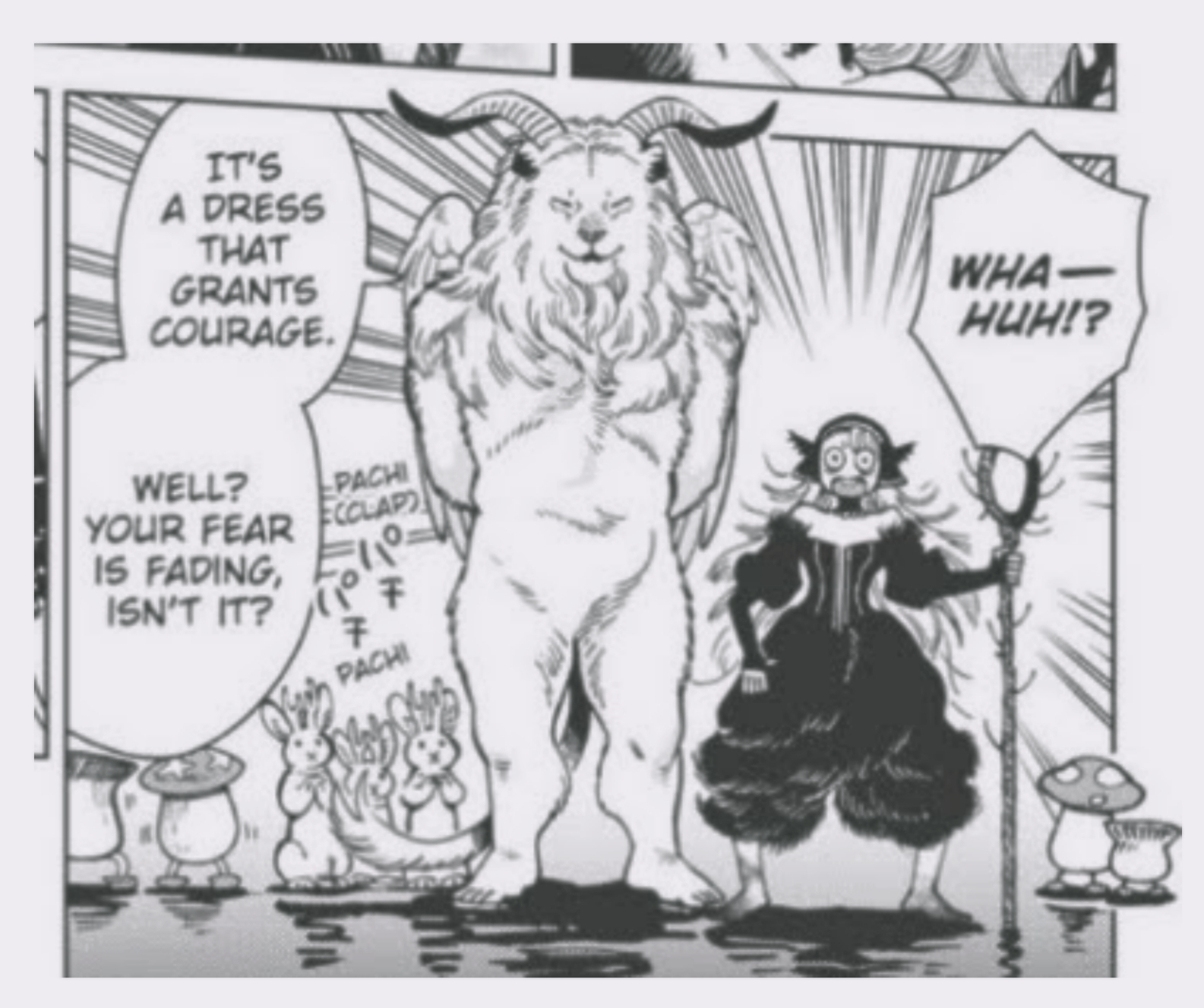
Ryōko Kui (Delicious in Dungeon) and Shouta Kikuchi (Sanshirou², Osen, Ruri to Ryouri no Ousama to).
For Ryōko Kui, I always love how strong her line works are. They are bold, thick and detailed, but never to the point its busy or too much. Plus, she use the screen tone only the part that needed, the rest are mostly traditional cross hatching line and just pure black ink.
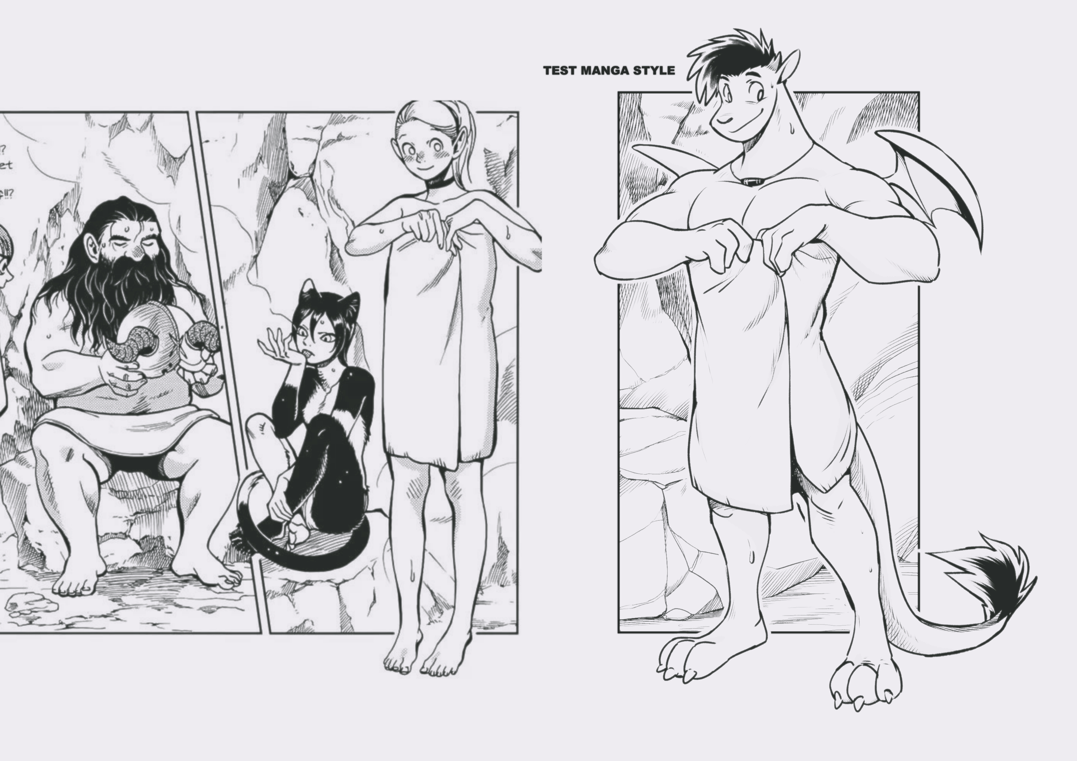
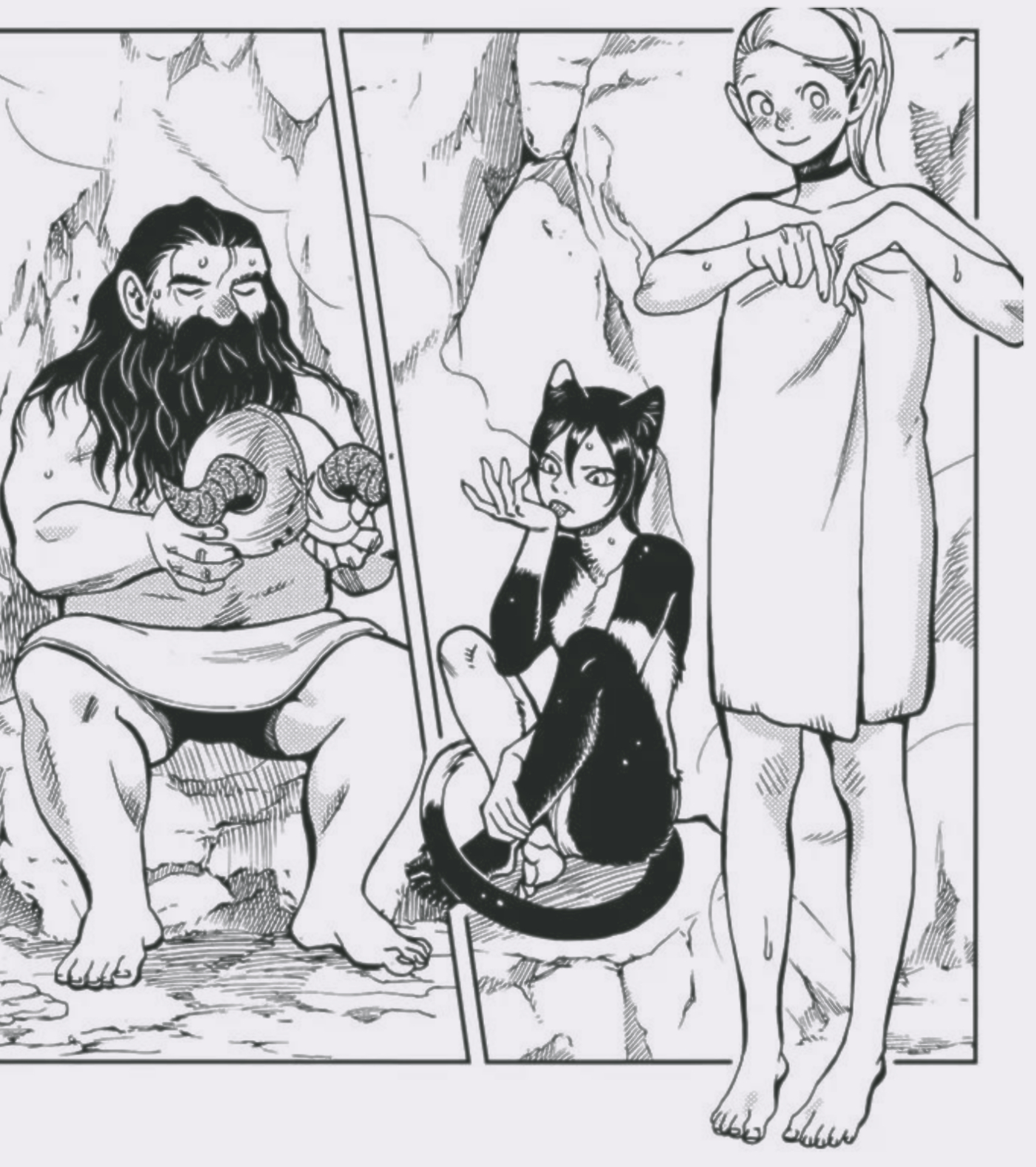
I randomly choose her manga panel and draw Mango over it. Trying to apply my style while studied her technique;
Was gonna draw Mango on Senshi but Marcille looks more fun XD
The immediat thing I learned from her drawing are the form. She start from outside first then fill the detailed later. That's why her characters silhouette are so strong!
Plus, she's only use screen tone for just a towell, rim light shadow only. The rest are just practical inking with thick and thin line to make a dimension!
Next!
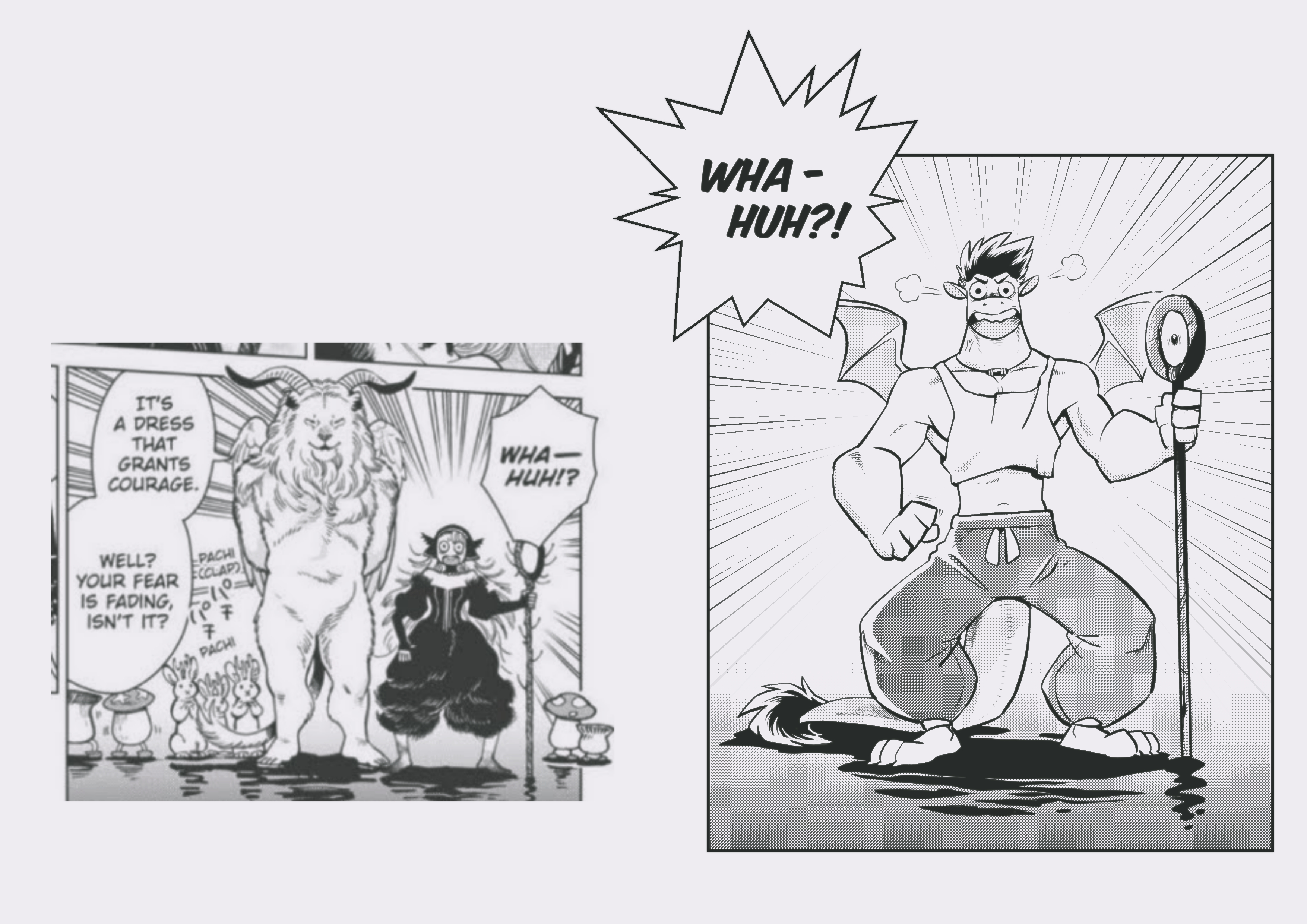
Marcille once again! This one has characters stand on a water (?) with some simple technque of gradient BG and an ink for shadow on water surface.
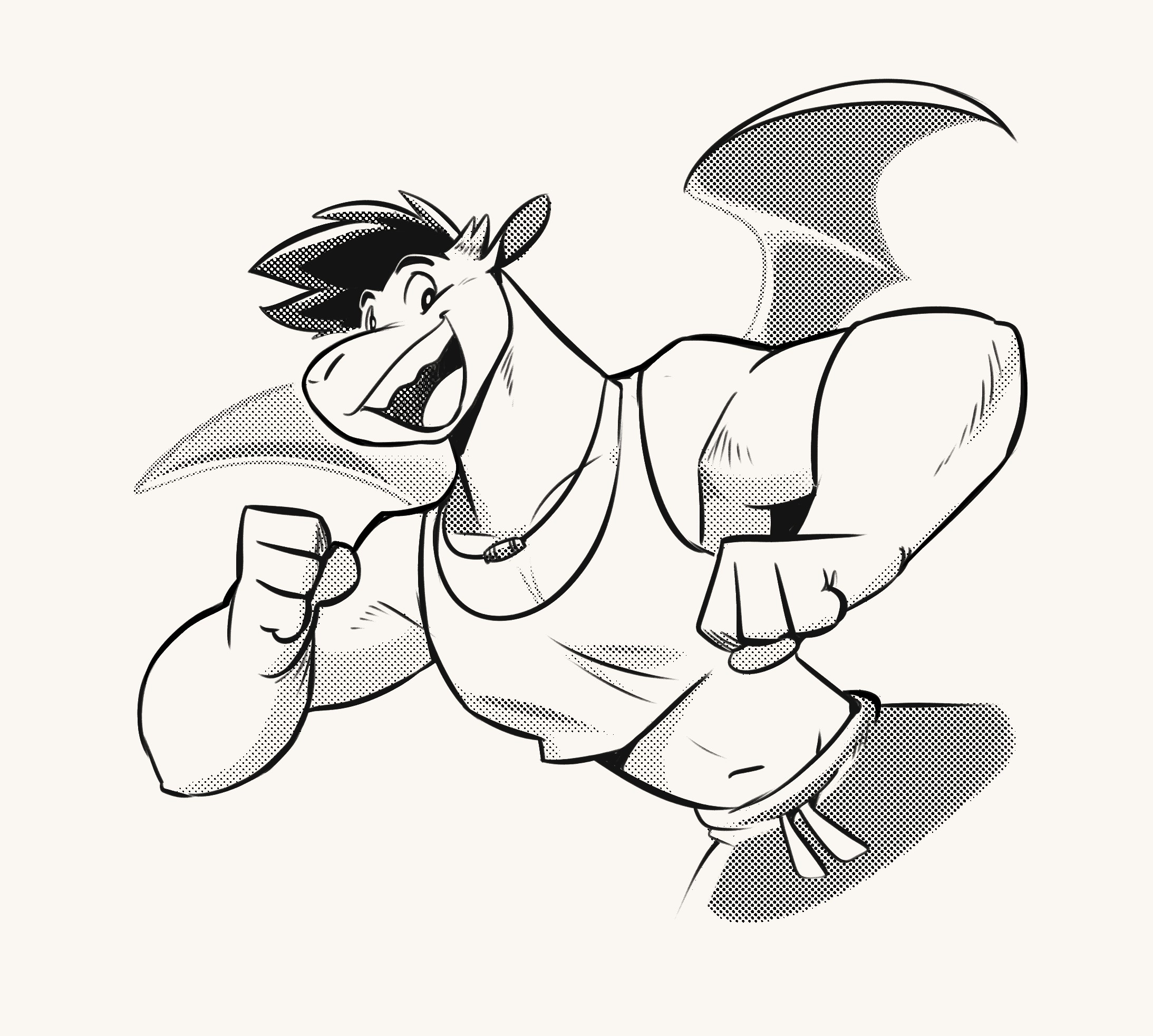
I learned how to use FX assetes on Clip Studio with this one. Those speed line, balloon with text inside. Some props of Mango like that stick, using the line tools and such. Mango's pants now have a simple gradients and it looks much better, simpler than the first one I draw!
The stick also use the contrast like, black out on the one side too. A technique to show that you don't need to draw every details on everything.
I think what I can improve is the idea of drawing a stronger silhouette for Mango. It still have the same problem like previous one.
But it's fun so, NEXT!
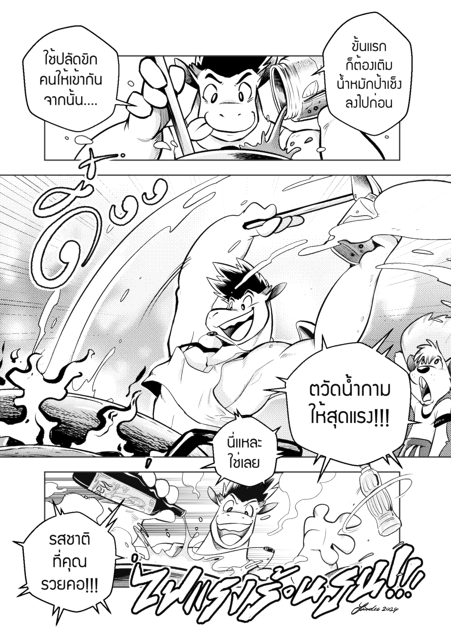
I wanted to try a full fledge manga page now. Ryōko Kui manga panel and layout are super tight and crowded (like, one page of her manga can have 12 panel!) and I don't want Mango comic to feel that crowded.
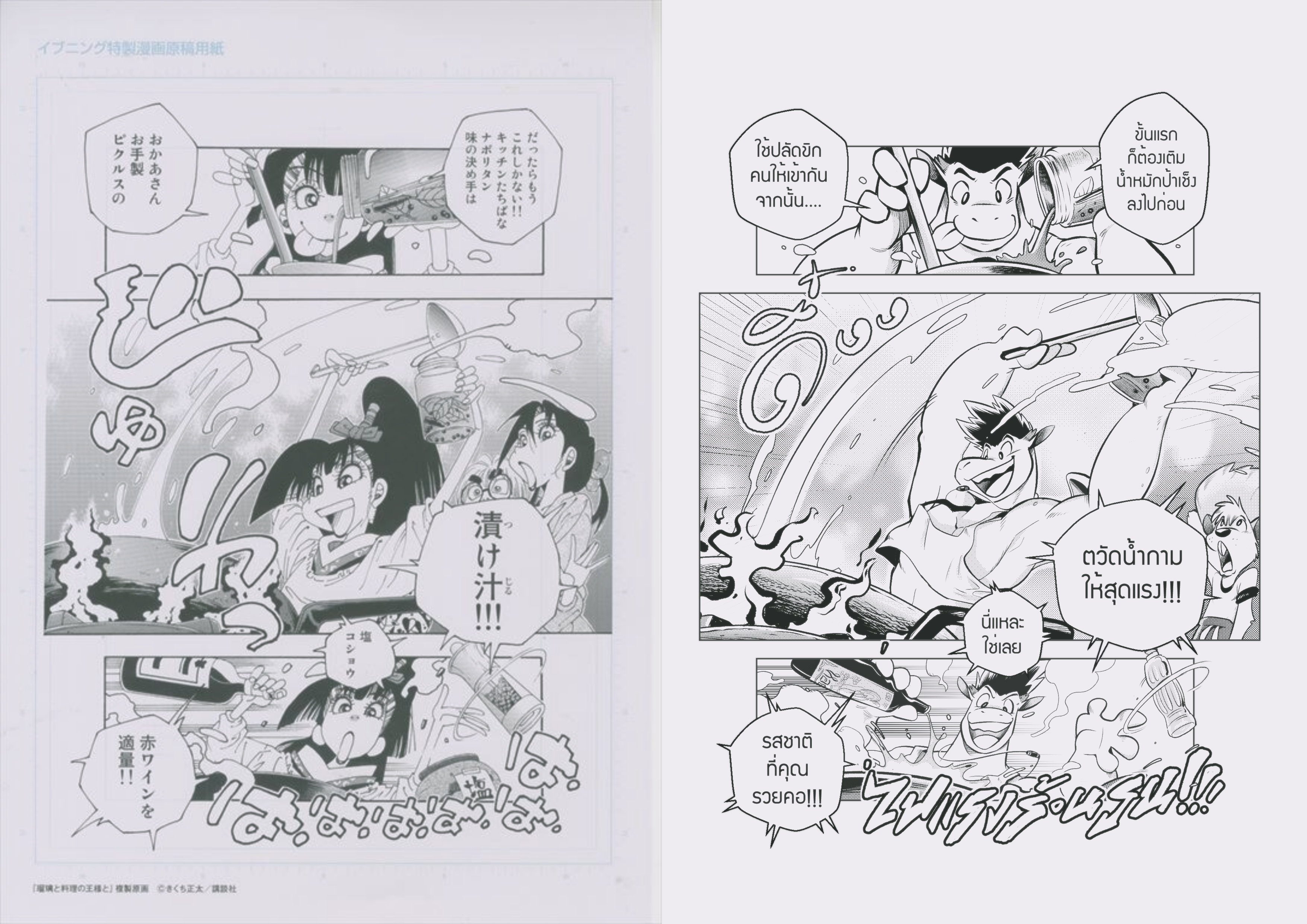
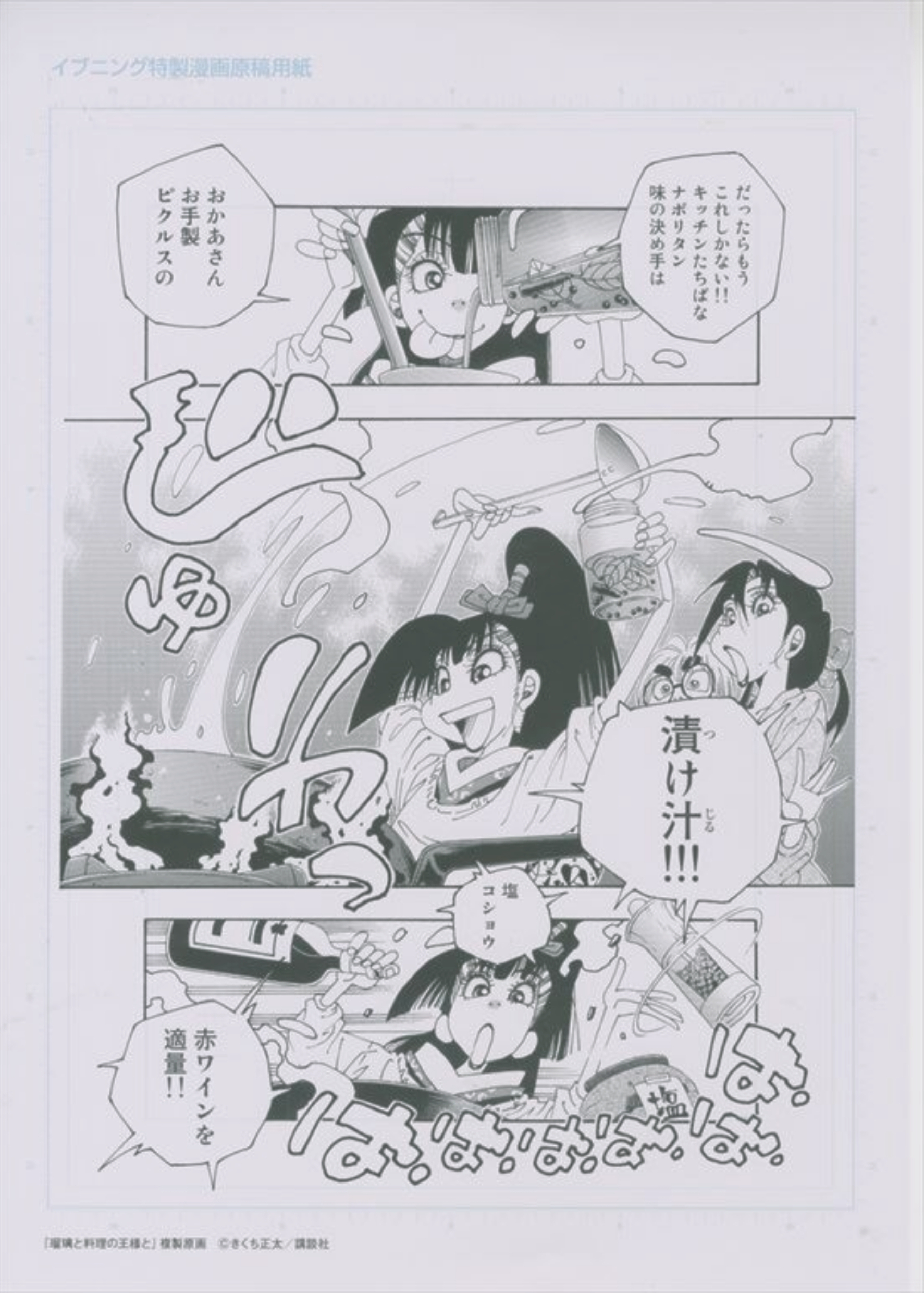
So I chose to do another practice based on one of my favorite manga artist that not really well known in the West; Shouta Kikuchi (Sanshirou², Osen, Ruri to Ryouri no Ousama to).
I read Shouta works since I remember. His works are mostly comedy with dirty jokes. Those typical pervert jokes you see a lot in 80s-90s media in Japan.
Sanshirou² was his most popular work back in the day. I love how crude the jokes are that so contrast with his beautifu line. But what make me really fall in love with his work is the feeling that he put into the story, especially the dramatic one. One page you laugh your head off but next page it made you cry out loud like that.
His latest works are manga about presenting Japanese traditonal cultures in doing thing the way they are, mostly about foods. They are pure conservative thinking XD Like, old is good, new is bad! Bleh! Stop using your phone and appreciate the blooming sakura! Never use machine in brewing beer, only human hands! Stuff like that XD I can't help but love how it represent (not the idea lol) that he make us, the reader, beleive in his world right away.
This page is from his 2013 series "Ruri to Ryouri no Ousama to" about a young girl name Ruri who have to learn herself in the world of fastfoods and poorly made foods with her tradditional cooking skills. Typical, but its so fun to read!
I wanna capture the chaotic of this page while showing the beautiful gourmet of foods and ingredients. You see, he use a lot of screen tone and text that design to match the tone of the story. Time to copy and learn!
Pls don't mind the Thai text, they are randomly written just to fill the balloon lol.
This page took me 2 hours to fin and I learned a lot from this. The layout, the eye leading and the amount of contrast to make the characters shine in these busy panels.
The ingredients are fun to draw! Beside from the panel, everything is free hand drawing. Shouta way of drawing is very loose, he use emotional lead the way his line are. That's why most of the time his characters are bending in someway but they still looks great! Very contrast to how Ryōko Kui drawn.
Good study!
Download the full images in the attachment below and feel free to comment!
Thanks for reading <3 See you in the next post!
- Piti Yindee
Files