Home
Home

 Artists
 Search
 Recent
 Random
 Posts
Posts
 DMs
DMs
 Tags
Tags
 Random
 Importer
 Import
 FAQ
FAQ
 Account
 Register
 Favorites
 Login
Login

Vis Dev & The Big Bad Burp: Ultimate 4K, Sketches and the Story Behind It! (Patreon)
Downloads
Content
Unlock the raw Clip Studio files with separate layers in PSD tier!
Download all the 4K pics in the attachement below!
Previous post about Wuffle and friends - What if...?!: CLICK

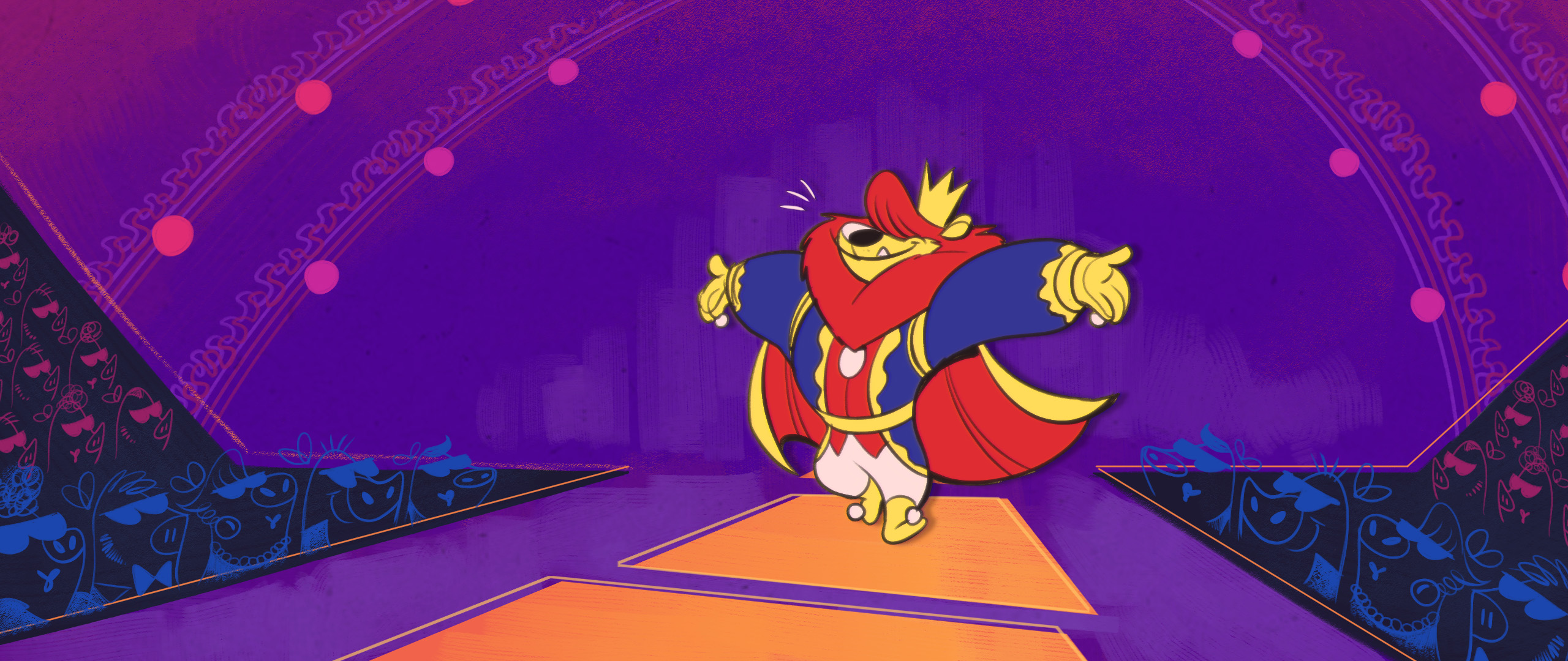
I'm back at The Emperor's New Clothes film proj and doing a visual development, aka the look and feel of the film! Plus, an illustration of our new member in Wuffle comics. Woofy, the big bad burp!
The designs are all done (see them all in monthly report here and here) and now it's time to stylizing it. After taking a break for three weeks to refreshing my POV (which is totally worked!)
I realized that, as much as I love spending time crafting it, in the end it's gonna looks like a million thing on Youtube and other channel anyway. I have to break the mold! To stylizing the design I did, into something more bold, more elegant and more personality!
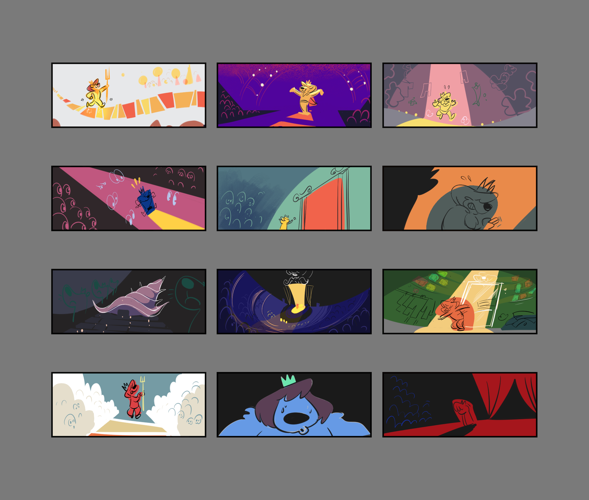
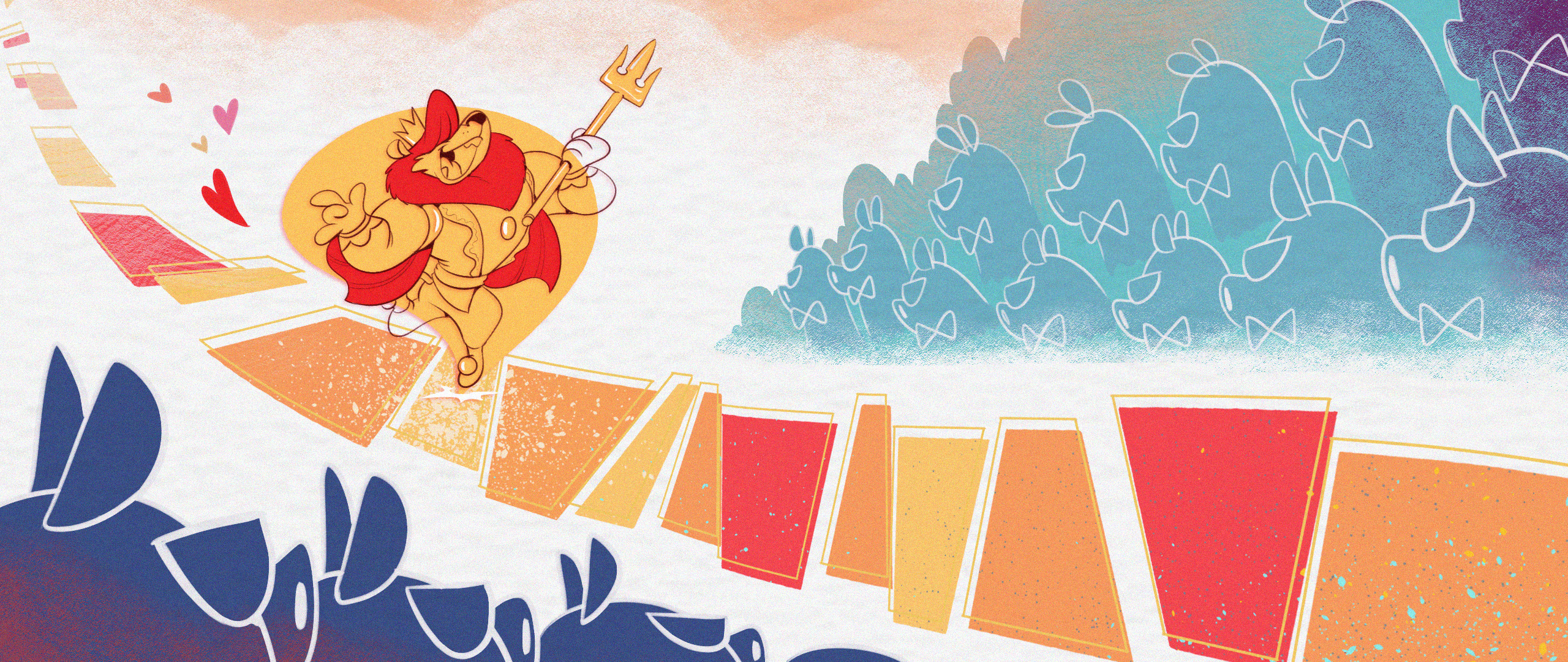
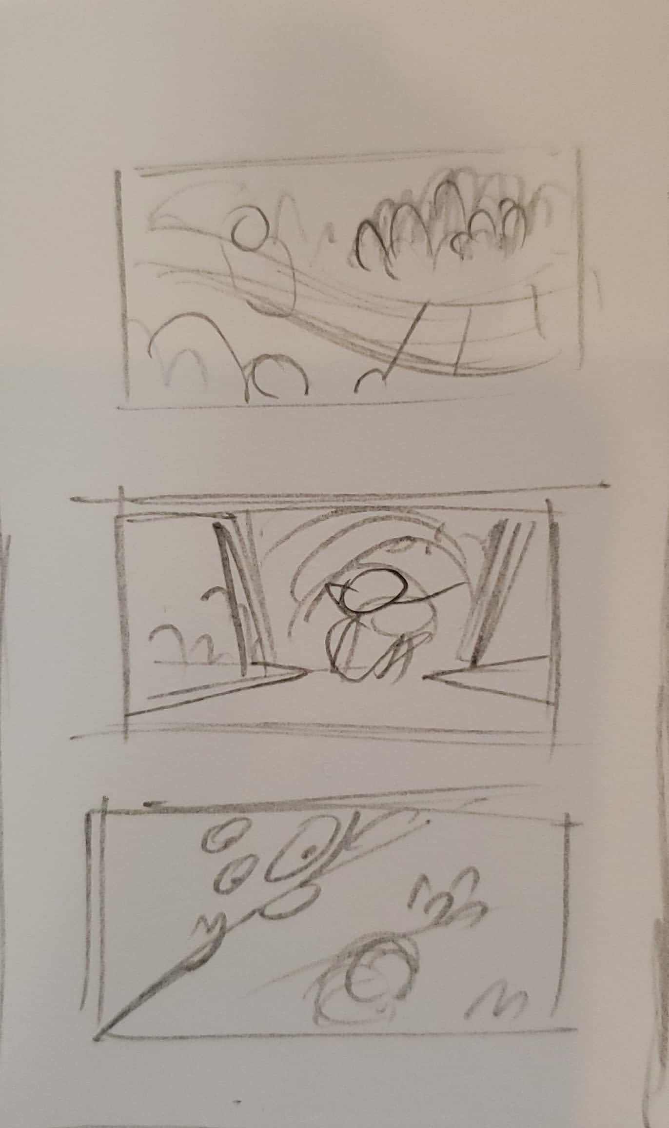
I started with painting a randomly scene in a small thumbnail just to see the feeling and the looks of it. The film will be presented in 2.35:1 aspect ratio (like in Fossils). Eventho it's a pain when it come to layouting but I just sucker for anything cinemascope XD

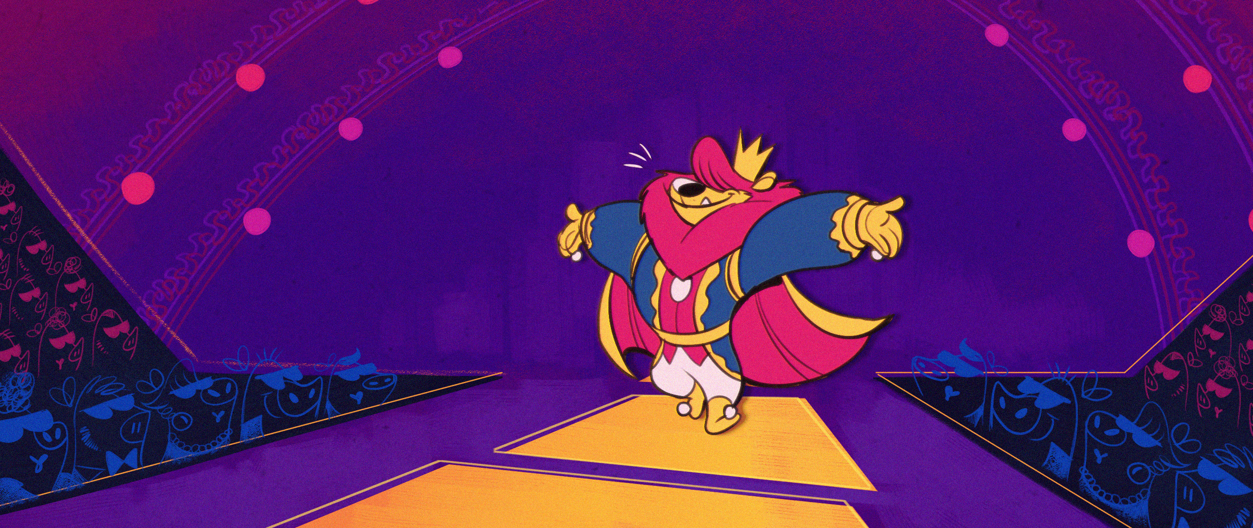
The result it's lovely! The scene above is not shown in order, nor is it a still from the film but I just wanna see the emotional and mood with the limited palette.
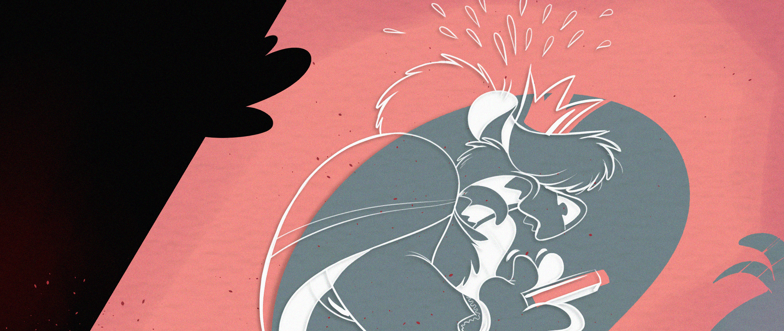
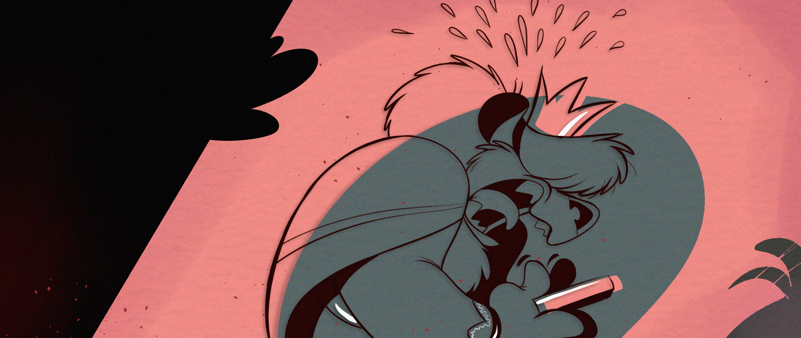
So I try painting Arthur with limited palette as well and compare it with the more traditional style.

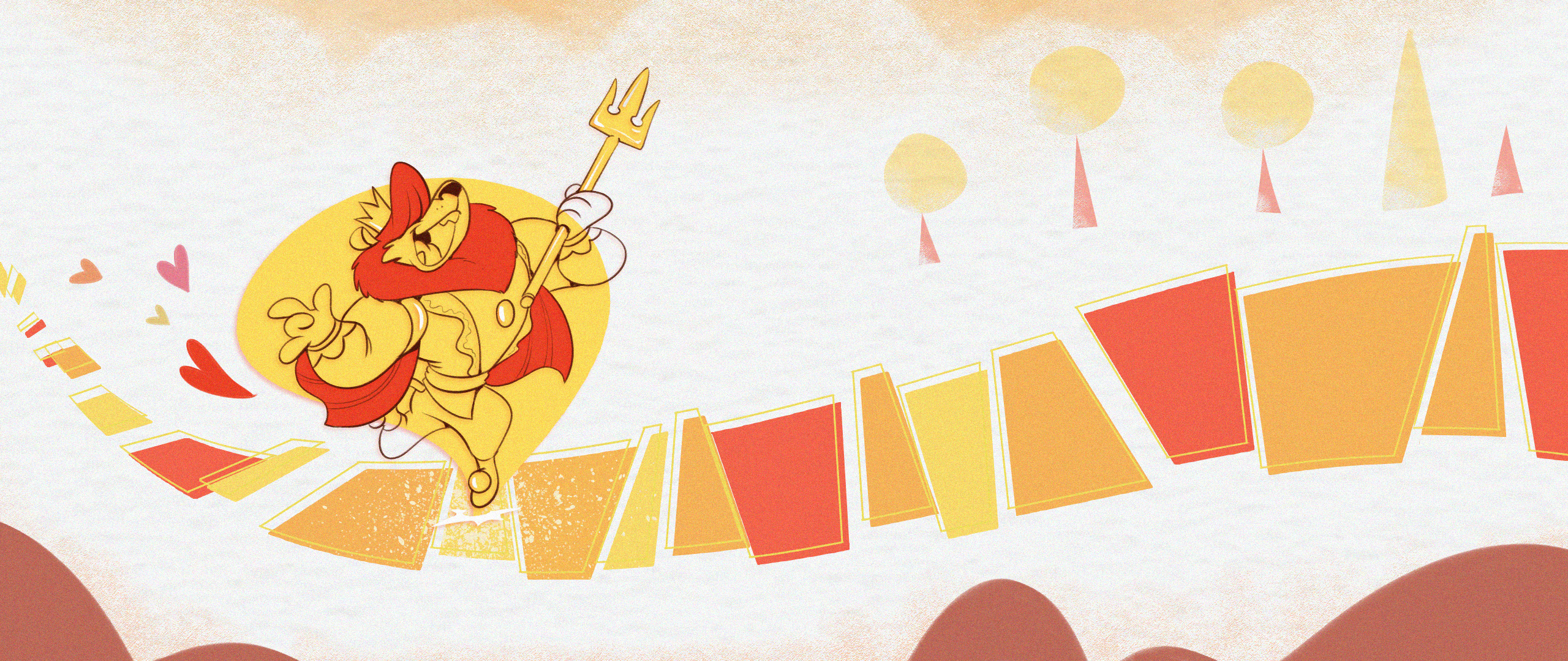
Can't tell much. I need to paint the character in full environment. So I blew up three thumbnail and did a mock up screen shot out of them.


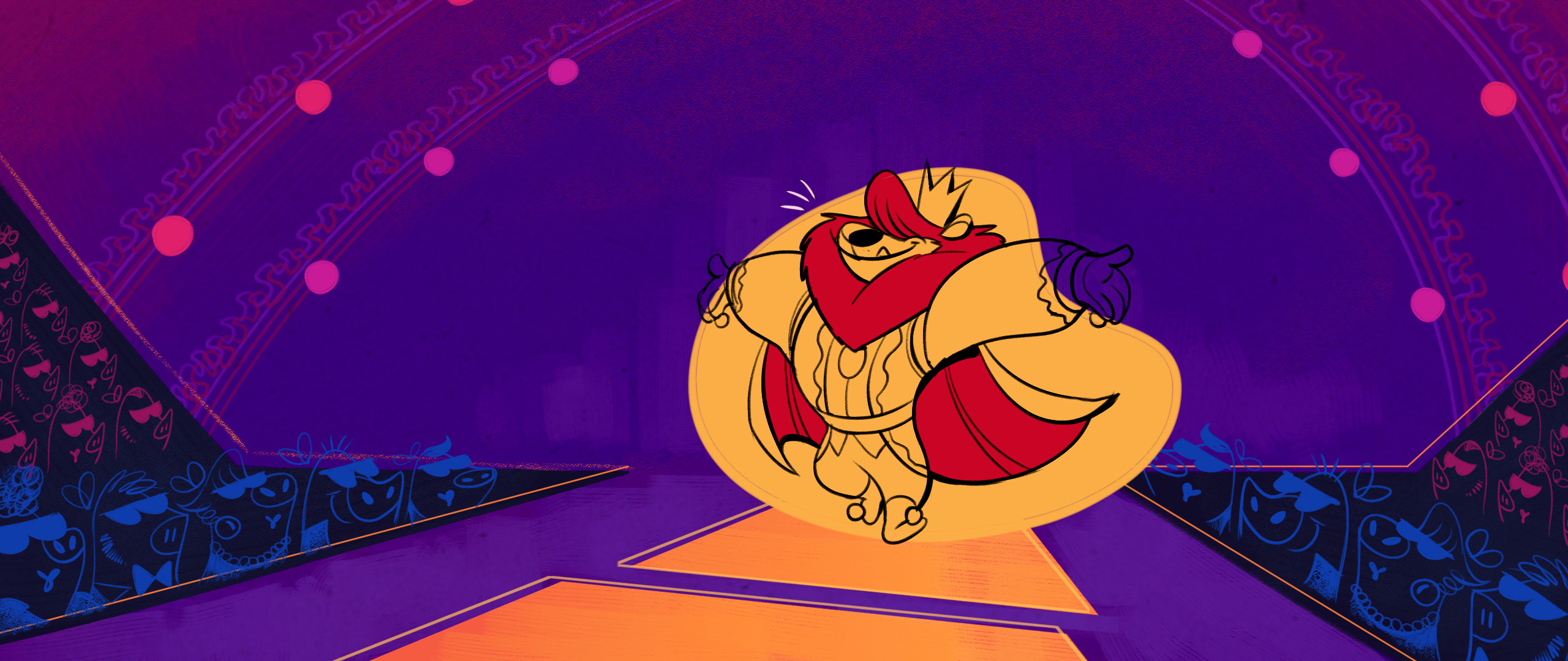
Lovely! I discovered that I don’t even have to color the characters in full color too. I can make a "color symbol shaped" as a represent the emotional and action of character like that. Make it even more stylized and faster to do too. Imagine a character line movement with animated color behind it. This is gonna be bop!
One problem: that damn wide aspect ratio! While looks good on thumbnail, I gotta readjust it again when blowing it up. Its very easy to trap into a long aspect ratio and feel like everything have to be narrow.
So I recompose it, making it more interesting. Here's the result:


Looks much better! The image looks more dimensional and less negative space now.

The first pic was not that bad, just improve some environment and color, to be more focus on Arthur instead of just vast space all around him.

This one has a negative space and a dimension problem. The original one showing the wide stadium but nothing else. No height, only width. The new composition showing the more of how tall the stadium is and more focusing on Arthur. Plus, the color is now looks more like a nightlight than previous one.
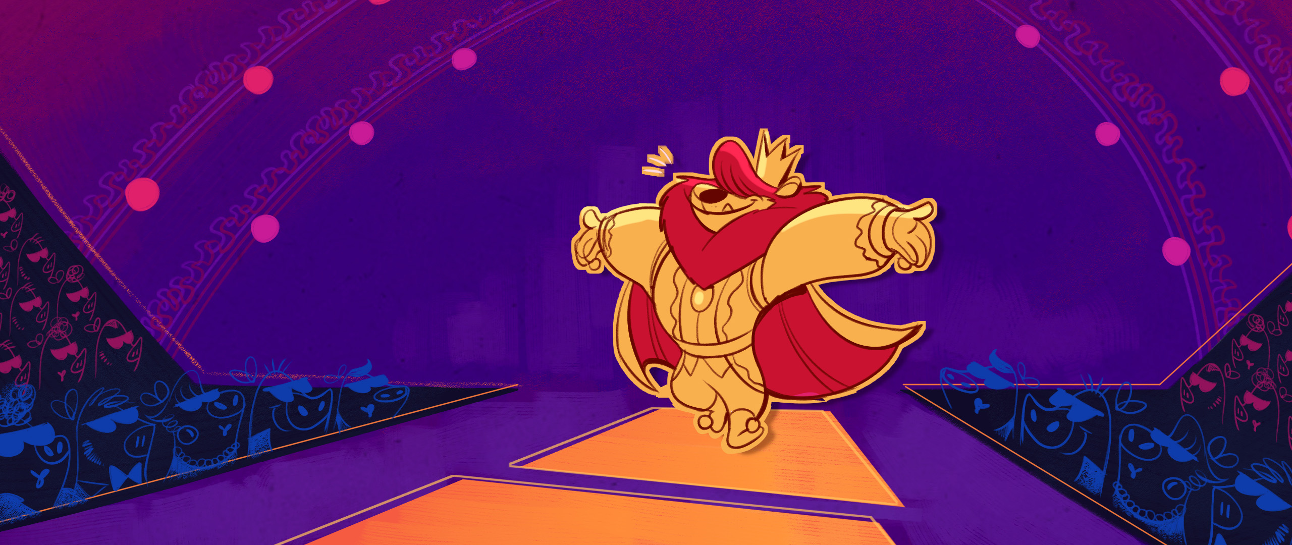
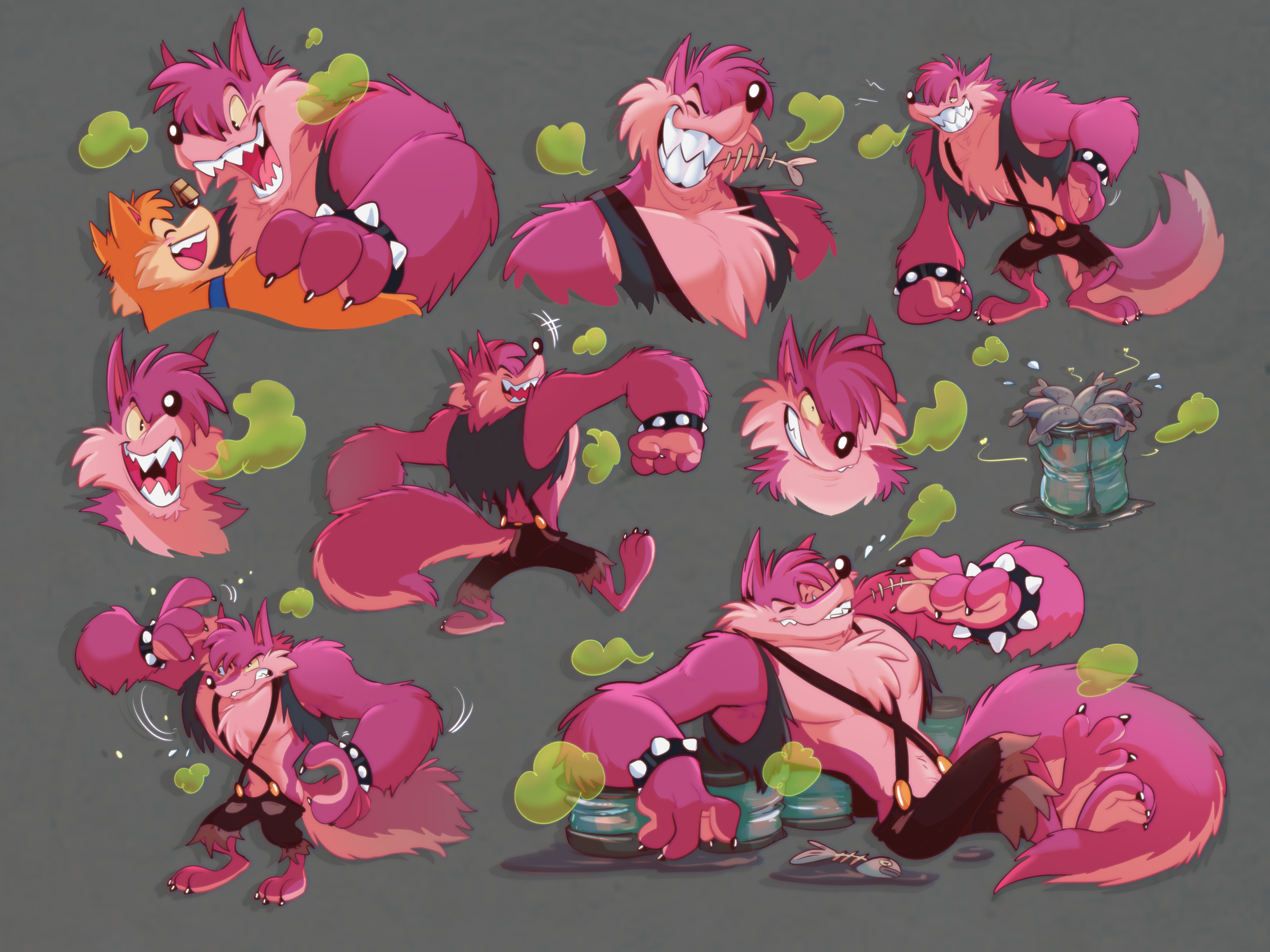
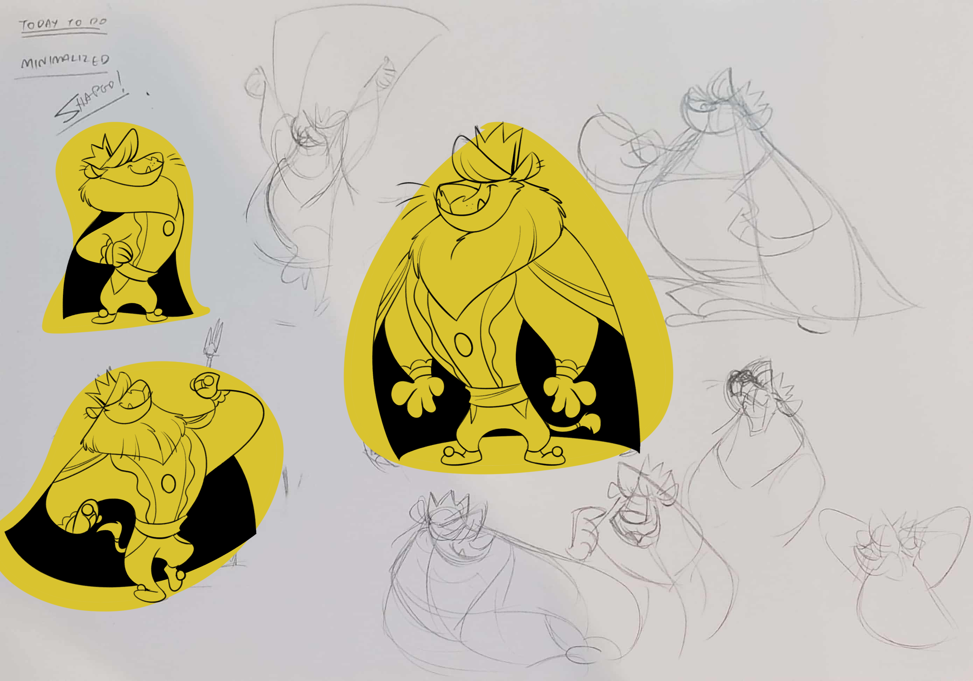
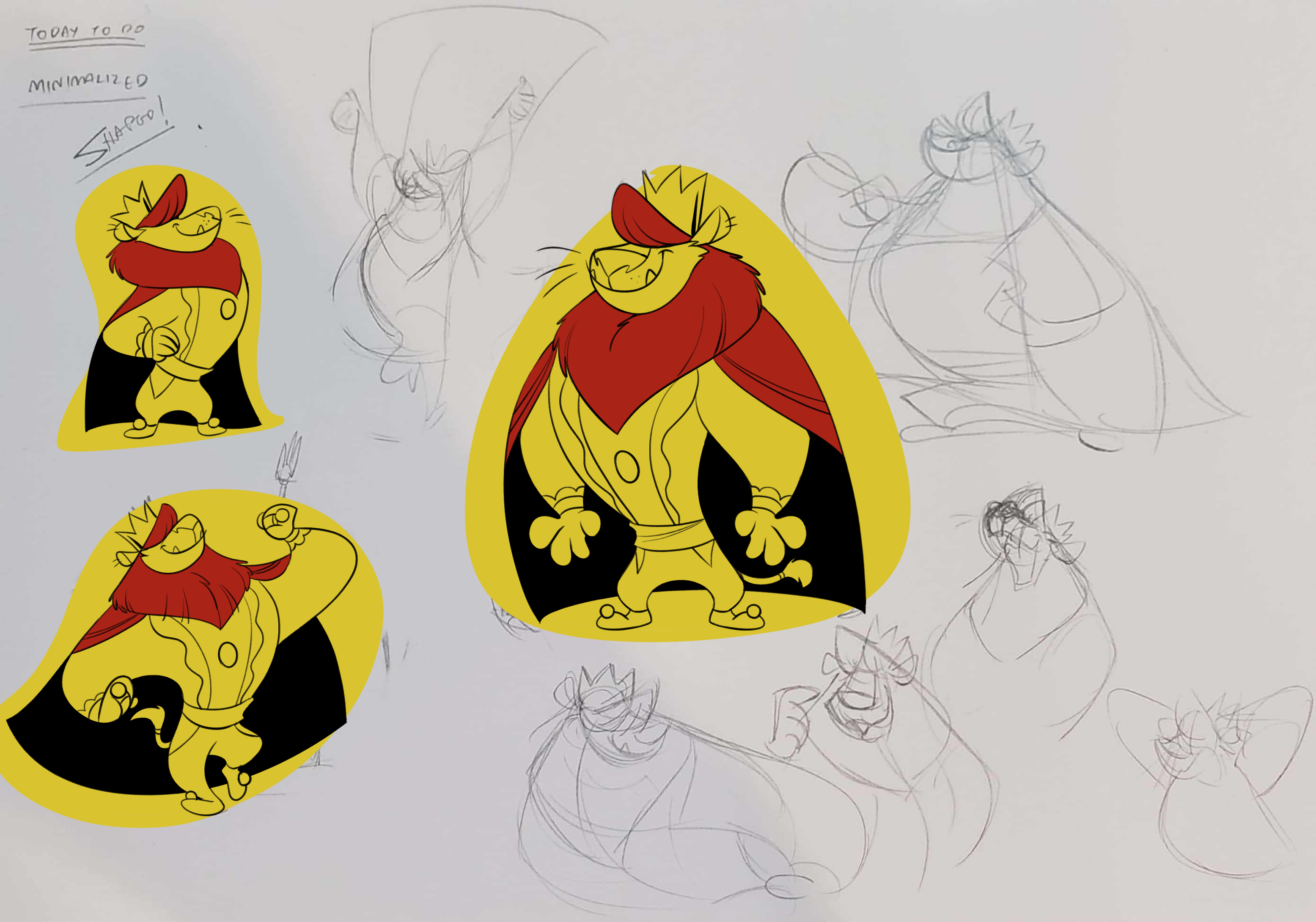
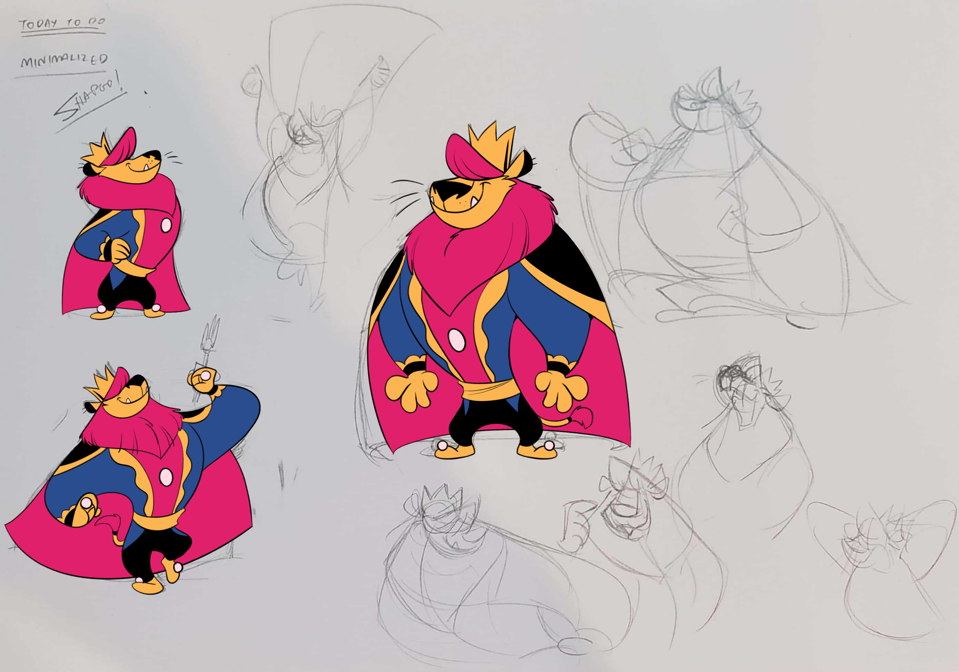
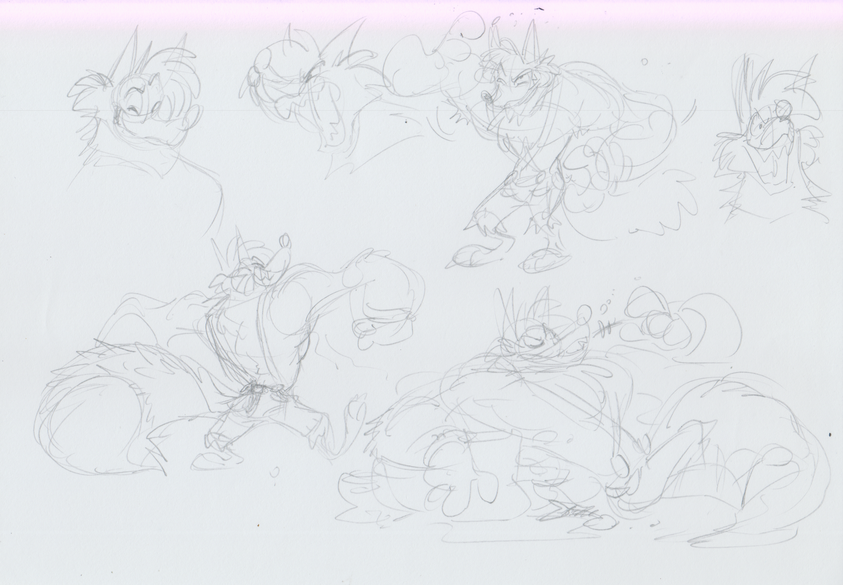
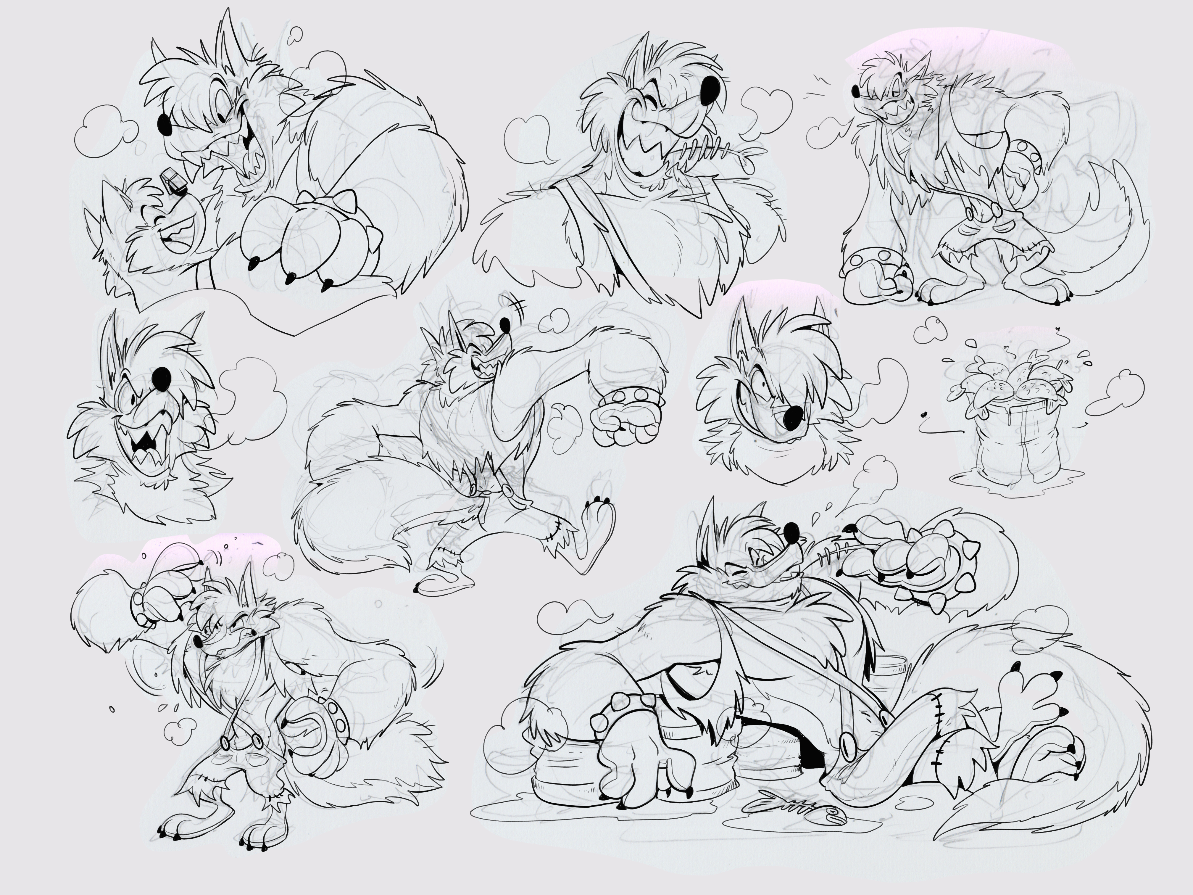
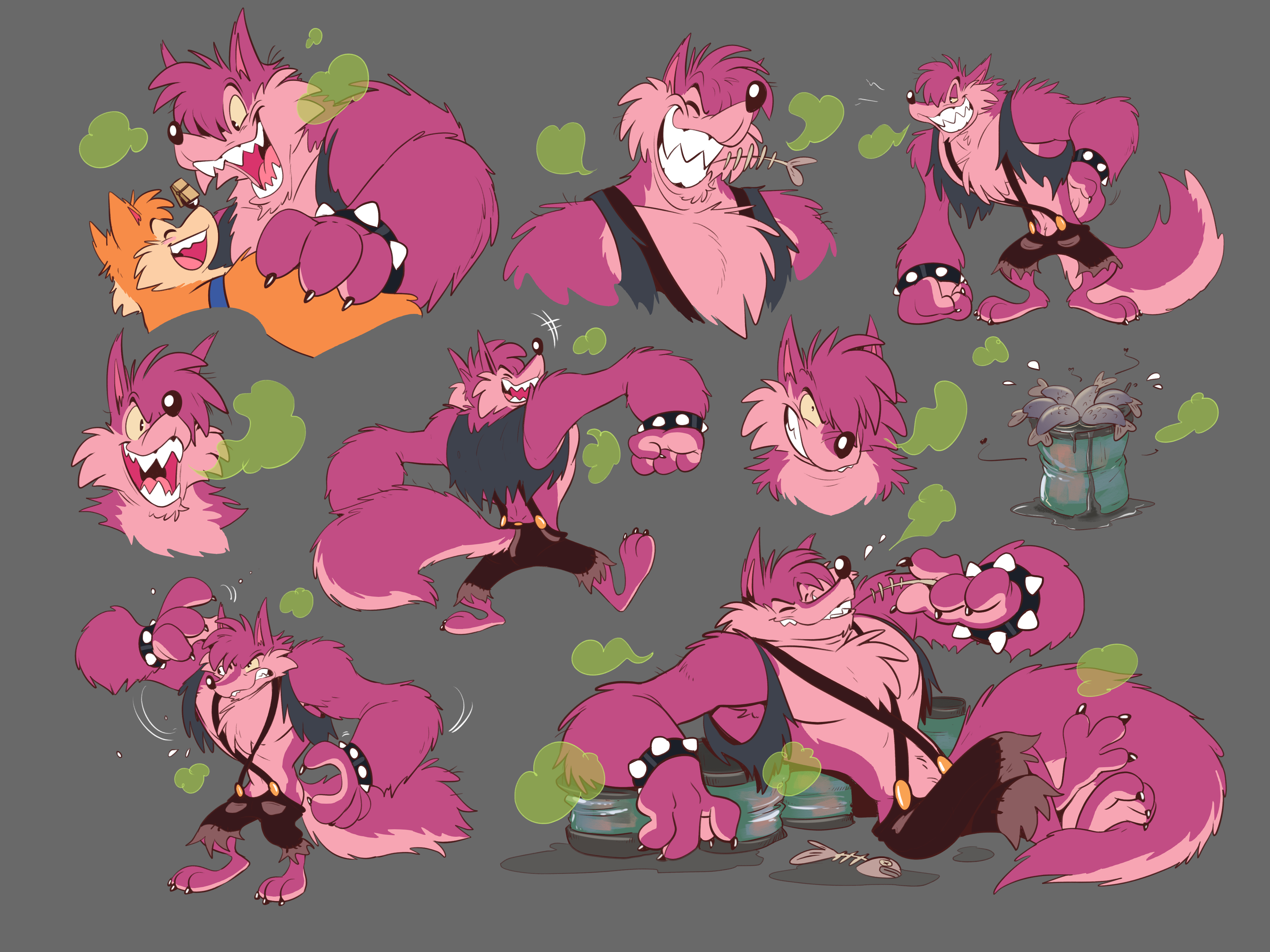
Lastly, a character concept of Wuffle's stinky cousin, Woofy, the big bad burp!

I decided that if I'm gonna come back and do more Wuffle, it have to be something special. I wanted it to be a one story comic once in a while. Like most European comic, a 40 pages, full colors comic that release one or two story per year. Something like this.


(I so wanna reach to this level of painting as well <3)
I might make another Patreon just for this alone and make it pay per update (once every 2-3 pages are done)
That's all for this weeks. Thx for reading and see you in the next update!
- Piti Yindee
Files