Status update -Vaasref (Patreon)
Content
I decided to make a post to explain the process I'm currently undergoing.
The context
Assessing the current state
First I need to explain the reason of such endeavor.
Currently to know about the availability of a scene you need to check if the option is grayed out. That system works. This action is easy to do and while you need to go into the categories the information is accessible at a glance.
It comes appart, in my opinion, when you want to know what to do to make those events accessible. Now you need to click each grayed option to have a little internal monologue telling you what's needed to unlock it. First it may not be intuitive for the player to click on a grayed out option. Second it takes quite a few clicks.
Assessing the constrains
For me keeping the gameplay inline with the content is very important. I wouldn't add a piece of GUI that don't work with the setting. For example while a display the current state of the girls training could be handy, I refused myself to display a simple number. The reason is that the MC has no mean to quantify it, he can only estimate. In that context displaying a number would clash with the setting of the game.
So the puzzle here is to give the player the right amount of information to make the gameplay enjoyable (as simple as it is). And at the same time the way it is given also needs to work with the game.
About that last concern the biggest issue is the lackluster GUI engine that Ren'Py provides. Don't get me wrong, it works, as long as you don't want to make your game interactive or ergonomic. But when you do, it's a constant struggle and bodge-fest to achieve your desired result.
The response
Why now ?
With the rework of Francesca and thus of the sexshop, for me it was the right time to act. To have a useful sexshop the various sextoys needed to be added in the requirements of the scenes.
That would mean adding yet more reasons to why a scene is locked. Aggravating the state of the display of those requirements. Now grinding mindlessly wouldn't cut it anymore.
Getting the idea
For me getting the idea is an important step. It is easy to roll with the first idea you get. But I need to feel like it's the good idea, and it seems that I have pretty high standard as I can spend a few month to get set on one.
On top of having to give information to the player about the availability of a scene, our end is also starting to be an issue. The code for only the menus is getting really long and hard to maintain. So I decided to kill two bird in one stone. I would create a system that would allow me to easily check is an event is available. I would also use that system to give the player the information they need.
It took some time to be set on how making it, around a full month. I also had to learn a few new tricks. But I'm quite happy with my plan now.
Redesigning the UI
Now that I have figured out the extend of the change in the back-end, I need to design a UI.
I'm not an ergonomist nor a GUI designer. That doesn't mean I don't try to make it look and feel good. But that task is not as easy for me as I would like, given the importance I give it.
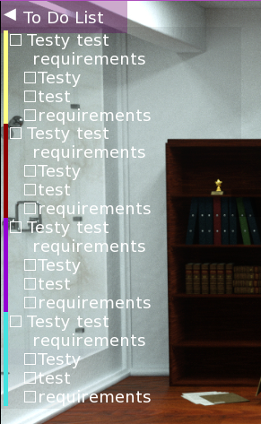
<figure> Prototyping a requirement list</figure>
So I tried. I initially went for a requirement list.
It was barely "ok" for me. I would say bare minium in term of coherence with the game. The MC is a scientist, it's probable he likes lists, not as much as a commercial airplane pilot but still.
When it came appart was the implementation. Doing that kind of thing with Ren'Py is a nightmare. When you try to achieve a very precise vision of a piece of GUI you will encounter a massive issue. That issue will either be impossible to get around or at least tediously hard.
For those that ever dealt with CSS styling and consider it horrible, Ren'Py GUI is grimdark compared to it.
I may scrap that GUI or more probably keep it for later. But what I show you is not working, due to one of those Ren'Py's jolly quirky bug.
I have a much simpler maybe elegant idea I need to test before making a decision. As I said I'm still working on it, and just laying out the situation in that article made me think of it.
Back to work
So here is the situation and what was going on behind the curtain on my end.
I may make a follow up article, but I wouldn't bet on it. The result of will be included in the next update. So it would only be for the sake of the adult game creators community. We will see if it is interesting enough to make another article about it.
That is all for now.
-Vaasref
