Dreary Dungeon, Adept (Patreon)
Downloads
Content
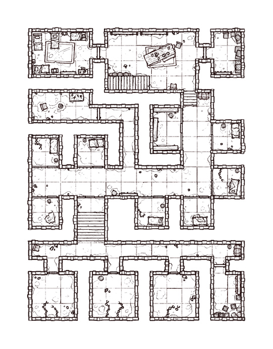
Hello Adepts, this week's map is the Dreary Dungeon (18x23), a compact complex of cells with enough space for your law-breaking party to spend a few nights and think about what they did. Your extra version of this one is a somewhat subdued version, which I'm calling 'Grim'. Rather, it's one where I've recolored it to have a less colorful and more typical dungeon-y palette, since I figured my grimy subterranean green version might not be appropriate for many settings. I think no one can complain about this version though, with darker, more warlike feel could likely slot into most settings, though I doubt anyone would say it's particularly exciting to look at.

1. I've kicked around layouts for a small jail complex for a few months, though I've never been happy with their utilitarian layouts. I know that's kinda the idea for a dungeon like this, but I'd rather design something more exciting than a typical jail. This layout is what I eventually ended up with, a little twisty with a few corners to block line of sight, and a clear divide in security when you reach the southern portion, where the cells change to large and empty rooms with chains and manacles instead of beds.
The only thing I'm not a big fan of is how linear the design is, with no circular routes or alternate paths for players to cut through. I suppose you could say that that design makes this a better jail, but it would have made for a more interesting location I think.

2. As much as I love reusing old brick walls, I wanted to try something a little different here. I see other mapmakers drawing their brick walls with a flatter side which faces the inside of the rooms and a more uneven side which faces outward. I think this is a nice effect which spices up the otherwise plain walls, and gives a little more depth to them as well, in exchange for making me keep track of the two sides while placing them, which isn't that much more work really. I think I might try this again with a later map, but with a more exaggerated outer side, since the effect turned out to be less pronounced than I expected.

3. I don't think I ever really decided to go green with this map, it just kinda happened while I was shading. I think I originally was planning for something more in line with the the 'Arena of the Globetrotter' April fools dungeon I made last year, but somewhere along the line I kept getting more and more green, probably in a gradual attempt to make things feel a little more grimy. In hindsight, I probably should have backed off a bit, but it's not a terrible effect- the only problem is I know someone out there is going to be messaging me with complaints, which will make me sad for a second.
Also, I wanted to play around with placing actual light sources for once! I thought that the shading would be much more dynamic with sconces placed at key locations, especially with the shadows from the cells' bars helping to express the 3D space. That was a fun thought until I got to actually painting those shadows, at which point I cursed my ambition and got to work. It wasn't that bad really, just annoying and time consuming compared to my usual crunchy dungeon shadows.

