Home
Home

 Artists
 Search
 Recent
 Random
 Posts
Posts
 DMs
DMs
 Tags
Tags
 Random
 Importer
 Import
 FAQ
FAQ
 Account
 Register
 Favorites
 Login
Login

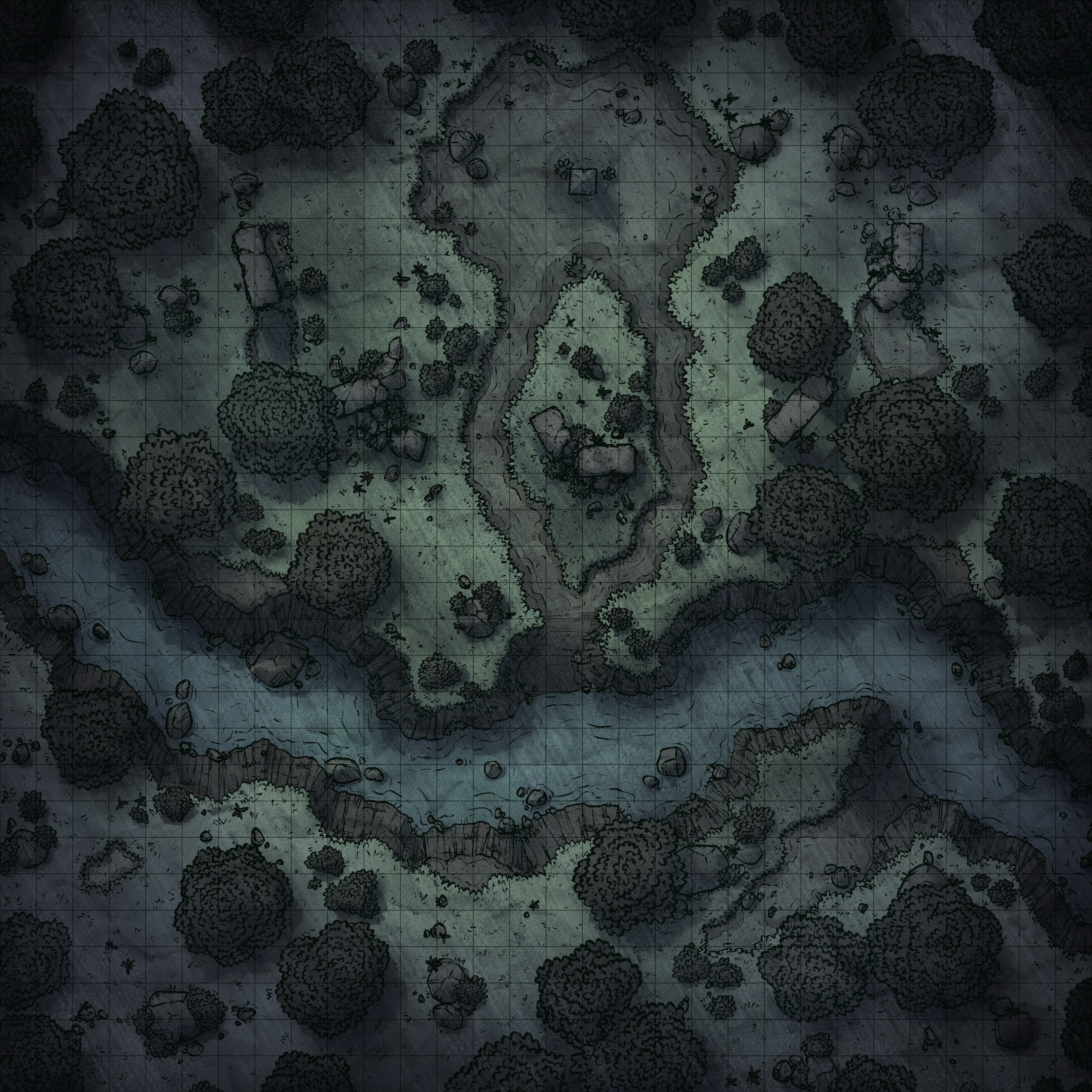
Stormy Ancient Altar, Adept & Expert (Patreon)
Downloads
Content
Hey there Adepts & Experts! This time around I've got a couple alternate maps for you: the stormy version you see above, as well as the day and night versions with a dry river bed. Truth be told I originally made the map without water at all, but about 2 hours before I planned on posting it I wanted to try it out with a stream in the trench. Turns out I think it works better as the regular version of the map, and I had a very frantic couple of hours as I whipped it into shape. Either way, you folks are the winners here because you get 2 extra versions of the map!
So, normally I start this section of these posts with a picture of my rough sketch, but since this map started life as a commissioned alternate map of the Curse of Strahd's 'Yester Hill', I didn't actually have too much planned when I started adapting it to what it is now. Several of the pieces of that map were the basis for this one, and with some cutting, redrawing, new trees and bushes, and a change of palette to something more my speed, it's looking pretty nice in it's new life!

2. I tried out a couple new things along the way as far as outlines are concerned. I used a slightly larger brush for the trees than I normally do, and just the trees. My thinking was that it would help the illusion of height, making them seems like they're somewhat nearer to the viewer then anything else, seeing as they're the tallest things in the map. Additionally this help differentiate them from bushes and the grass's outlines, which admittedly are very similar in appearance when uncolored.
I also tried to skimp slightly more with the grass's details. Not their outlines, but the small lines and hash marks further away from the grass's edges. I've started to feel that I usually overdo these details, drawing more attention to them than necessary when all that's needed are a few lines here and there, randomly placed. What's important is that it gets across the feel of grass, so the level of detail I've used here should do the job without catching the eye more than necessary.

3. As I mentioned, the water was a pretty late addition to this one. Adding it didn't take too much work, I swapped the brown for blue, removed the less water-like lines, and cut many of the smaller rocks I had placed around. Looking back at it now, I think I overdid the vibrant blue I used, something more subtle would fit somewhat better, but I've found that people enjoy brighter colors in my maps so it will probably be more appealing in the long run.
Other than that the palette I used is more or less the same as my Roadside Clearing map with minor changes to make it a little less exuberant. For example, compared to Roadside Clearing I've colored the trees and bushes to be somewhat more grass-colored, I've made the rocks and dirt a little more brown as opposed to gray and yellow, and I've tinted the entire map very very slightly blue which I think should help tie it all together. I'm not sure I'm happy with it yet, but I'm certainly not done tweaking the minor details ;)
Files