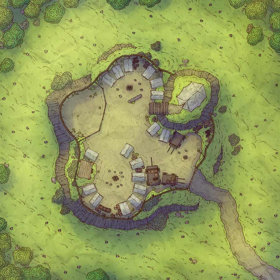
Forest Outcropping, Adept & Expert (Patreon)
Downloads
Content
Hey there Patrons, this week's map is the alternate version of the Big Camp, just minus all the camp stuff. I think this will make for a nice template, the central hill is big enough to fit all kinds of things. But anyway, let's talk about the making of this map!

1. I had a couple of ideas in mind when starting this one, but as always I ended up with the most versatile layout. Hills in the middle of fields aren't the most interesting, but it's a reasonable place to pitch a defendable camp (I would think) and can be easily slotted into most campaigns. This is something I've been a little concerned about with my mountainous maps, as they might not be very handy for the average DM.
When drawing camps, I like to give them a somewhat strong position, but with clear flaws or faults. This one is set up on a hill, is fortified with a palisade, and they even cleared the field around the camp! However, they didn't set up many positions to attack from within the palisade and they didn't build the palisade to encompass the hilltop, which can probably be fairly easily scaled. I'm sure they felt very smart as they built this camp, but a large force (or a crack team of adventurers) would likely make quick work of it with a little planning.

2. This is my biggest map yet, which is unfortunate as I've been pretty short on time this week, but I hope I did it justice. People have mentioned before that they would like my maps to be a bit bigger (especially when tactics are required) so that their players will have more to work with. With a somewhat fortified hilltop camp, I felt that I would be doing it an injustice if I kept it around 30x30 as I normally do. Anyway, this one came down to the wire (for my own self-inflicted deadlines), but I'm looking forward to getting back to my normal pace next week.
I don't think there's much to talk about this time, I drew this one without rocking the boat. I've drawn a lot of wagons at this point and tents will always look like tents.

4. I don't know, I couldn't settle on a color palette I liked for this map. I wanted to do something more exciting, but keeping it reasonable was a struggle. I really enjoyed the look of last week's night version, so I noted what worked and did it again this week! Definitely an improvement, so check it out.

