Home
Home

 Artists
 Search
 Recent
 Random
 Posts
Posts
 DMs
DMs
 Tags
Tags
 Random
 Importer
 Import
 FAQ
FAQ
 Account
 Register
 Favorites
 Login
Login

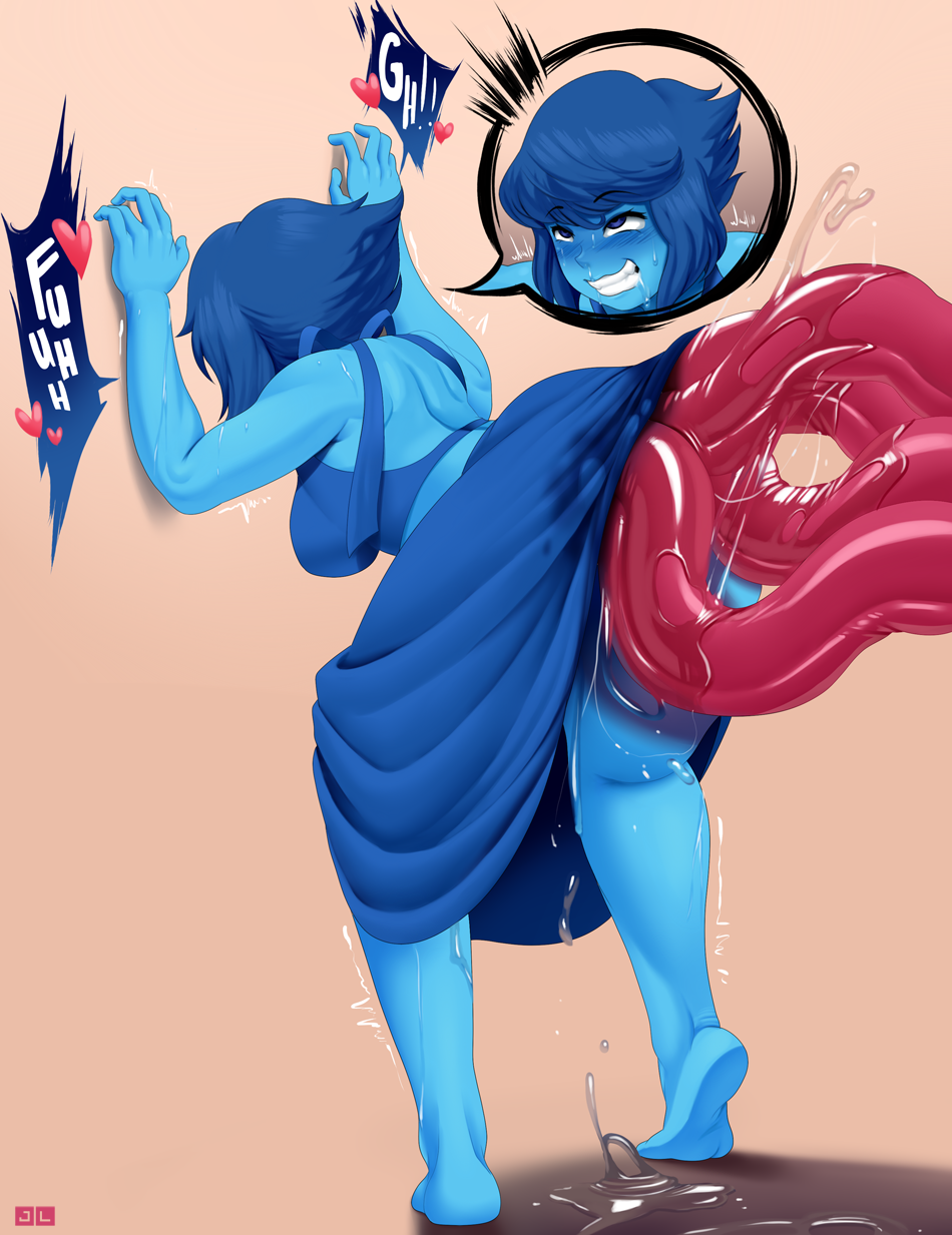
Lapis Lazuli 1 (Patreon)
Content
FOR $10 SUPPORTERS, LAST DAY TO VOTE!
sorry for taking a while on this one! i was experiementing a bit with no necessarily new methods, but new presets. I've mentioned beforehand that i was trying to find a better way to blend my shades/highlights and the only way to do that was merge the base colors for more control on the colors. However i discovered something called DPI/PPI when finding ways to make the blending more efficient by changing it from 72 to 300. I know it affects the resolution or something when printing but i actually don't know if it actually does help with the canvas itself x) from testing it however, i felt more control but that could be of course my brain tricking me into believing it lol when nothing has changed at all.
Another test i tried doing was providing more color theory to my pictures. In this piece, since i knew Lapis was going to be a strong set of blue colors, i had to avoid some monochromatic sets. i tried complementary which looked good, however the colors were too strong to focus on lapis. So at the end, i went with compound colors with some desaturations of course to contrast with how saturated Lapis' color palette is. I personally liked how the colors turned out, especially since i have trouble with characters with an extreme color saturation to them. Anywho, i'll start working on part 2 of this ASAP! a bit of all the way through action for it ;D
Files