Home
Home

 Artists
 Search
 Recent
 Random
 Posts
Posts
 DMs
DMs
 Tags
Tags
 Random
 Importer
 Import
 FAQ
FAQ
 Account
 Register
 Favorites
 Login
Login

More Experimental UI Testing for HoHH (Patreon)
Downloads
Content
I'm about to give myself another crash course in CSS, this time looking at media queries to work out an appropriate display for House of Hellish Harlots on mobile devices.
Before then I should check that HoHH is displaying correctly on desktop, laptop, and possibly also tablets (with horizontal layout).
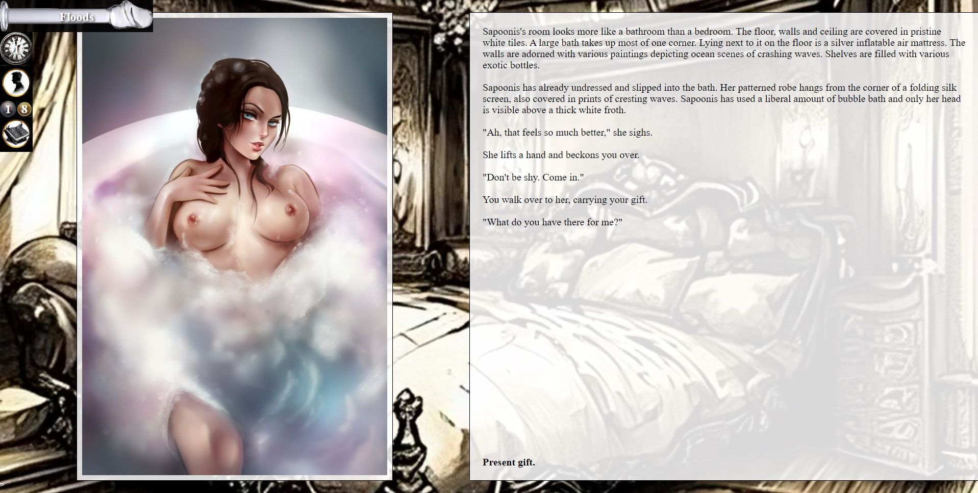
If you unzip and run the .html file I've attached and play around with the demo, the screen should look something like above. The player control panel is a fixed size and pinned to the top left corner. The art is on the left, text on the right. If it doesn't, let me know in the comments below.
It's important that the .html file is run from the folder it's in, otherwise it won't find the art in the "images" folder. I have heard that some permission settings can prevent browsers from displaying images from a local source (from a folder on the device rather than over the internet), which might be another reason why art doesn't show up. I still need to do some research here to figure out what settings it is and whether it is a potential problem, so if it happens to you, let me know and give details of what browser you're using.
If the screen width is too small (as it would be for mobile devices), the display will get messed up with the pic over the text.
The next demo will look at getting better control of that. The control panel will stay where it is. Everything else will centre-aligned and stacked in the order of:
Portrait -> Text -> Harlot art.
Before I get to that, I want to make sure everything is fine for wider-screen devices. So, if you play HoHH on laptop/desktop/tablet, give the following experimental demo a look and let me know if it looks radically different than the image above.
Files