Home
Home

 Artists
 Search
 Recent
 Random
 Posts
Posts
 DMs
DMs
 Tags
Tags
 Random
 Importer
 Import
 FAQ
FAQ
 Account
 Register
 Favorites
 Login
Login

Still working on those covers (Patreon)
Published:
2022-01-11 20:10:49
Imported:
2024-02
Content
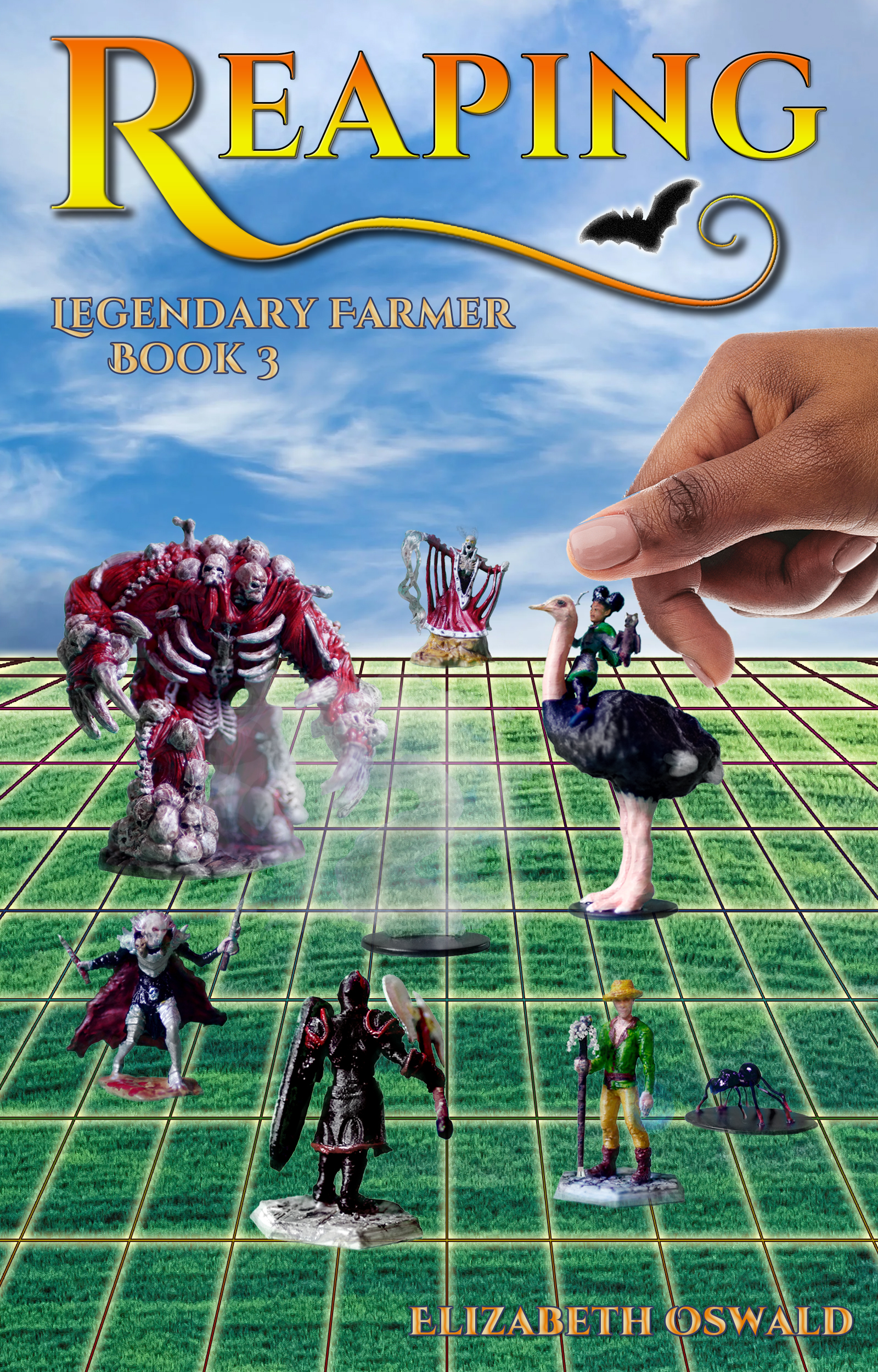
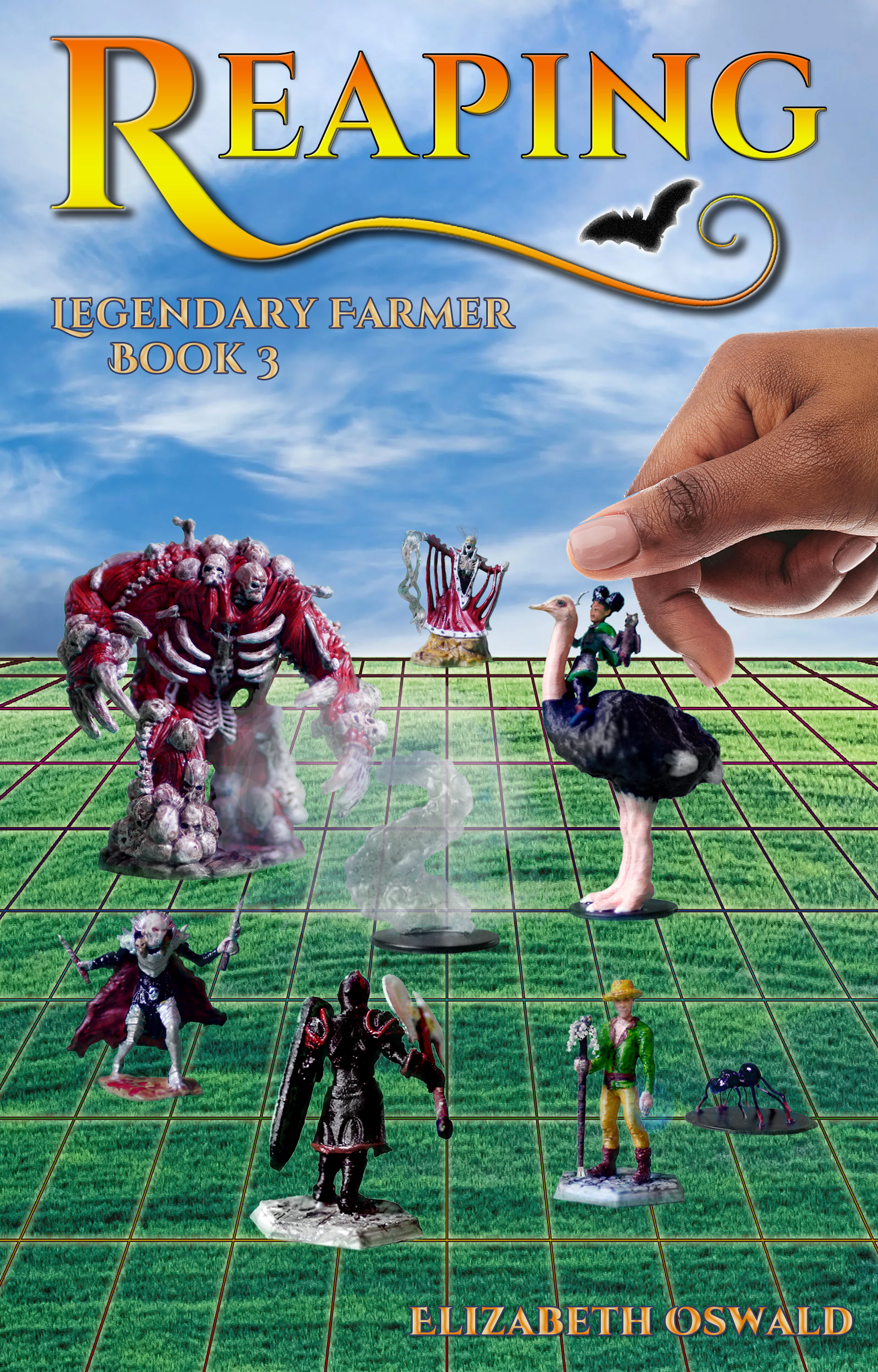
It's like when the edge of the label on your bottle peels up. You just can't stop picking at it until the whole thing is in shreds on the table in front of you.
Or maybe that's just me.
ANYway, here's another attempt at the cover for book three. Still the same idea, but more video-game looking, rather than table-top game looking. What do you think? Better? Worse?
Files