Home Artists Posts Import Register

Content

Time flies and January almost comes to a close again. The development of the new scenes is going well, but this week I would like to share something I have been working on slowly during the past updates.

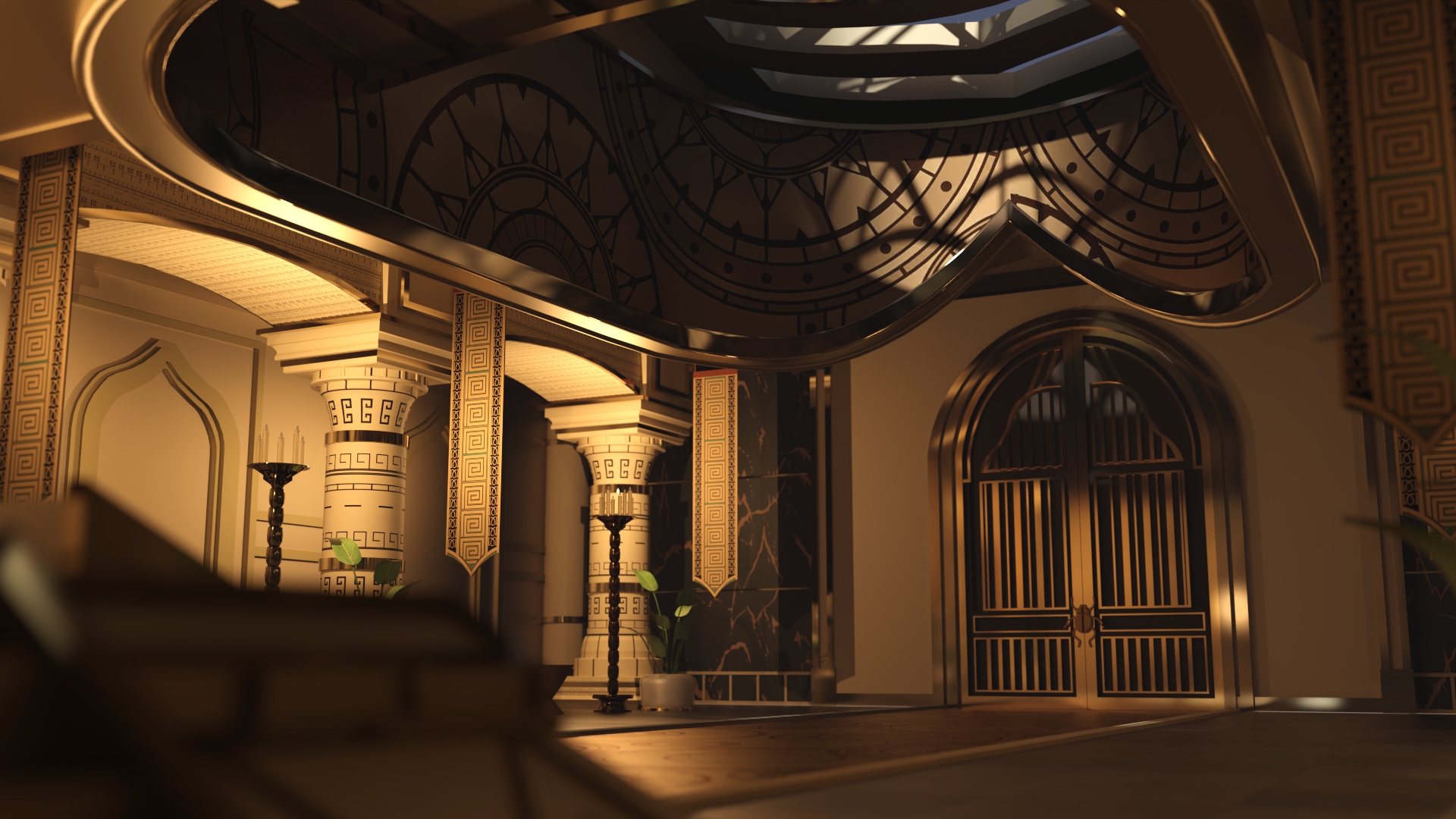
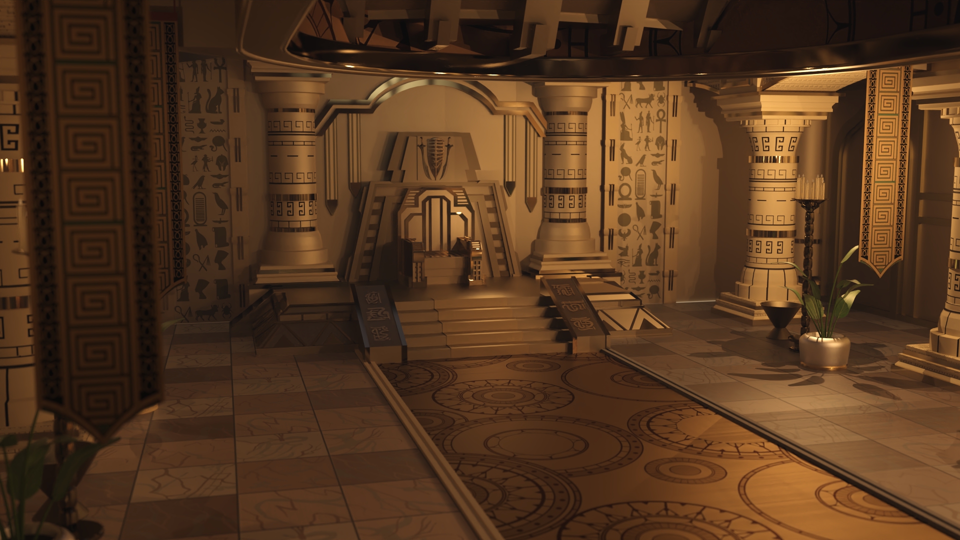
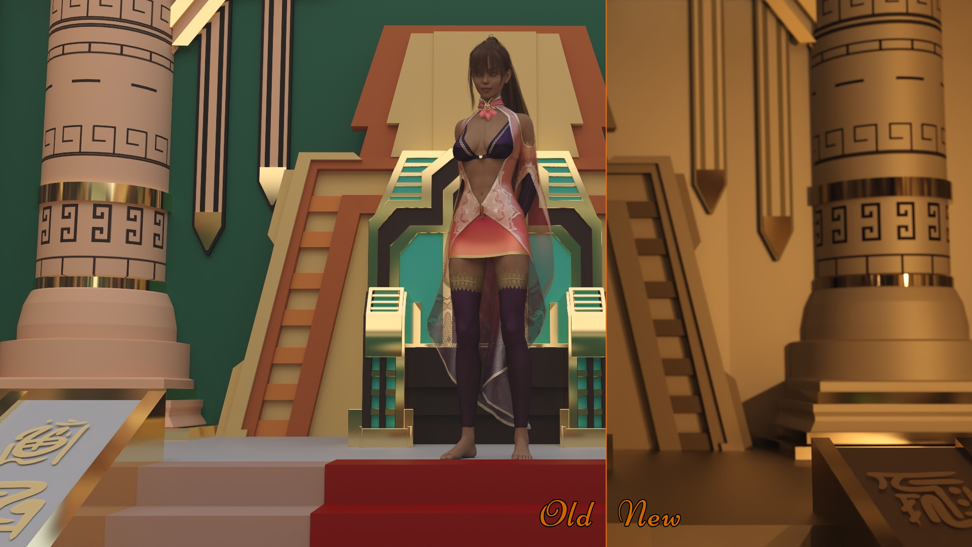
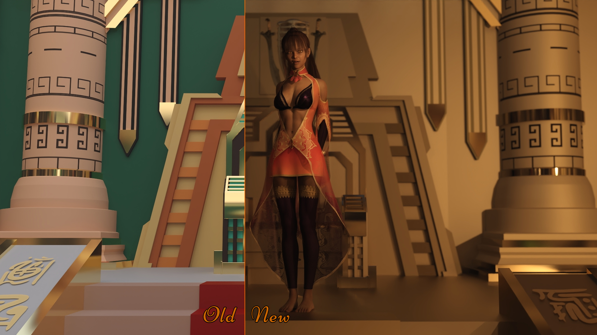
The Queen's palace always looked weird and flat and the backdrop felt as if Willy Wonka had puked colours on a child's design. Back then however, I didn't have the knowledge to turn existing props into something better. Now, since every update so far had at least one little scene that got a rework, this time around, rework will be focused on the Queen's palace.

Since we not only visited the Queen twice in her throne room but also will do again in the future, I decided to give the room a tune-up fitting for a Queen that is celebrated with a godlike status in a city that has been accumulating wealth for 400 years. Gold, gleam and glitter feels appropriate for a young girl who was raised to become the single most powerful person in Zeta, further underscoring the immense divide between the wealth and stability achieved by Zeta compared to the rival cities and settlements in the region.

In other news, the results are in on the polls about the music settings, and I am happy to see that it supports and my efforts in trying to find the right tunes for every update!

Until next week!

Progress:
Kitchen scenes: 80%
(More to follow...)

Files

Comments

RMZ

That looks AWESOME 😍

OZ

Great upgrade! lookin really nice!

Nayer

Oh my god! Tha's look really amazing! 🤩🤩🤩🤩

Anonymous

Great work! But, hmm, the lighting feels a bit surreal. There seems to be daylight coming through the opening in the roof, but the candle light seems to outshine it. I mean Cairo lies on a pretty sunny latitude and I loved how everything in the game that wasn't either in a basement or at night reflected this strong light. Can you perhaps make a brighter daytime version of her throne room too?

Desert Stalker

Good point, thanks for the feedback. As you can see the sun in this scene is indeed shining in, but from an angle that would suggest it's more in the afternoon. For other scenes I could indeed go for a more midday thing where the light shines directly from the top, which doesn't look bad either. However the area where light comes in is quite small compared to the rest of the room, which is why I had to turn up the candles. In the end it's always a style vs realism thing.

Anonymous

Palace looks good...The queen...looks like she's aged. Maybe it's just the lighting.

Desert Stalker

I did not change the model at all, so yes that's just the lighting. Tone of body is also more defined because before it was flat lighting.

Rebelyon

We need more Queen but without clothes.... 🤓

Nayer

Yeah i think its for the shadows in the expretion lines around the mouth.

Raz

We need a more submissive queen...😏😏

Anonymous

this might have been a bit of an over-correction. now the throne room looks a bit deserted (no pun intended)

Starfish

Great improvement. Worth the effort. <3

Anonymous

I like it. It looks luxurious but with the lightning - more dark than you would expect for a throne room at the same time. Which fits the queen really good as far as we know her till now.

Da Salty One

Really looking forward to the update where we will make her fully submit to us. One of my fave fantasy's is to take a powerful and stuck up women and make her into my personal plaything. Keep up the great work and like the new look of the palace personally.

Desert Stalker

Yeah, I wanted the "tomb" aspect to be in the center too. As nice as bright rooms are, the Queen is supposed to be a holy and mysterious figure, so her throne room should illustrate that. I'm not saying it's perfect, but hey better than before for sure.