Home
Home

 Artists
 Search
 Recent
 Random
 Posts
Posts
 DMs
DMs
 Tags
Tags
 Random
 Importer
 Import
 FAQ
FAQ
 Account
 Register
 Favorites
 Login
Login

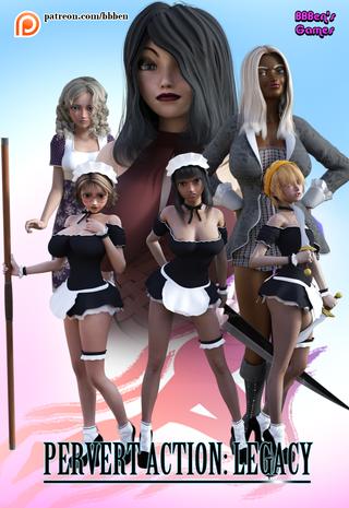
Poster for PAL - second draft (Patreon)
Published:
2016-07-29 23:50:50
Imported:
2023-03
Content
I've made some changes based on the feedback to the poster's first draft. I've cleared out the monsters, made the maids a little bigger and more spread out, and I've made Ai a little smaller and more in the background to make her less obvious. I do want to keep her in there, though, because I want the poster to demonstrate that there is a range of different girls with different body types in the game.
I also changed Iku's pose because I thought something was inexplicably not working with it in the last pic; I turned Rio's head because the angle of the lighting in the last shot made her look a little weird; and I re-angled Fumi slightly to better show off her pose and figure. Oh, and I changed the arrangement of the symbols up the top.
So what do you think? Have the changes made anything better? Worse? Have you noticed any problems that you didn't before? Is the title still legible with the girls' feet behind it?
Files