Home
Home

 Artists
 Search
 Recent
 Random
 Posts
Posts
 DMs
DMs
 Tags
Tags
 Random
 Importer
 Import
 FAQ
FAQ
 Account
 Register
 Favorites
 Login
Login

Paint Doctor - Charles' Sunstalker (Patreon)
Content
I will break this down into a few different areas.
1. Pallette selection
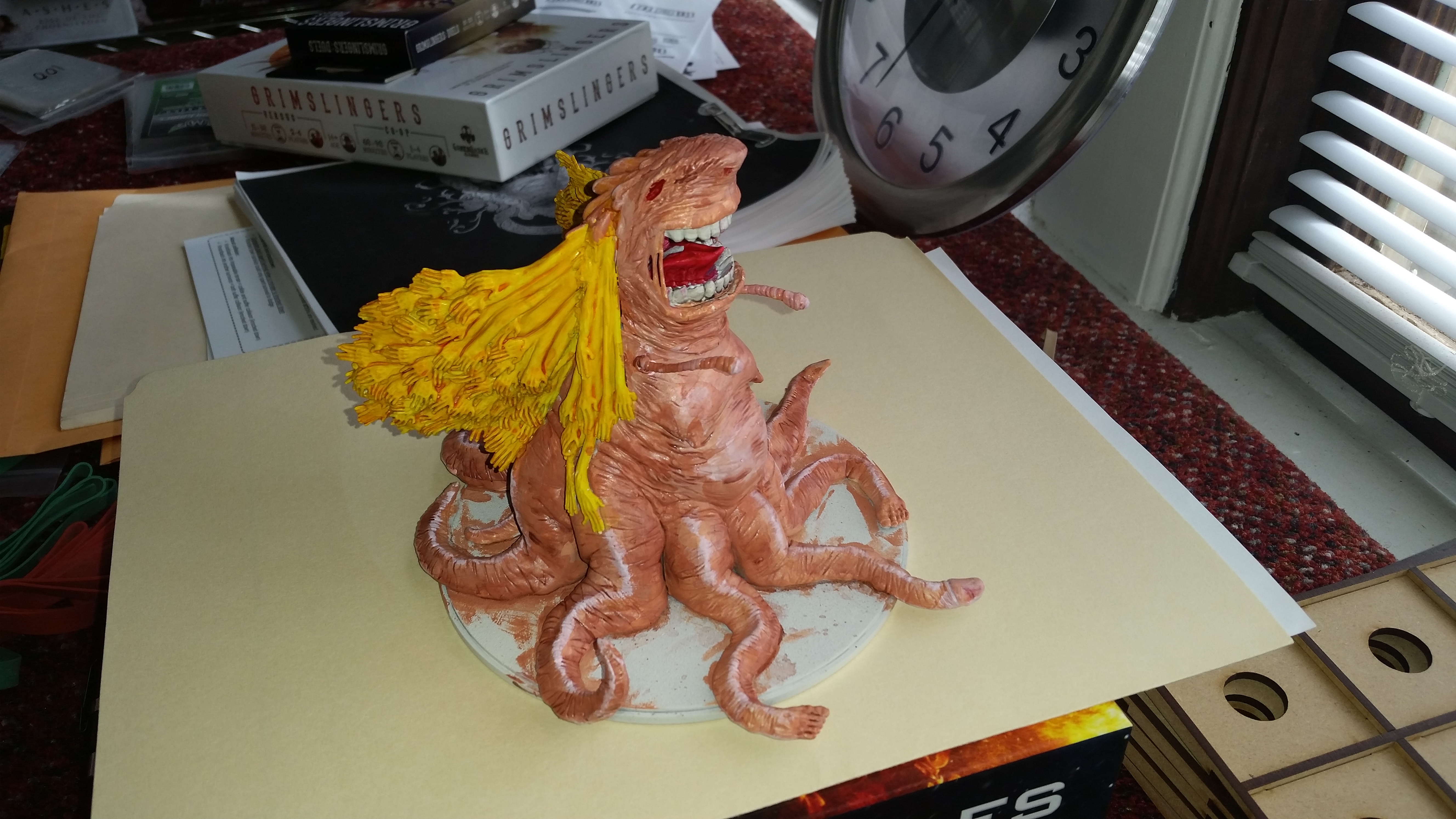
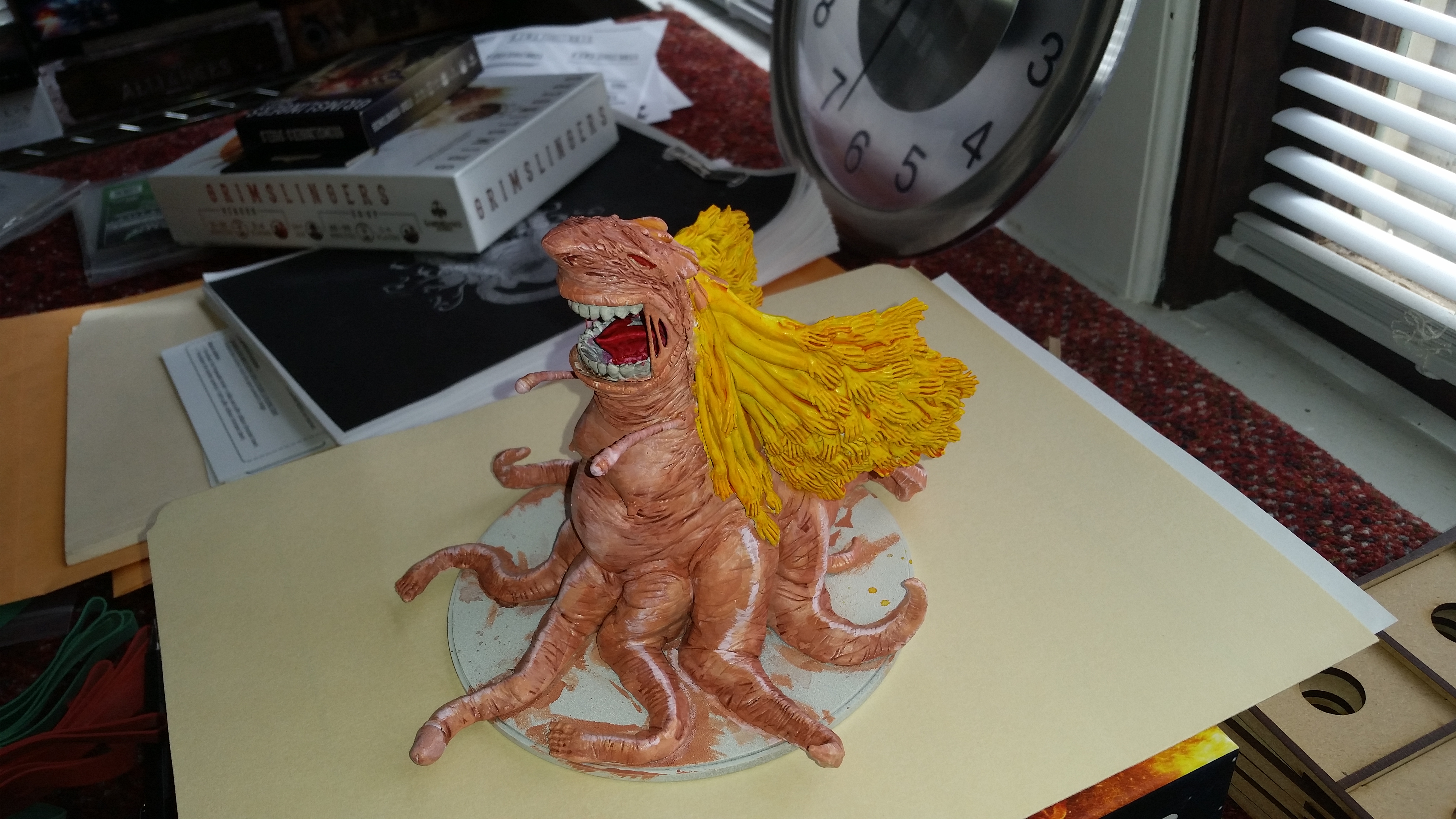
We are going to look at the choice of colours here. Now I will preface this by noting the following; the "official" Sunstalker is a combination of Greens, Beiges, Browns and Flesh Tones, but moving away from that range and painting it the way you want should always be an option for an artist. My second Sunstalker was painted by using a Parsnip as reference material for example.
Here we have a combination of Yellow and Flesh tones, with some accent of red in the mouth. Now this is a fine pallet to start with, it's not got too many colours in it and that makes it easier to manage. However, the best way to work on a piece is to consider the 'rule of three' that is you want three distinct colours in the mix. You can see this when you look at the official Sunstalker colour scheme, it's Green, Brown and Beige/Cream.
The red in the mouth doesn't really count for this matter, because it is at best an accent - equally, when you paint a survivor, Flesh doesn't count (with the exception of when a lot of it is on display). So what would work well is getting a third colour into this piece. However, unless we really aim to create a more monotone pallet, it would be best if the third colour was more contrasting to what we already have here. So because this is a very warm piece, something like Red and Orange is best not used.
The obvious choice here is Green, Green compliments yellow without matching it exactly, so it stands up near the top of the choices, but figuring out what area to make green is another challenge entirely. The main area which could be made green would be the tentacles. However, to make this work a great deal of blending, glazing, shading and colour matching transisitons would be required - totalling many hours of work. So, while I'm confident that I could make it work, there is a high risk that if Charles went for that, it would result in a very harsh transition from the flesh to the Green and that would not look so great. Blue is another option, but it would need to be a light blue and it would suffer the same issues as the Green, so again I would not recommend it for someone at Charles' progression stage.
What does this leave us with then? Well we have browns, beiges and purples. These are all colours I used to accent my own Sunstalker and create areas of interest. So I would use these, and I would apply them as follows:
Beige
Tto the stomach and chest area, with some simple blending into the flesh tones. It can be shaded with either light tans/browns or flesh colours. It can also be applied to around the mouth and the underside of the nose if desired.
Purple to Brown
The Tentacles can either be made to be completely purple, completely brown or they could transition into brown and then end in Purple (or the other way round). Again the main trick here is to make sure that the transition areas are smooth and gradual, which can be achieved by mixing from the flesh colour towards the colour you are transitioning to and applying it in very thin coats.
This would give the model 'the third kind of heat' it requires.
2. Yellows
Yellows are a tricky beast, not for the faint of heart, but thematically having the hand hair yellow works and makes sense. What I can see here is that it has been painted with a yellow and then washed with what appears to be Casandora Yellow (or something very similar). This is a very acceptable choice, but there are a couple of issues here. The first is that the shade is inconsistent, it's not in all the gaps and it's not strong enough.
This first part can be fixed by applying multiple layers of the wash, keeping each one thin - thin with multiple layers is the correct method here. Stopping when the deepest areas are well shaded.
Then the original yellow needs to be reapplied, this can be done via drybrushing, layering or blending, whichever technique suits best.
But we do not want to stop there, while this will have given us more depth we can add to that by increasing the light in parts. So the idea is to mix the yellow with a cream/bone colour (not white, which will look chalky) and add lighter areas to the hands and the parts of the arms which are nearest the arms. The very lightest colours should reach only the finger tips.
Again, if you look at my Sunstalker you will see that I have done exactly this, but I have used green as my base instead of yellow. Same principle, Green and Yellow work in similar fashions.
This should then give the hair more definition, make it more interesting to look at and also present the illusion of light.
3. Flesh
Next we have the flesh tones. these have a similar issue to the yellow, the coverage from the wash isn't sufficient, so it looks blotchy in areas. So the same process as above can be applied. Using the flesh wash a few times to darken and ensure full coverage. But I would also recommend a darker wash for some of the deepest and lowest areas on the model, perhaps purple or brown.
What can be done before these are applied is the skin could be 'over saturated' by highlighting it with some very light flesh tones, almost white, knowing that the washes will dampen these colours down and tie them together better.
This is in fact one of my preferred tools when painting large models, I will oversaturate the colours with bright highlights and then tone everything down (and together) by bringing it towards the midtones with washes.
4. Teeth and Mouth
The Teeth simply need some brown in shades and then bone applied to add light. A good trick with teeth is you can get away without blending by instead painting in lines, leaving a bit of the lower level visible each time. This works for bone also. It makes the teeth/bone look somewhat serrated/ridged and it is also easy to do. I have attached an image to demonstrate.
The Mouth needs more darkness to it, I would recommend purple and blue washes here. Blue first, then purple to normalise that.
So, these are some relatively simple steps that can add a lot to the model and get it looking a stronger piece overall. :)
~~Fen
Files