Home
Home

 Artists
 Search
 Recent
 Random
 Posts
Posts
 DMs
DMs
 Tags
Tags
 Random
 Importer
 Import
 FAQ
FAQ
 Account
 Register
 Favorites
 Login
Login

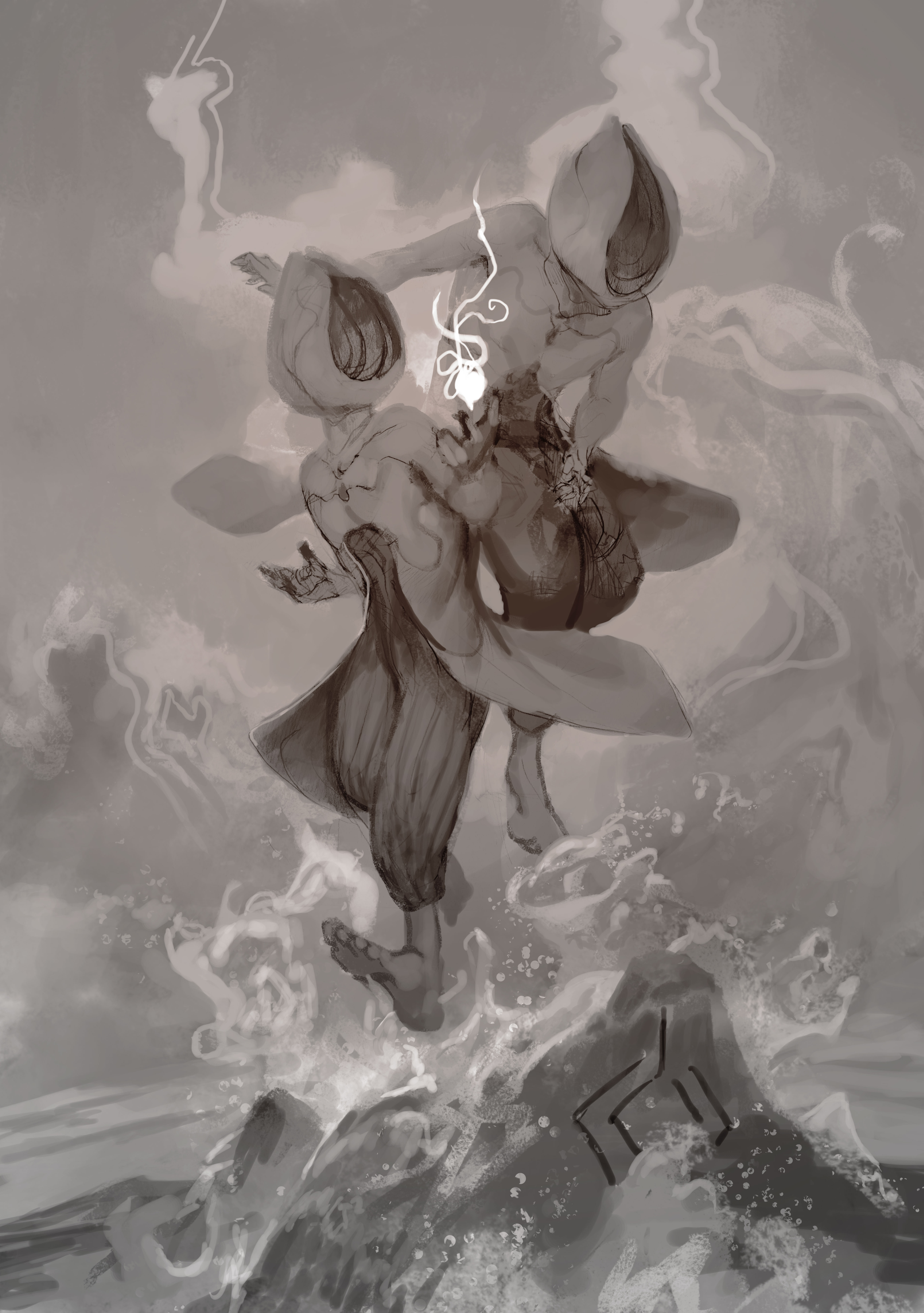
Sandalphon - Value Phase (Patreon)
Published:
2016-11-09 21:18:59
Imported:
2022-09
Content
The range of value in this piece is thinner than normal. At this phase it looks flat, but that's by design. The artist I'm quoting from for this piece is James Jean. I was inspired to look to his art because both the subject matter and the color palette I wanted to use were similar to some of his work.
What I noticed right away was how little he was utilizing value to build the piece. Instead, the flatter arrangement gives the work a more textural quality. Playing with texture and flat graphic shapes has been some of my favorite things to do recently, so using James' work as reference has been really informative.
With the next update, I'm going to overlay the color palette on to these values and the choices are going to become more obvious.
-Pete
Files