Home
Home

 Artists
 Search
 Recent
 Random
 Posts
Posts
 DMs
DMs
 Tags
Tags
 Random
 Importer
 Import
 FAQ
FAQ
 Account
 Register
 Favorites
 Login
Login

Critic's Corner! (Patreon)
Content
Our fellow photographer, Ben, sent a few photos for Critic's Corner. He wrote: "There are various re-edits I've done over the course of the last week. Shots that I thought were decent, but I know your expert eye can make them better"
I don't show all edits, because some of them are pretty good, no questions. Now, let's talk about others.
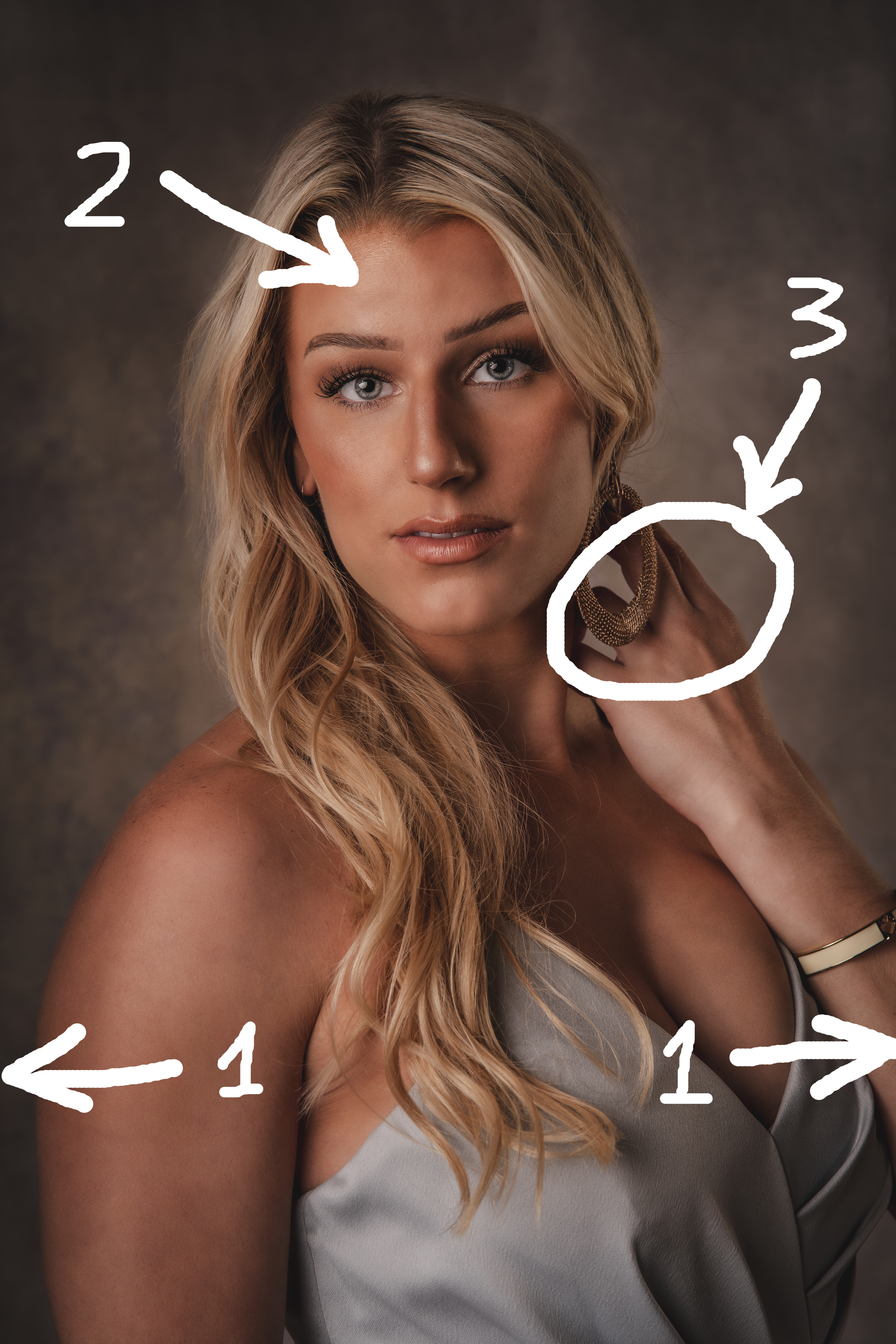
First and second photos
1. Her hand looks a bit too bright and big, distract us from her face. I think it's good too make it a little bit smaller and darker.
2. Liquify. Don't change people, but use it reasonably, hair and neck lines are quite important.
3. She's falling to the right, I guess. So I rotated image a bit. Check second image, you can see the difference. The hand, the neck etc.
Third photo
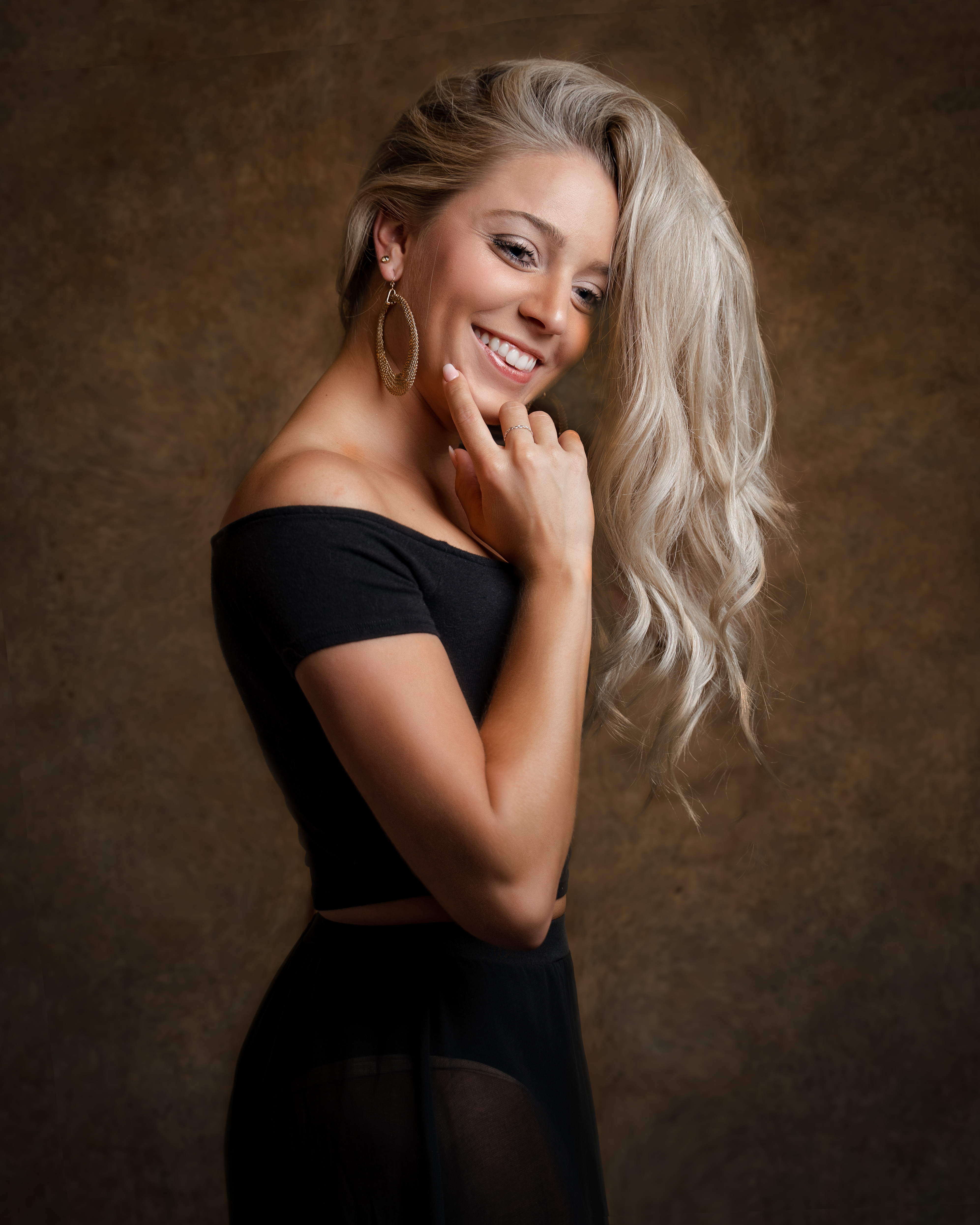
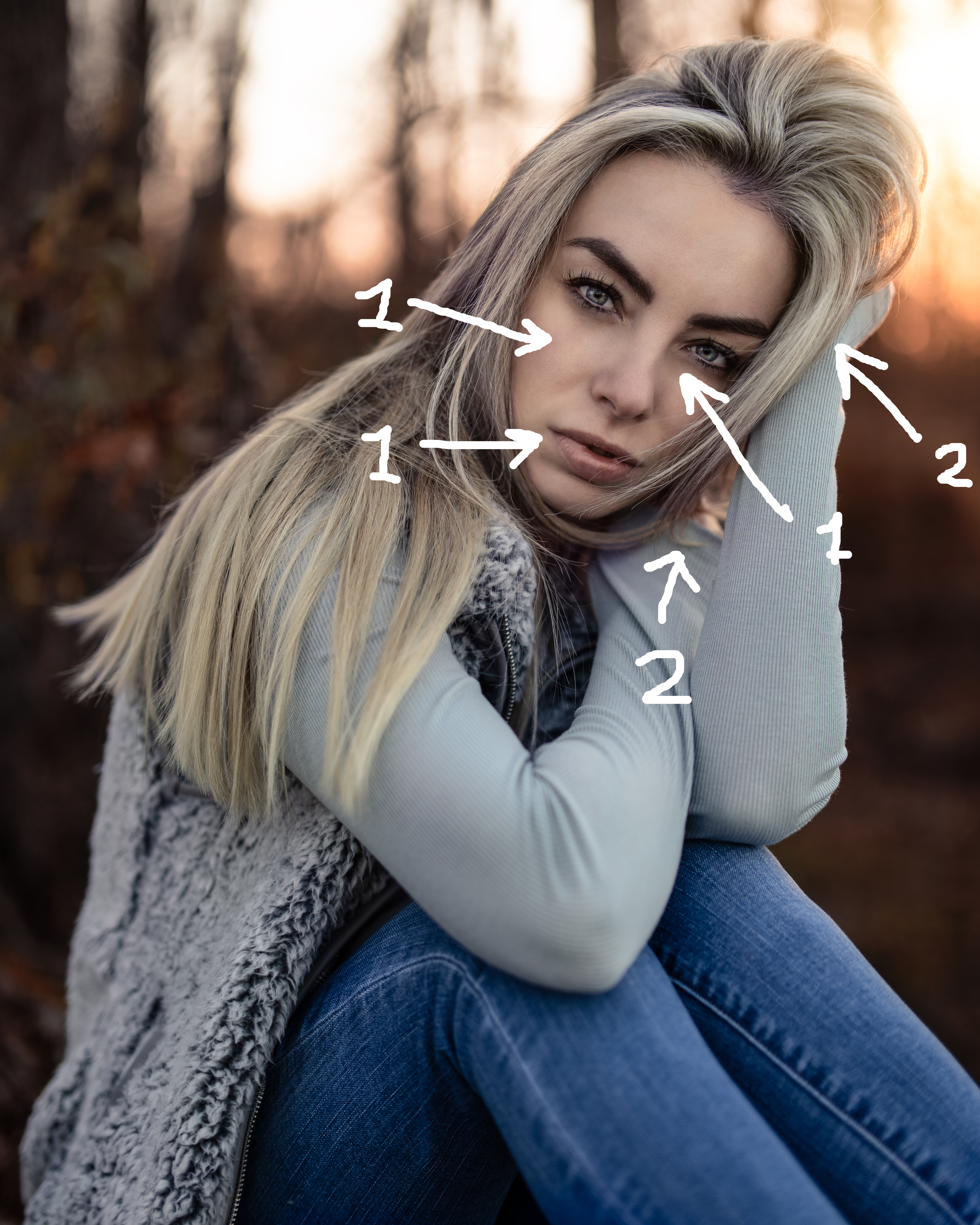
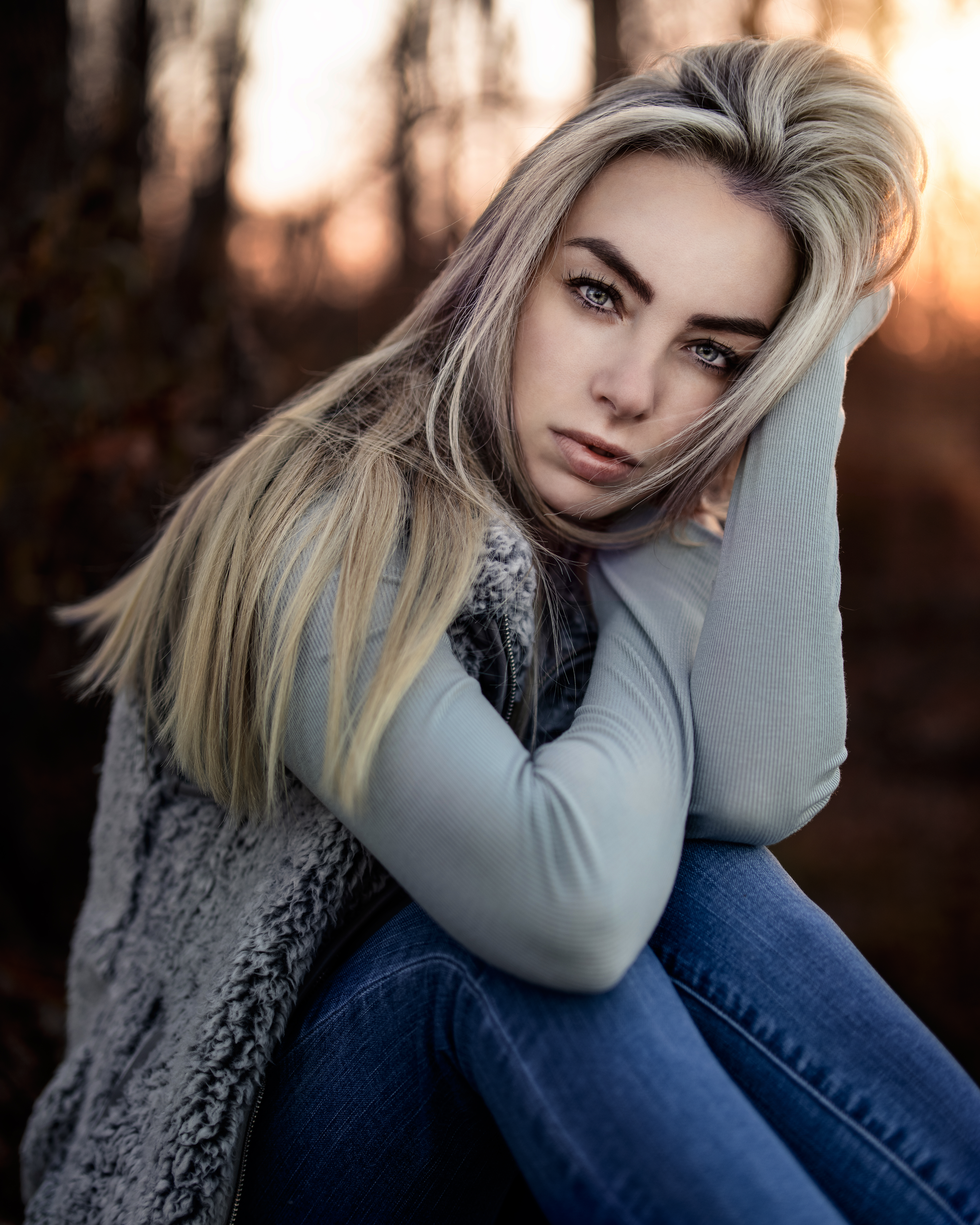
1. Very tight crop! That's why she looks massive in this frame.
2. Dark spots on her skin. And we need more light on her face.
3. Fingers and massive earring is not the best combo.
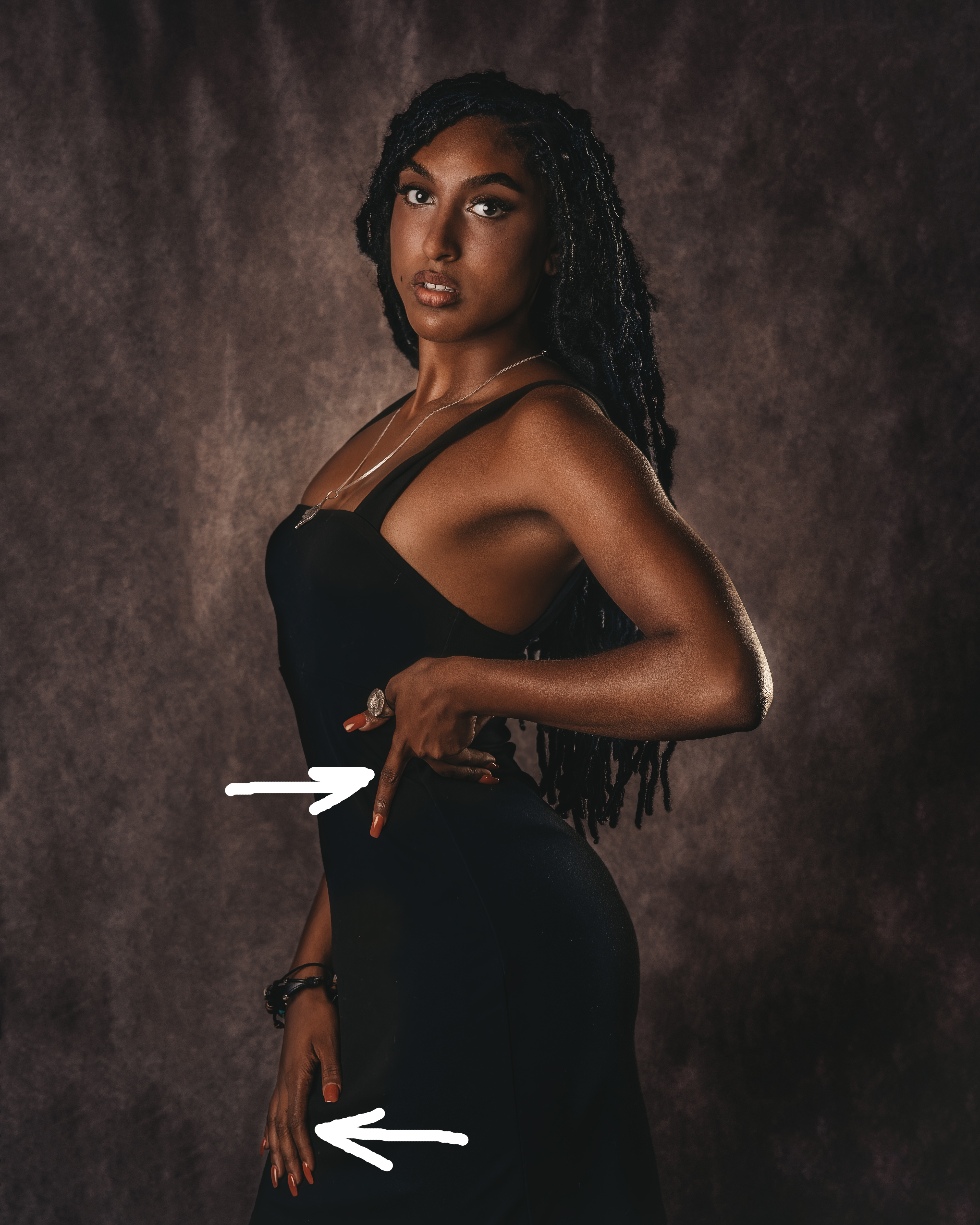
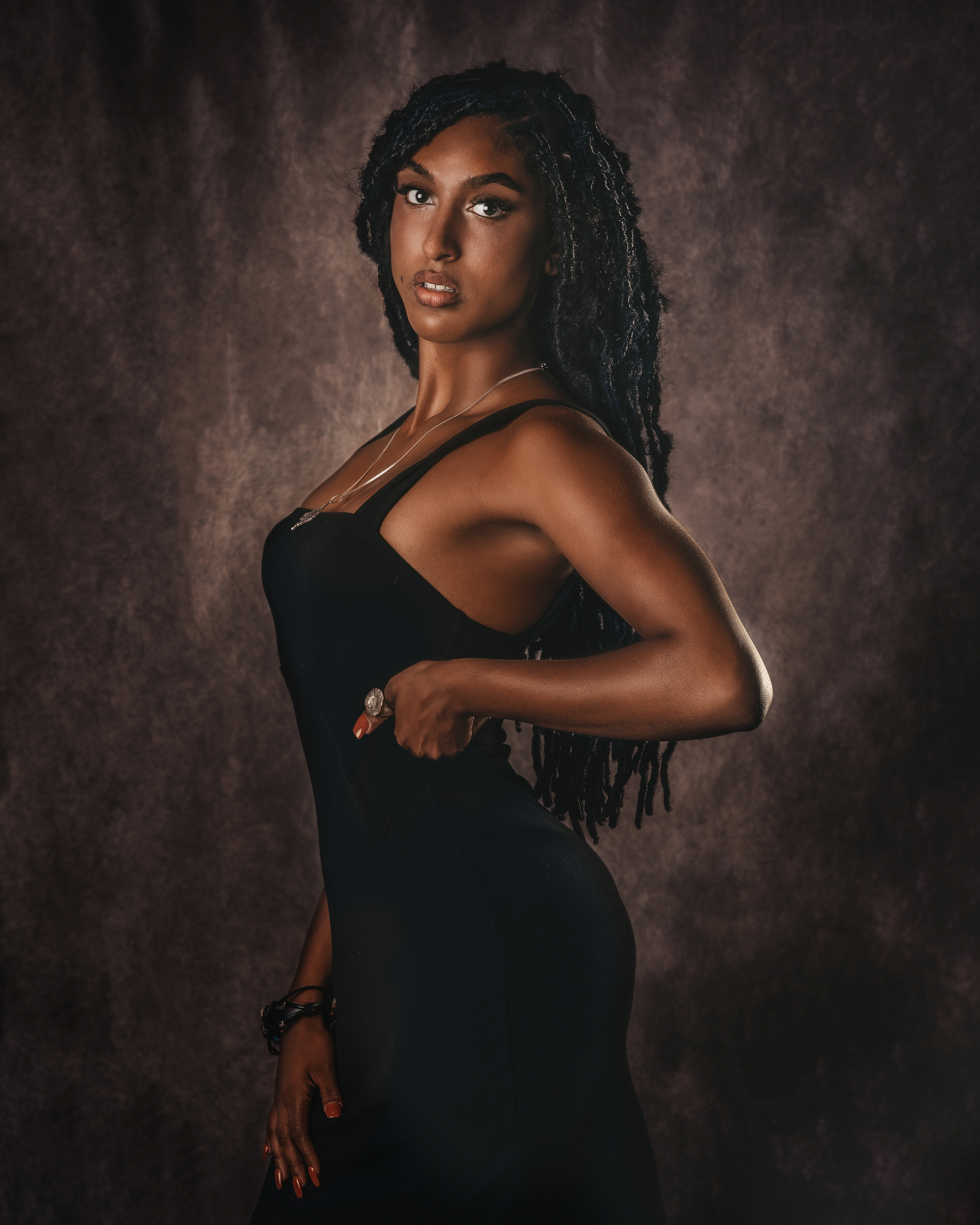
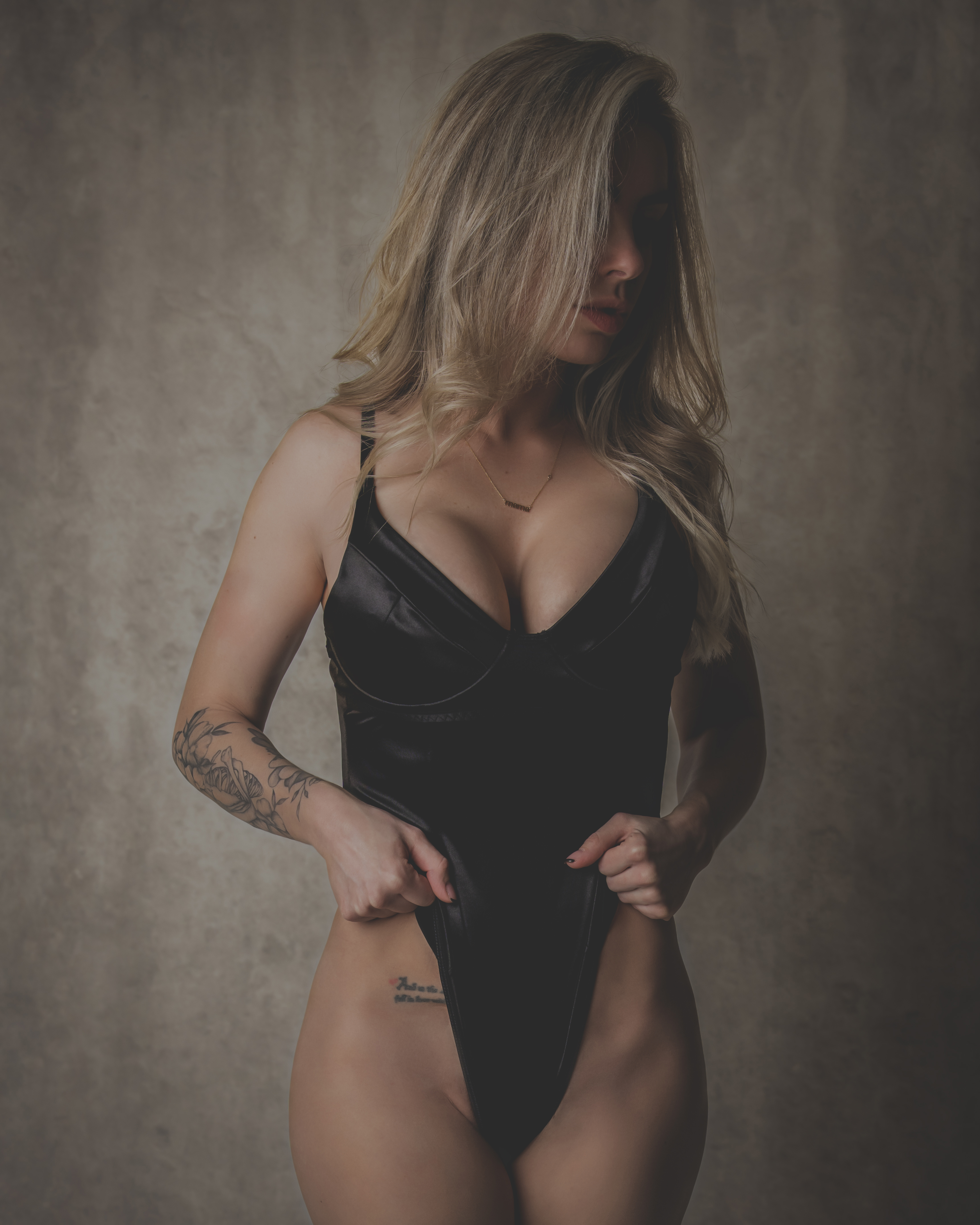
Fourth and fifth photos
Her fingers look enourmous. Especially, the one on her waist. It's a common problem, that's why I always try to hide them :)
Maybe its was better to ask model to hold her dress, something like this. And a bit more light, and a bit of liquify, check my edit.
Sixth and seventh photo
I don't like this kind of contrast, there is no black, only gray instead. Images like this look kinda lifeless for me. And this pose is not good for her hips, tell model to turn her hip a bit towards you, check my posing guide.
Eighth and ninth photo
1. Dark spots again. I think we need more light and more focus on her face, check my edit.
2. Maybe it was better to try this pose again with visible hands.
Files