Home
Home

 Artists
 Search
 Recent
 Random
 Posts
Posts
 DMs
DMs
 Tags
Tags
 Random
 Importer
 Import
 FAQ
FAQ
 Account
 Register
 Favorites
 Login
Login

Critics Corner! (Patreon)
Content
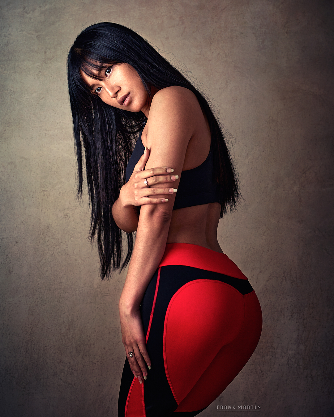
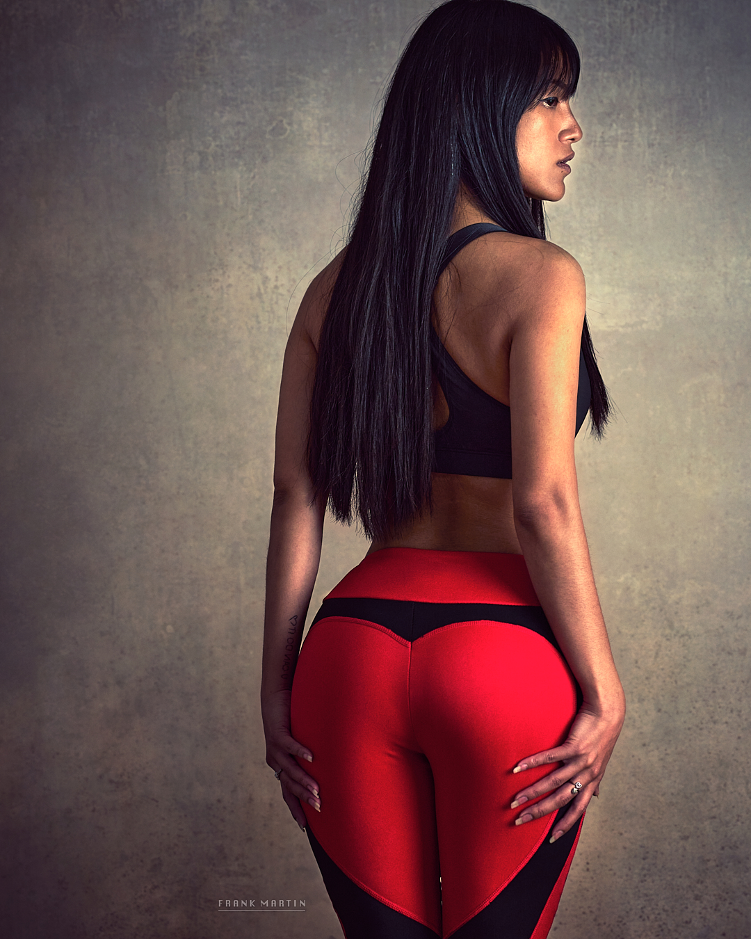
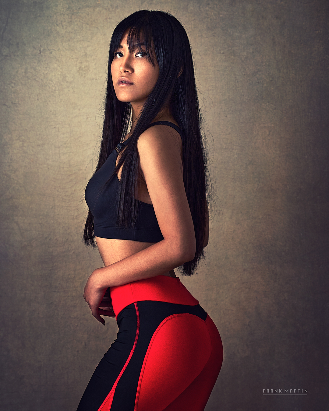
Our fellow photographer, Frank Martin, sent a few photos for Critic's Corner. He wrote:
"The backdrop was way to bright, and I think I had to crank it down almost two stops using your method in post.. the girl also had darker skin, and that made it even more pronounced. But its an easy fix - just move the light further away from the backdrop next time.. I dont have natural light, so I used a video lamp instead"
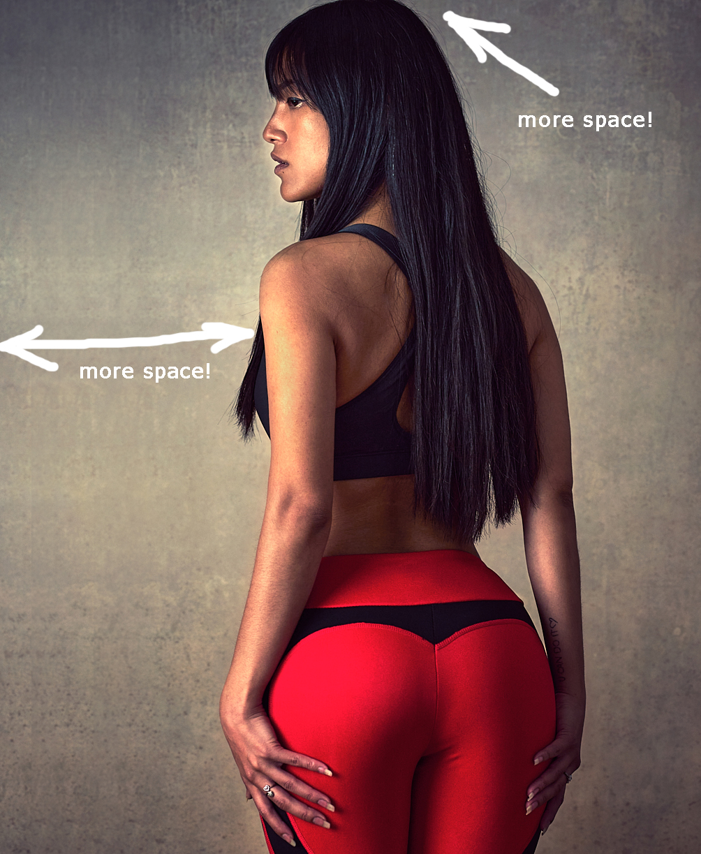
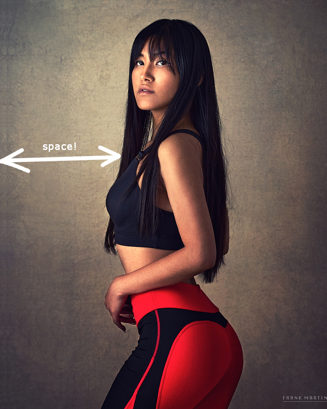
So, first three photos are original ones, then my thoughts about Frank's work. Overall, it's really good, Frank managed to solve some problems and he knows about it. And, of course, the following text is my humble opinion :)
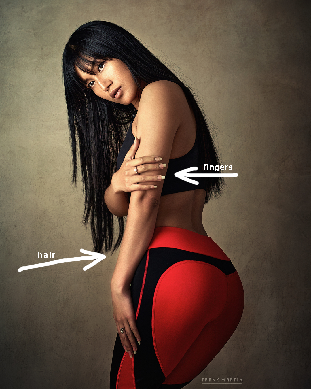
1. First, I tried to change the color balance a little bit, I want it less red, less saturated. And I think it's better to soften the body hair (you can use plugins like Portrature or Luminar), it was a bit distracting. And I always ask model to keep fingers together. Looks much better for me. Fingers is a BIG problem, keep them together :)
2. The main problem here is composition. I rotated the image and added much more space in the direction of her look. And cut was not perfect, bottom part was dominated. And it's better to keep some space above her head.
3. Basically, the same. You add more space on the left, change color balance if you want, soften body hair.
PS And I don't like rings, I ask models to remove them during the photoshoot, if possible.
Files