Home Artists Posts Import Register

Content

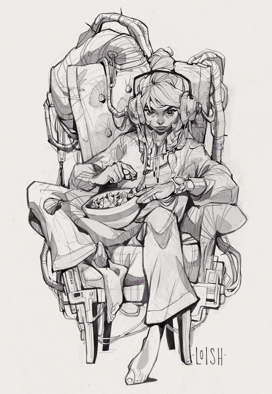
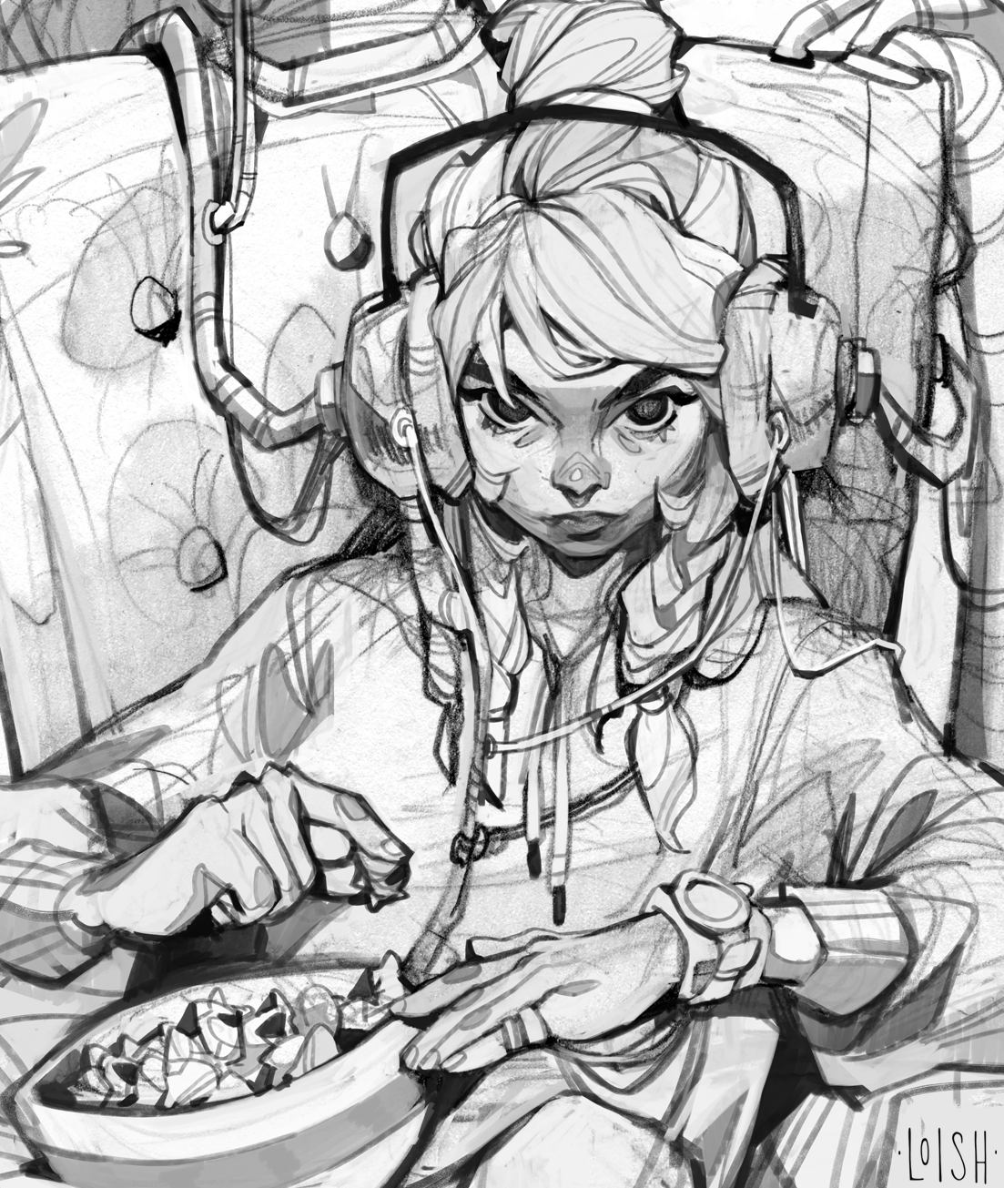
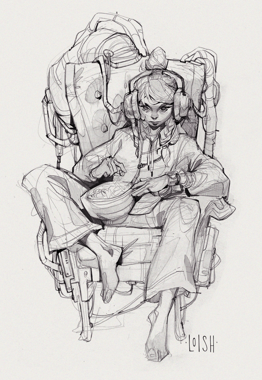
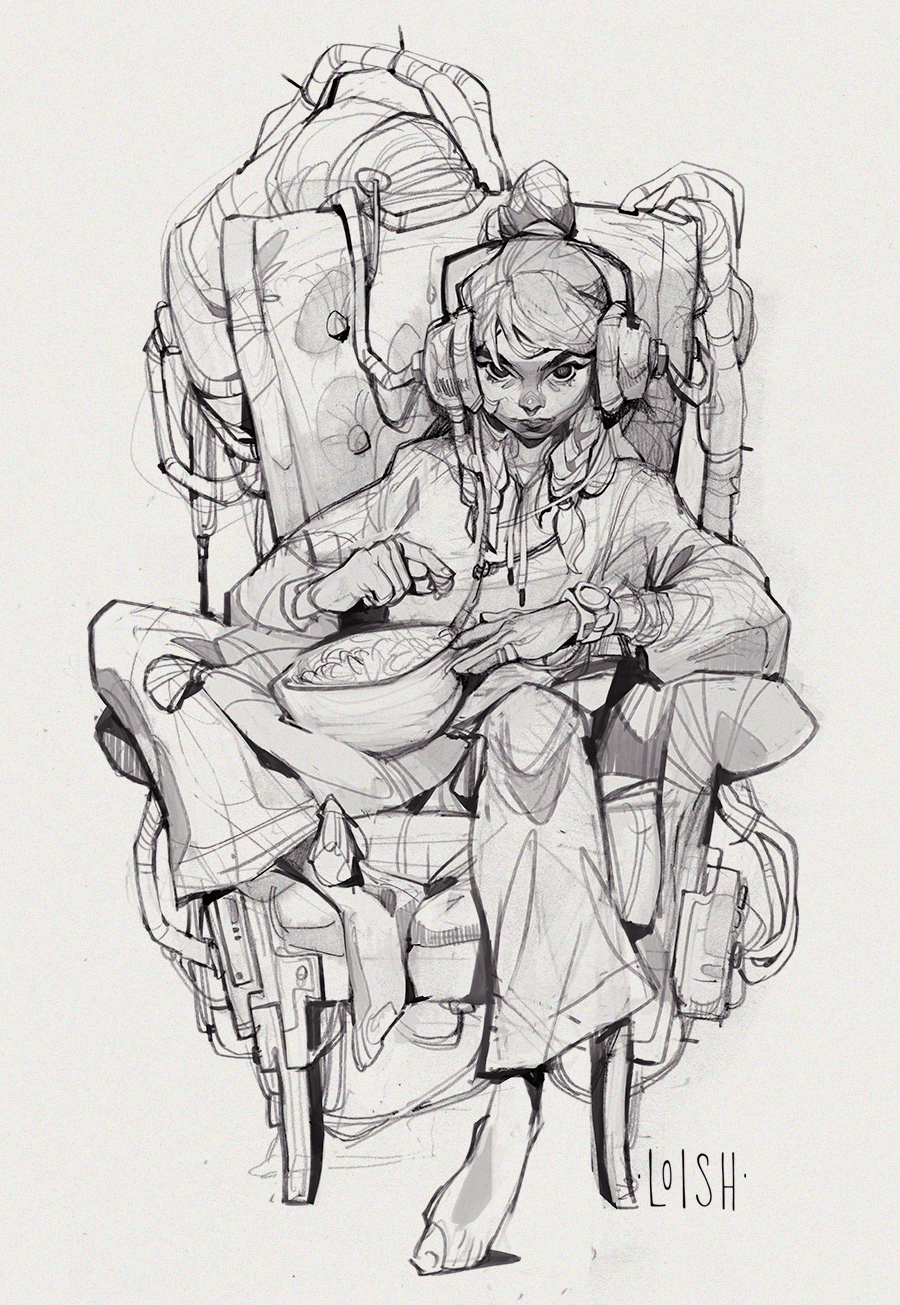
Hello lovely patrons! Thanks to everyone who stuck around for yet another month, and welcome new Patrons! I’m working on editing this month’s tutorial which will be done next week, so keep an eye out for that! For now, here’s the first art post of the month ~

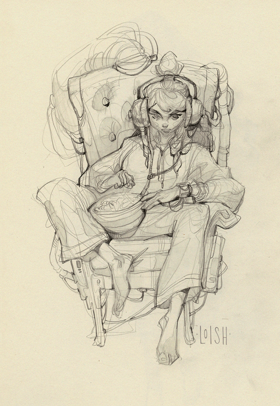
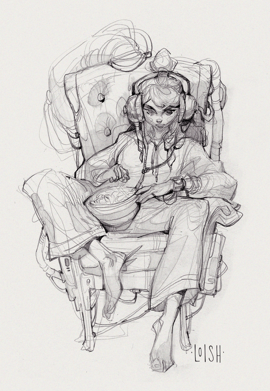
I took one of my sketches from last month’s sketch session and finalized it in Photoshop! The sketch is loosely based on this fantastic editoral photo by Steven Meisel.

It has been so soothing to just focus on lines and pick away at the smaller details. I tend to struggle with details because I go from sketch to painting and usually delay detailing until the end of the process. When I’m just working with lines it feels a lot more fun to push the detail and I think the result is quite refreshing!

I’m very stuck on how to proceed from here though. If I used my normal workflow, I’d be painting over a lot of the lines at a later stage, and I just don’t want to do that this time! I want to keep the lines intact. I have a bunch of different color setups but I’m not really feeling any of these:

What do you think about them? I feel like they are too brown and too faded. I’m going to have to try out some different approaches before I find something that works for this. For now, I hope you like the linework!

Files

Comments

Anonymous

Really cool to see how you edited the line work and really make things pop and flow. I wonder if you changed the color of the line work in different areas instead of having them be one unifying color like usual, you might be able to get more variation. Just throwing ideas out

Anonymous

Definitely top right is my favorite !

Anonymous

Really love the colors in the bottom left - the spontaneous pops of saturated pinks make me very curious to see how you would use it while "sculpting with color".

Anonymous

These are looking great! Such a cool style :) I'm digging the bottom right as well, that pop of pink on the watch really stands out nicely. Which, I'm not sure you were wanting that to be a focal point or not, but it works!

Anonymous

I love these! I think where I’m seeing a bit of issue is perhaps the lack of contrast around her face? Regardless, these are awesome! I love the dark background with light coming from above; makes it a bit spooky!

Anonymous

A cyberpunk color scheme involving neons or the old scifi horror (greys, blacks, blues, and greens like Alien) might be a good direction?

Anonymous

Incredible! I’m in love with the lineart! And bottom right‘s my fav, followed by top left. For my taste I miss a stronger contrast at top left 🤔 … not that I‘d ever dare to draw strong contrasts in my artworks - I I wish I would! That’s smth I also admire about some of your artworks - maybe it fits in here too?

Anonymous

My brain was like hmm maybe like a pale sage green or a muted slate blue. But overall I love this imagery. How I frequently sit around lol.

Anonymous

Personally I really like the ones on the right side. I am really curious of your approach and can't wait to see the end result!

Anonymous

I'm not going to lie, I do feel all cool to see your work early, and then be like "I SAW THAT" while seeing it again publically. Such a nice experience! Oh, and about the options, I do like the bottom left color palette.

Loish

haha I'm glad! I want my patrons to feel like the most important followers I have!

Loish

yes, I'm thinking of making one more setup with more blue tones in it!

Loish

yes I was thinking the same as I posted this! I'm going to give it a shot.

Loish

that is a good idea. changing the color uniformly causes some areas to really fall away!

Anonymous

I vibe with the red one. With the tubes, it creates an organ feel that intriguingly ‘alive’ lol. It actually looks quite a bit like the heart to me, which might be fun to embrace. I know you’ve been wanting to dive into more organic feeling work lately.

Anonymous

I love this piece already!! Maybe something a bit more pop-like to go with those "comic" lines? With more vivid colors like pink, or lime green or electric blue?

Anonymous

I’m getting Borderlands vibes from these and could see those type of colours working really well with your lines ( I’m new to art and digital art, so I may be completely off track 😂)

Anonymous

I'm really in love with the line work you've done on this piece!!

Anonymous

My new favorite! ^^

Anonymous

So cool! Beautiful work.

Anonymous

They're so beautiful Loish!

Loish

ohh thanks for the tip! I'm gonna take a good look at their style.

Anonymous

I should have probably said Borderlands is a video game ( you probably know that already😅, but just in case😅😅)

Anonymous

This composition and the brown colors really remind me of some of your old pieces (back from 2014-2015 ? I don’t clearly remember haha). Love it ! Also, love the lighting on the second one (top right) but also really like the vibrant colors on your lineart in the third one (bottom left) :D

Loish

thanks so much! i am feeling drawn to similar themes and colors that I used to draw in around 2012-2013. nostalgia is hitting me hard these days!

Anonymous

I love this sketch.