Home Artists Posts Import Register

Content

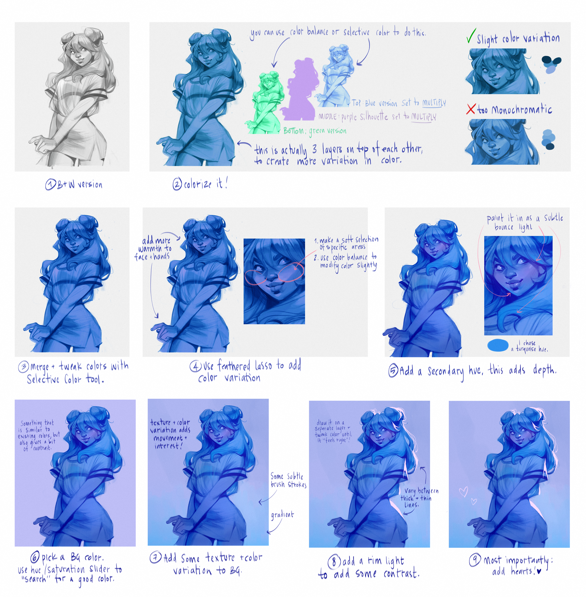
Here’s a little step by step for the process I used to add color to the b&w sketches! I don’t know if this is the most efficient way to reach this end result, because I was just experimenting for the most part. Hopefully it has something useful that you can integrate into your process!

I think the main thing that others can learn from this process is how it shows my piorities when choosing colors! They are: 

  • Making sure there’s hue variation between the highlights, midtones and shadows. If all of the values are the same hue, it’s a missed opportunity to bring more life to the color scheme! 
  • Defining the silhouette: I try to make sure that the silhouette of the figure is interesting and is visible! That means picking a background color that doesn’t make the character fall away too much, and sometimes also adding lighting effects to emphasize it. 
  • Adding hearts! This is an obvious one ;) 

Hope you guys enjoy and have an amazing valentine’s day! Also, have an awesome weekend too! You guys are the best. <3 

Files

Comments

Anonymous

Very nice! 🙂 I especially love your technique in step 2. I’m going to start using that... great way of having some color variation from the start! Btw... do you ever reach step 7..and suddenly have the feeling that you don’t like the color palette at all.. and wanna go a different direction entirely? I have a cool little trick I like to use in those situations 😁 Its not just a hue adjust, its a fun way to experiment with random color combinations and variations on your existing piece... and it’s an amazing “happy accident” creator in terms of color. Let me know if you wanna know the super top secret FBI protected color trick 😁

Anonymous

What made you choose blue, purple, and green as your main color variations?

Anonymous

Can you do this on procreate?

Anonymous

Appreciate this, thank you!! Makes me want to get my tablet out. 😁

Anonymous

Thank you for this process! It's really interesting and useful 🤩

Anonymous

How do you create the silhouette

Loish

I just select the color layer (control + click) and on a new layer, use the bucket tool to fill that selection.

Loish

definitely! the only difference in procreate is that the color balance tool works slightly differently, acting more like 'selective color' in photoshop. but for the rest, the process is the same!

Loish

i just intuitively landed on those colors, they 'feel right' to me!

Anonymous

Thank you Loish

Anonymous

:D Ok, its a bit too complicated to explain via typing.. would you like me to record a video ? Or can you hop into a quick screenshare-videocall ?

Anonymous

Thanks for sharing! I particularly loved the tip about splitting the colours of your midtones, shadows and highlights!

Anonymous

So interesting! It's honestly a little different than I expected! I love the addition of the color variation in the 2nd step. I've never thought of that. When I color b&amp;w, it's just a lot of use of multiply, overlay, and soft light layers.

Anonymous

Interesting and helpful. Thanks for your generosity in preparing and sharing.

Anonymous

Thank you for sharing this! I’ve been learning a lot from your breakdown posts like this :) I was wondering, why do artists often put warmth/red on a figures hands and nose? I’ve seen it with the nose most often and I think it looks good but can’t figure out why it’s done like this?

Loish

for me, it's a really important way to make the character feel 'alive'. skin tone variation is what makes skin feel like a living surface. it also helps draw the eye towards a certain high-detail area. hope that helps :)

Anonymous

That does help, thank you very much! :)