Home
Home

 Artists
 Search
 Recent
 Random
 Posts
Posts
 DMs
DMs
 Tags
Tags
 Random
 Importer
 Import
 FAQ
FAQ
 Account
 Register
 Favorites
 Login
Login

The Red Year : artwork walkthrough (Patreon)
Content
First big piece of the year! Linework, photobashing, 3 braincells allocated to composition, glow layers. Let's dig in!
I began the way I generally do with big pieces of illustration, by considering the atmosphere I wanted to portray. This moment in Elder Scrolls lore and a part of my OC's history is one of devastation and ruin. A volcano on his home island- famed setting of TES III: Morrowind- has erupted with catastrophic consequences for the native elves. After finding some great material to create a landscape, I decided to whip up a cinematic shot of two lonely figures in the aftermath.
> In game or film development, these might also be called Beat Boards. When an artist spends a moment to capture just that-- a moment, a "story beat", or just a really cool shot to anchor other members of the team in the visuals. Bioware are prime culprits for letting their artists have free range on beat boards; most of the promotional 'concept' artwork we see from their games are such snapshots.
1. The (Rough) Plan

No matter what kind of art you're making, I don't think the importance of a first sketch or initial drawing can be understated- especially when you already have an image in mind. None of these lines will be in the final picture, but this stage is where I arrange the building blocks to compose my image.
Broadly speaking, our brains are drawn to certain things more than others. In a rough order, we will notice brightness first (in art, this is referred to as Value) before darkness. After that, we notice the saturated strength of colour (also called Chroma) before more grey tones.
The final component of colour composition- Hue- is less important for this piece as I have already decided to work primarily with reds. It sits at the opposite end of the spectrum to green, and in some instances we associate it with warning, danger, inhospitable places and barren lands devoid of water. Behold!, my extremely technical diagram.

This is a very basic and easy composition to arrange on the canvas. The sun- the brightest point in the picture, sits top left. The darker green shapes are the characters that appear in the foreground-- closer to the viewer. Lighter green elements will be further away and help to frame the characters and balance the picture as a whole.
The red line is the general path I expect the viewer's eye to take: from the sun first to the more detailed and saturated character, past the natural horizon line in the distance and finally up again to the main character in the piece. You can see there was originally a third figure in the picture, but more on that later.
2. Bashing some photos
Photobashing is exactly what it says on the tin. A very common method in visual development, this process involves taking photographs that suit the image you're trying to create and bashing them onto your picture. This could range from what I do here, creating a landscape from royalty-free photographs and transforming it into the Ashlands of Vvardenfell, to applying material textures onto a character design to illustrate what their costume is made of. The biggest benefit of this technique is that it saves artists a hell of a lot of time and energy and makes for extremely efficient visual communication.
I began with this photograph from a pack of volcanic desert shots that I bought. It's sweeping, has the right colours for my piece, and is a great angle of view to show a vast and empty(ish) landscape.

Bash it. This is a fairly different image now. I applied a second photo of a sky to the first and painted in clouds of dark dust to obscure the background a little. This island of Morrowind is now ruined, desolate and choked by ash. I reduced the saturation of the background sky too, as while the original image is lovely, the background will not be the final focus of the piece. The foreground remains empty and mostly unaltered; I'm going to fill it with character and drawn in details.
With photobashing, it's key to give extra love to the image to make it your own. Paint, draw, add, recolour. Give it enough love to make the viewer believe they're not just looking at slapped together photos.
At this stage, I also added points of brightness. Try looking away from this image for a moment, clear your mind of it, then look back. Where is your eye drawn first? How does it travel across the scene?

Check your work! As my original sketch is on a separate layer, I was able to toggle it back in to check how the background is working with my character placement. It's vital when creating big pieces to always, always, always!, keep checking the big picture. Does my background support my original composition idea? What detail do I need to add to frame it well? The background looked good to me here, so I moved on to detail.

3. Dig in
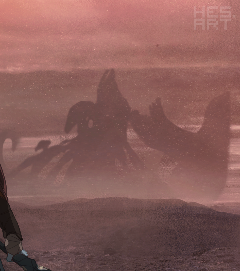
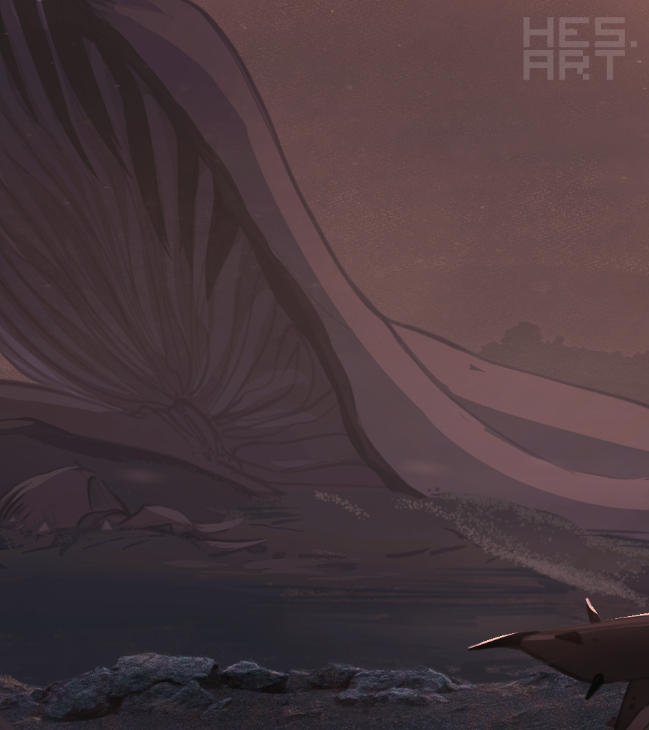
The devil in art is always in the detail. The more we add, the more information there is for the viewer to absorb and use to build their understanding of an image. This is where the scene really begins to change from generic landscape to a specific setting. One of my favourite and most iconic elements of Morrowind's environments are the giant mushroom trees and cover the landscape. After a catastrophe, having some of those giant shrooms felled and framing the characters felt suitable to the piece. Just beneath it, buried in the ash, is a very unfortunate nix hound. A scathecraw plant adds a bit of depth to the image, in front of the mushrooms but behind the characters.

4. That's no tree...
Shrooms, in. Sky, bleak. Distant background... lacking. The centre of the image felt lacking to me here. A third character might have done the trick, but in my mind it really needed something recognisable to drive home where these characters are supposed to be.

A colossal fungal castle, an iconic feature of one of Morrowind's great ruling houses, was the answer. It only appears in silhouette and while it might have been more recognisable if it still stood tall and proud on the horizon line, it could not survive the devastation of a volcanic eruption. Details like this- while not particularly detailed themselves- lend visual information to a scene and an anchor point for the imagination.

5. Character time
I'm glossing over the drawing of the characters for this walkthrough because I intend to cover character drawing a lot in future, and because the purpose of this one is to show you how the image comes together.
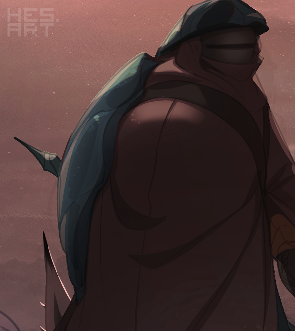
Adding characters here brought in the real focus of the image- a pair of ashland travellers surrounded by devastation.

Just like with the photo backgrounds, these characters needed extra treatment to feel grounded in the piece. That bright point in sky is not a strong light source, so the lighting on the characters didn't need to be strong either. We see more of what's in shadow than what is in the light. The characters themselves are also slightly more saturated (less grey) than the environment they stand in to pull attention to them.

6. Final touches
Going back to the big picture, it's good to experiment with tweaks and changes. I increased the brightness of the sun behind the ash clouds and coupled it with a soft red glow across the whole image. This soaked the picture in a reddish light to help it feel a bit mot coherent- like elements in the scene belonged together- and saved the background from becoming TOO grey and muddy.
Finally a very quick and easy trick to helping make a picture feel more cinematic is to literally add black cinema bars. It's not subtle, but it is fun.

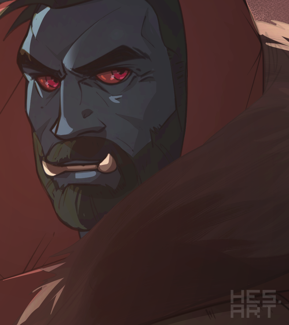
And that is my piece, The Red Year, featuring my half-dunmer, half-orc character Kato, and a travel companion as they trudge across the once-lush swamplands of eastern Vvardenfell.
I hope the walkthrough was informative and fun! Apologies for any typos and spelling mistakes. You can find a high-resolution download of the final image attached to this post.
See you in the next walkthrough!
Files