Home
Home

 Artists
 Search
 Recent
 Random
 Posts
Posts
 DMs
DMs
 Tags
Tags
 Random
 Importer
 Import
 FAQ
FAQ
 Account
 Register
 Favorites
 Login
Login

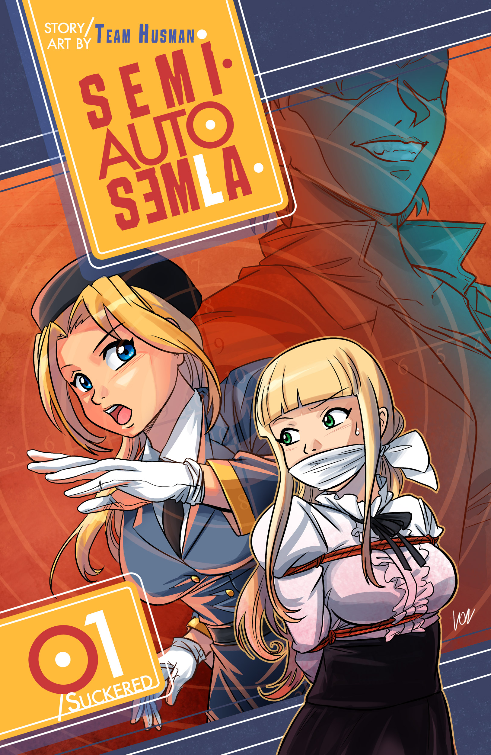
Art Talk#2: Cover design (Patreon)
Content
Covers are the first thing we see on a book or a comic. So in many cases they’re our introduction to a story. I often end up picking some comic book I didn’t know about because I liked the cover. So I never underestimate the power of a good cover!
Some time ago I got asked to do the cover for the Semi Auto Semlawebcomic series (the comic can be found here: https://www.trifecta3.net/semla/ and here is their Patreon page: https://www.patreon.com/Husman ). The nice thing about that is that I had to design the cover from zero, including the logo and the graphic. This can be a nice challenge but it also leaves lot of creative freedom.
First step is:
1. Talk: Discussing with the commissioners is always important, trying to understand what they want, what they prefer and so on. But once all details are set, it’s also important, as an artist, to do your own thing and not put too many limits. As soon as you got all infos you need on the project, and you got all the references you need (example: if you are asked to draw a certain car, it’s not a bad idea to study photos of said car, right?) you’re ready for the drawing table.
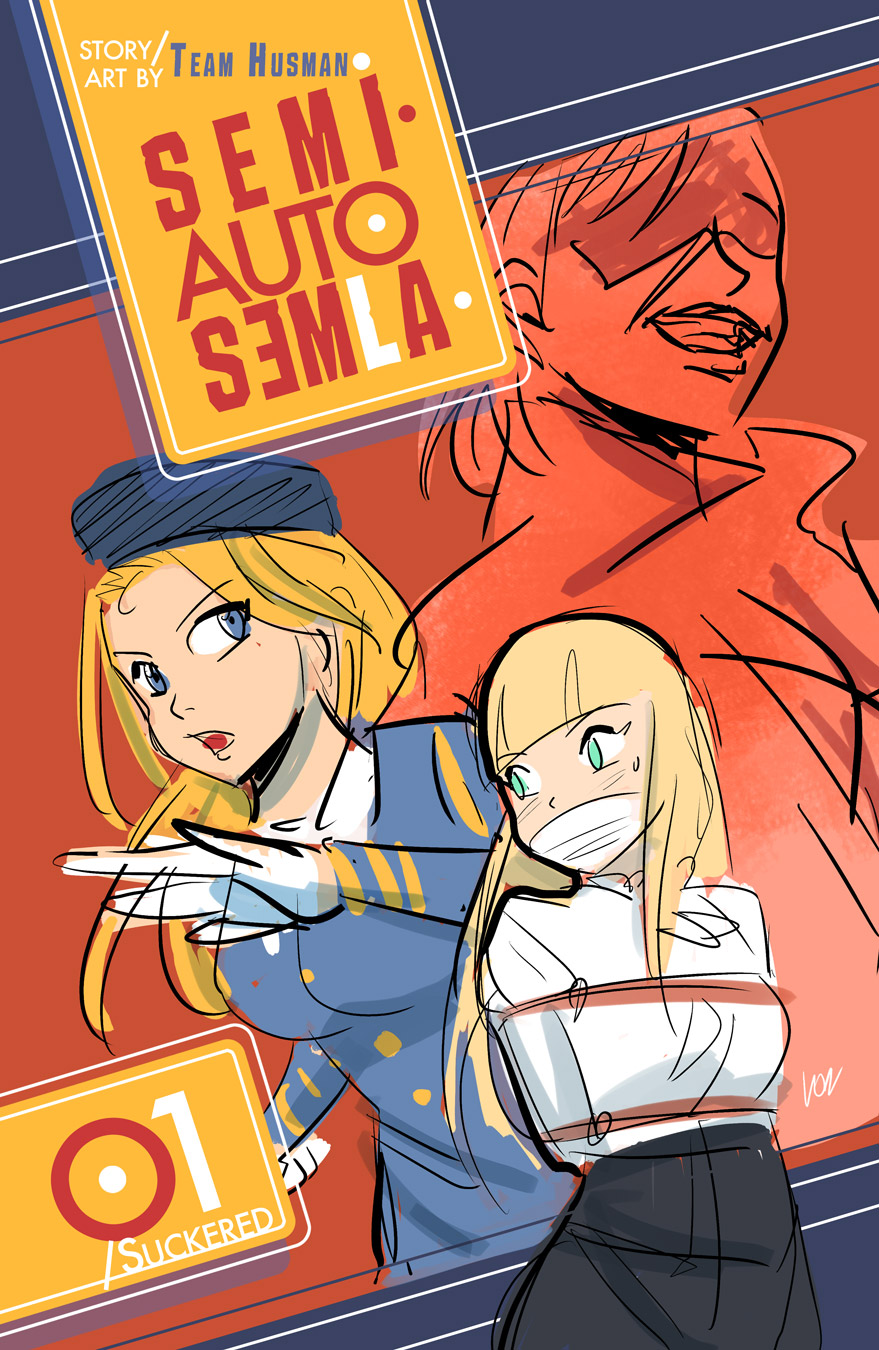
2. Sketch: Since I had to do also the graphic design, I started sketching from very simple doodles to understand how I could deal with all elements of the cover. I knew all text to be put on the cover, so I had to think a layout that could contain all elements. This links directly to the first step (Talk!) as I got some good infos about what this comic series was about: being an action oriented series, full of cars, weapons, running back and forth and whatnots, I chose to tilt the graphic much like the camera captured a quick frame of a movie. The titled angle also enhance the sense of action, so I felt it was appropriate for the occasion! After a very rough doodle layout was approved, I prepared a more detailed sketch, adding colors and a test for the graphics. This step is very useful to see if colors will go together nicely on the cover. Example: if you use too similar tones on a foreground figure and on a background figure, the result won’t be so good and none of the figures will shine or stand out.
2 and half: Composition! A little digression about composition. Composition is a core concept when comes to visual medias. Composition is (in a nutshell) the way elements are arranged on an illustration. In this case I chose to make 3 different planes: foreground (the figure than goes over the graphic and emerges form the bottom of the picture), middle (the defined figure behind the foreground one, whose figure is cut by the background frame) and background (the hidden figure in the background, whose color tones are less natural and more emotional lessay). Please also notice how the size of each figure goes from smaller (foreground) to bigger (background). It was an intentional choice to create a little sense of confusion (as usually figures appear bigger when nearer, not the opposite) to reflect the kaleidoscopic, suddenly changing situations that occur in the comic.
3. Draw! I’m going short on this step as we’ll explore it more in detail another time. This is where the picture really takes its final shape. In some ways this is a more technical phase, as it’s about putting on paper the ideas you defined in previous steps. First comes the inking/lineart, so to have a very solid base to color. In this case all figures were done on separate layers, to allow me to apply all effect on each of them easily. The color step comes immediately after the inking. I usually first do all flat tones first, to define the overall colors of the picture and then I shade each area accordingly :) More about all these steps on future posts of course!
Hope this small art talk comes helpful!
(The attached pictures show some previously unreleased work in progress steps for Semi-Auto Semla first chapter cover)
Files