Home Artists Posts Import Register

Content

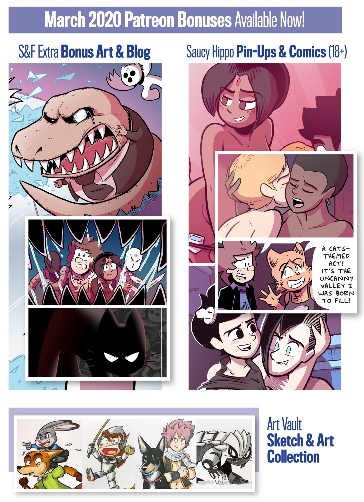
Hi, team! A ton of bonus stuff is ready for you this month. Here's what's new:

All backers: Check out some new REXFORD art, then help pick next month's bonus pieces! 

S&F Extra backers: Our latest S&F Extra features a big behind-the-scenes look at all the new art I'm making for the final S&F books! Plus: attention-craving cats and pillow fights. Pow!

Art Vault backers: The Vault has been updated with a new batch of marker commissions! (There are over 2110+ other pieces in the Art Vault!)

Saucy Hippo backers (18+ only): 5 new nsfw comics and illustrations (plus some bonus variants) have been added to the collection. Featuring: Morris and Cooper! Nic and Tats! And the start of a brand new story with Sam and Jess!  (There are now more than 279 pieces in the Saucy Hippo Collection!)

Thanks, everyone. As always, enjoy the goodies, and let me know what you think! 'til next time...

Files

Comments

James M

I kinda hate to say it but that montage made me realise something I was thinking about saying on the S&F Extra post - I'm not really keen on "soft-shaded" Brain. It just seems at odds with your normal solid tone style. I can see from the Rexford piece that it's not the only time you've used a gradient to shade a character, but I think in that case it's more subtle rather than the sole source of lighting (he has some hard-shaded shadows). With Brain, it's all soft and it just seems jarring to me. Unfortunately I also agree that the other piece is too flat HAHA. So I don't have a solution to your problem. Retcon Brain into being another colour all along? "Who said the tar was black? It's purple!"

samandfuzzy

Yeah, I totally understand what you mean! I've also been experimenting with doing some more flat/cel-shaded treatments on Brain. https://www.dropbox.com/s/241pdgzr04vcxj2/cover-cat-2.png?dl=0 https://www.dropbox.com/s/38w1si2bowqp8zw/cat-cover-3.png?dl=0 https://www.dropbox.com/s/nxpq2jdif3n6nte/cat-cover-5.png?dl=0 I think this style is more in line with the shading on the previous covers (which all use a mix of flat cel-shading and mild gradient highlights). But without really strong gradient lighting, he's such a dark and flat character! I'll have to keep thinking about it, haha

James M

I think you're on the right track. 2 appeals the most to me of those.