Home
Home

 Artists
 Search
 Recent
 Random
 Posts
Posts
 DMs
DMs
 Tags
Tags
 Random
 Importer
 Import
 FAQ
FAQ
 Account
 Register
 Favorites
 Login
Login

Lets Talk Anti Aliasing (Patreon)
Content
UPDATE: When I wrote this I was uploading example images that showed off what was talking about very well, but if when reading you find that you can't tell the difference between the good and bad versions, this is because out of all the websites discussed in this blog post, Patreon actually has GOOD image compression, so... whoops. But trust me on this one guys. Images that look good here, do NOT look as good on Twitter or Bluesky right now. 💀
Anti-aliasing is a technique to remove the jagged edges or "jaggies" in a rasterized image. It can be done by increasing the sampling rate, using high-resolution display, post-filtering, pre-filtering or pixel phasing.
And I hadn't been doing it.
You may not have noticed it but now you may not be able to see that my last few posts have been rather sharp. Too sharp. And this was because I was using binary layers. Too refresh you all Binary Layers are raster layers that limit the amount of color information available to only a handful a bits. Which in my case was only black and white.
I gushed over the use of these late last year as I was working on this Madam sequence because they had helped me limit a lot of the bothersome messiness and cleanup my lines would so often produce. By drawing in pure binary, I didn't have to worry about brush quirks or left over smudges, which allowed me to draw much much faster.
But there was one added step that I may have kept hidden from you, and that was me uploading my images to a vectorizer to convert my pixelated raster image into a smooth vector based one. The pro of this was that it helped smooth out the lines and allowed me to rescale the drawing to any resolution without losing data. The con was this was a tricky middle step that worked once and really never again after I was done with that particular sequence.
To solve this, I simply moved to drawing on larger canvases but this only got me so far, and eventually I just tried to put up with the rasterized drawings as is. This is why my lines have boon looking particularly crunchy recently when you zoom in. And this I see now was a huge mistake.
See while these images looked "okay" at their native resolution, once you start uploading to other websites that use jpeg compression, the artifacting started to make my lines look really really ugly. Just yesterday I tried uploading the Milkshake Puyo sequence to Bluesky and it looked really really bad. This was because at the moment Bluesky compresses anything larger than 2000 pixels, and made my thin linework into an illegible mess. But why? What was the issue? These files only really have 2 colors, black and white. Meanwhile other comic artists' work looked perfectly fine. What had done wrong?

I hadn't accounted for antialiasing.
You see aliasing is more complicated than "make jaggies into fuzzies". It actually involves a lot of complex sampling math in order to make the image look good. This is why people fork over subscription fees each month to adobe just to use their photoshop filters. Those people are paying for the math involved to make their pictures look good. Whereas the compression algorithms used on Furaffinity, Twitter, and Bluesky don't give a fuck. They're only concerned with making the image big enough or small enough for their website. And by limiting myself to just 2 colors, though the files were small, the file image quality was brittle.
When an image has lots of colors, its very easy to blend from one to another without most people noticing. This is how despite the artifacting, jpeg images with their lossy compression are still used throughout the internet. This "good enough" approach really is good enough for 99% of images out there. And I've stupidly set myself up to be the 1% where this becomes a problem.
In hexadecimal, black and white are literally the farthest apart form each other in the color space 000000 vs FFFFFF and so when a website tries to blend the two, its forced to brute force everything to some direct middle ground with no care for what the underlying pixels represent. So as a result the jaggies don't go away, they just become blurry. -- Blurry Jaggies! Aaah!
But if I hadn't been meddling with all of this binary business and drawn with a normal pen, the problem would be solved because the antialiasing would already be there. When zoomed in a black line would have a smooth transition into white. Thus when compressed rather than trying to blend black with white, the website can blend greys with other grays, keeping everything smooth.
But if I want to keep binary layers and I can't convert to vector anymore, what's a bullfrog to do?
I'll have to alias everything myself 🔻

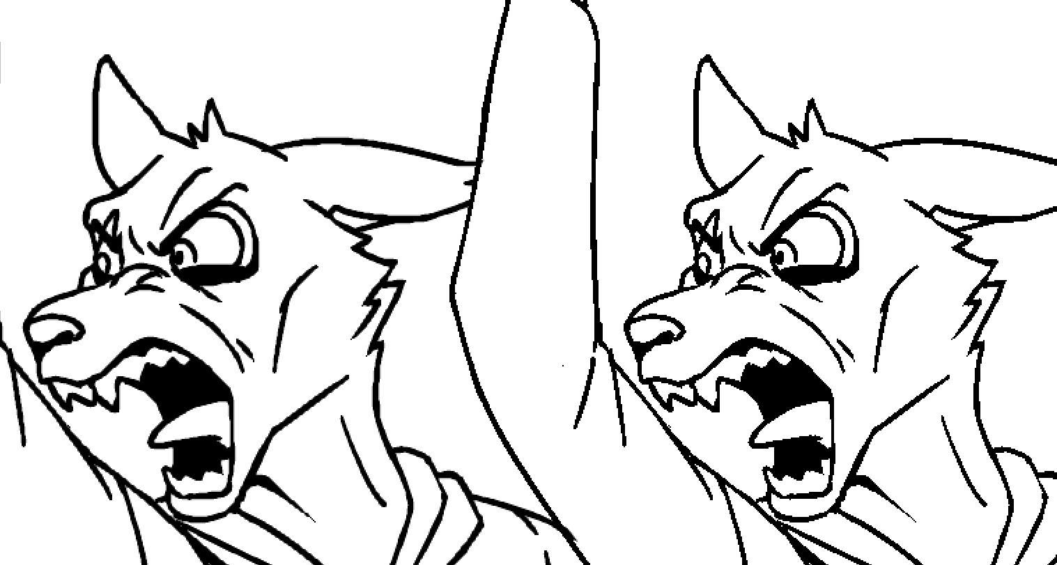
The left is my attempt at anti-aliasing, while the right is my original binary image.
As you can see the left is far blurrier, whereas the right is far sharper. I personally like the sharp version better, but what happens when we zoom out? 🔻

And then when we compress it 🔻

Look at the straight lines on that sign! And how the Jaggies (and holes on my monitor) go away one the blurrier version. The anti-aliased version will therefor look much better when browsing twitter.
But how am I accomplishing this?
Well I'm going to have to fiddle with this a bit more, but I'm taking my crunchy binary layer and duplicating it 3 times -- each time blurring them slightly and lowering the opacity by a slight fraction 🔻

Because these layers are still binary the color doesn't blur, it spreads by a tiny amount. Here I'm blurring at about 0.7px while lowering the opacity by half each time. The end result, when composited, fills out the gaps left by the black and white pixels, resulting in my own DIY anti-aliasing. 🔻

As a consequence, all of my lines are now roughly 0.7 pixels thicker, as if I was using a thicker pen. A pen that's bled into the canvas But the final results speak for themselves.🔻

Going forward I'm going to start doing this to all of my pictures before finalizing them, and I hope this slight bump in quality will make up for how things have been looking these past few months. Thankyou.
Files